
Hello Trailblazers!
In today’s fast-growing world of business, making informed decisions based on data is crucial for success. Salesforce dashboards are powerful tools that allow organizations to visualize and analyze their data in real time, helping users track key metrics and uncover insights that drive business success. Whether you’re in sales, marketing, customer service, or operations, dashboards provide an easy way to stay informed and make better decisions.
In this blog, we’ll cover what a dashboard is in Salesforce, its importance, the different types of dashboard components, and step-by-step instructions on how to create a dashboard in Salesforce Lightning.
What is a Dashboard in Salesforce?
A Salesforce dashboard is a visual representation of your Salesforce data, organized through various components such as charts, tables, graphs, and gauges. Dashboards pull data from Salesforce reports and display it in a single location, offering a comprehensive view of key performance indicators (KPIs) and business metrics. With dashboards, users can monitor trends, track performance, and make informed decisions quickly.
Key Features of Salesforce Dashboards
- Real-Time Data: Dashboards update in real-time, ensuring that you are always working with the latest data.
- Customizable: You can create dashboards tailored to specific users, roles, or departments, ensuring that everyone sees the data most relevant to them.
- Interactive: Dashboards are interactive, allowing users to drill down into the data for deeper insights.
- Multiple Components: A single dashboard can have multiple components, each displaying different types of data (e.g., charts, graphs, tables).
- Dynamic Dashboards: Dashboards can be dynamic, meaning they display data based on the logged-in user’s permissions and access levels.
Let’s learn about what types of dashboard components Salesforce provides.
Dashboard Components in Salesforce
Salesforce dashboards are made up of several components that allow you to display data in different ways. So here are the common components you can use when creating a dashboard:
1. Chart:
Visual representations of data, including bar, pie, and line charts. Best for comparing data sets or visualizing trends.
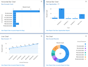
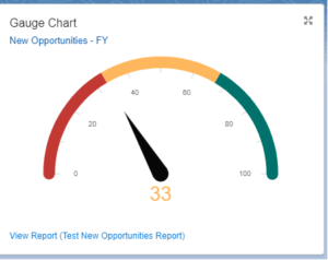
2. Gauge:
A gauge displays a single value within a range. It’s perfect for tracking performance against a target (e.g., sales quota).
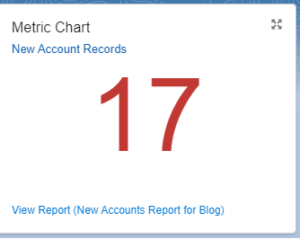
3. Metric:
Metrics display a single key performance indicator (KPI). For example, it can show the total number of closed deals for the quarter.
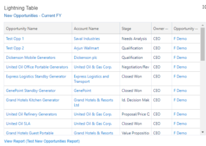
4. Table:
Tables show multiple rows of data in a grid. Useful for showing detailed lists, such as top-performing salespeople or open customer cases. (Lightning Table)
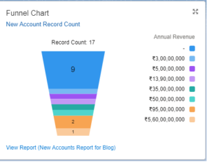
5. Funnel Chart:

A Funnel Chart in Salesforce shows data progression through stages, like a sales pipeline, highlighting conversions and drop-offs.
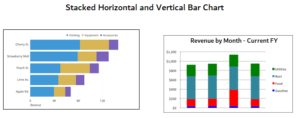
6. Stacked Vertical and Horizontal Bar Chart:
A Stacked Bar Chart in Salesforce displays data in horizontal or vertical bars, where each bar is divided into segments representing different data categories. This chart type is ideal for comparing totals across groups while also visualizing the breakdown within each group. You can add a stacked bar chart to dashboards by grouping a report and choosing the Stacked Bar Chart component.
So these are all the dashboard components (charts) provided by Salesforce.
Types of Dashboards in Salesforce
- Dynamic Dashboards: These dashboards display data based on the logged-in user’s access and permissions, making them highly personalized.
- Standard Dashboards: These are regular dashboards that display data to all users with access, irrespective of their permissions.
Note: If you would like to learn more about Dynamic Dashboards in Salesforce Lightning, please feel free to go with this link.
How to Create Dashboards in Salesforce
Creating a dashboard in Salesforce is a simple and intuitive process. Here’s a step-by-step guide to help you set up your own dashboard in Salesforce Lightning.
Step 1: Navigate to the Dashboards Tab
- Click on the App Launcher (grid icon) in the upper-left corner of your Salesforce instance.
- Type “Dashboards” in the search bar and click on the Dashboards tab.
Step 2: Create a New Dashboard
- In the Dashboards tab, click the New Dashboard button in the top-right corner.
- Enter Dashboard Details: A pop-up will appear, asking for the following details:
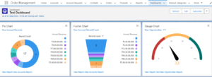
- Name: Enter a meaningful name for your dashboard (e.g., “Sales Team Performance”). Here we’ll enter ‘Test Dashboard’.
- Folder: Select the folder where the dashboard will be stored. Choose whether the folder is public (shared with everyone) or private.
- Description: Enter the description. (Optional)
- Click “Create”. This will take you to the dashboard builder page.
Step 3: Add the Dashboards Components
So once the dashboard shell is created, you can begin adding components to it.
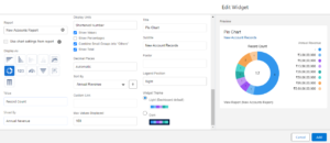
- In the dashboard builder/editor, click the + Widget button.
- Click “Chart or Table” and select the relevant reports for your dashboard..
- Select a Report: Salesforce dashboards pull data from reports. Select the report you want to use for the dashboard component. Make sure the report contains the data you want to visualize.
- Choose the Component Type: As discussed above, so you can choose different component types, such as charts, gauges, metrics, and tables. Each type provides a different way to display data.
- Customize the Component: After selecting the report and component type, you can configure how the data will be displayed. Customize the chart type, axis labels, filters, and any other settings to suit your needs.
So it should look like the image below:
- Once done, click Add
- Repeat the procedure to add more components like gauge charts, metric charts, bar charts, etc.
- So once you’ve added all the necessary components, you can drag and drop them around the dashboard canvas to arrange them in your preferred layout.
- You can resize the components by clicking and dragging the edges of each component to fit more data.
Step 4: Set Dashboards Filters (Optional)
If you want to allow users to filter the data on the dashboard, you can add filters.
- Click “+ Filter” button at the top of the dashboard builder.
- Select Field: Choose the field you want to use as a filter (e.g., “Region” or “Sales Rep”).
- Set the filter options to allow users to adjust which data appears on the dashboard.
We’ll learn how to add filters to the Salesforce Dashboards in the next segment of this blog post.
Step 5: Save and Run the Dashboards
- Once you’ve finished configuring the components, click Save at the top of the page.
- After saving, click Done to exit the dashboard editor and view your newly created dashboard.
Note: If you would like to learn more about how to place your dashboard on Lightning Pages in Salesforce Lightning, please feel free to go with this link.
Best Practices for Creating Effective Dashboards
- Keep It Simple: Avoid overcrowding your dashboard with too many components and focus on the most important metrics to ensure clarity.
- Use Appropriate Chart Types: Choose chart types that best represent your data. So for example, use a line chart for trends over time and a pie chart for showing percentages.
- Leverage Filters: Use filters to make dashboards more interactive and customizable for users.
- Regularly Update Dashboards: Ensure your dashboards are up-to-date by scheduling regular refreshes and updating the underlying reports as needed.
- Monitor Performance: If your dashboard is slow to load, reduce the number of components or optimize the reports it pulls from.
Conclusion
Dashboards in Salesforce are a powerful way to visualize and analyze data, enabling users to track key metrics in real-time and make informed decisions. So by following the steps outlined in this guide, you can create dynamic, interactive dashboards tailored to the needs of your organization and whether you’re in sales, marketing, or customer support, and Salesforce dashboards provide the insights you need to drive performance and achieve your business goals.
Happy Reading !!
The journey of learning never ends; every moment is a chance to grow.
Related Posts:
You Can Also Read:
1.A Comprehensive Guide to Custom Report Type in Salesforce
2.Mastering Salesforce Queues: A Step-by-Step Guide – Part 2
3.How to Assign Records to Salesforce Queue: A Complete Guide
4. An Introduction to Salesforce CPQ
5. Revolutionizing Customer Engagement: The Salesforce Einstein Chatbot