Hello Trailblazers!
Salesforce provides powerful reporting tools to help businesses analyze data, track performance, and make informed decisions. In the previous part of this blog we learnt about different types of reports available in Salesforce. Tabular Reports are the simplest and most straightforward way to display your data in rows and columns. They are often used when you need a flat list of records with no groupings or complex calculations.
In this detailed guide, we will explore what tabular reports are, how they work, and step-by-step instructions to create them in Salesforce.
What is a Tabular Report in Salesforce?
A Tabular Report is the simplest type of report format in Salesforce, similar to a basic spreadsheet. It displays records in a simple table layout consisting of rows and columns. Each row represents a single record, and each column represents a field from the object you are reporting on. These reports are ideal for lists of data such as contact lists, task lists, or straightforward reports where no grouping or summarization is required.
Key Features of Tabular Reports:
- Simple flat list of data.
- No groupings or subtotals.
- Often used for export purposes or for simple report views.
- Best suited for creating lists such as mailing lists, lead lists, or product inventories.
- Can be used as a source report for a dashboard component, such as charts, but has limitations when used in dashboards.
When to Use a Tabular Report?
Tabular reports are most suitable when you need to generate a simple list of records without any complex summarization or grouping. You might use a tabular report when you need:
- A list of all accounts or contacts.
- A task list for a specific time period.
- A list of opportunities or leads to export for further analysis.
- A flat view of any object records.
While tabular reports are effective for these simple lists, if you need to group or summarize data, you might want to use other types of reports like Summary or Matrix reports.
Steps to Create a Tabular Report in Salesforce
Creating a tabular report in Salesforce is a straightforward process that involves selecting the data you want to display, choosing the fields, and organizing it into a flat table. Let’s go through the steps in detail.
Step 1: Navigate to the Reports Tab
- Click on the App Launcher icon and search Reports.
- Select Reports. It’ll open the report’s tab.
- In the Reports tab, click New Report in the upper-right corner of the screen.
Step 2: Select a Report Type
After clicking on New Report, you will be prompted to select a Report Type. Salesforce provides report types based on the object you want to report on.
- Choose the object for your report (e.g., Accounts, Contacts, Opportunities, Leads).
Here we are going to create report for Account object. - If you want to report on related objects (e.g., Accounts with Contacts), you can select a custom report type that allows for this relationship.
- Select the Accounts Report type as shown in the figure below.

- Click Start Report once you’ve selected the report type.
Note: If you would like to learn more about how to create Custom Report Type in Salesforce then you can go with this link.
Step 3: Define Report Filters
Once you’ve selected the report type, Salesforce will open the report builder. Here, you will define filters to narrow down the data that will be displayed in your report.
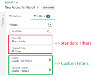
- Standard Filters: Salesforce will automatically apply some filters, such as the date range and object ownership (e.g., My Accounts). You can modify these filters based on your reporting needs.
- Custom Filters: Add additional filters to refine your data. For example, you can filter by specific field values, such as filtering Opportunities by a specific stage or filtering Contacts by country.
Apply the Standard as well as Custom filters as shown in the figure below.
Step 4: Add and Arrange Columns
In this step, you’ll choose which fields you want to display as columns in your tabular report.
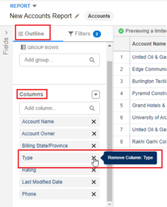
- Click Outline in the left-hand sidebar.
- Click Add Column and choose the fields you want to include in your report. For example, in an Account report, you might want to add columns like Account Name, Phone Number, Rating, and Type, etc.
- Drag and drop the fields in the desired order.
- You can also remove any unnecessary columns by clicking cross symbol on the column as shown in the figure below.
Step 5: Apply Sorting (Optional)
You can choose how the rows in your report should be sorted. For example, you can sort by Account Name, by created date, or by any other field in ascending or descending order.
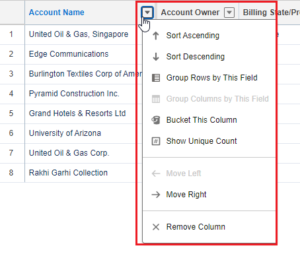
- Click the down arrow on the column header you want to sort by.
- Choose Sort Ascending or Sort Descending based on your preference.
Step 6: Preview and Run the Report
Once you’ve selected your columns and applied the necessary filters, you can preview your report to make sure it looks the way you want.
- Click Run to preview the report with the data from your Salesforce org.
- If everything looks good, click Save & Run to save the report.
The report will look like this.
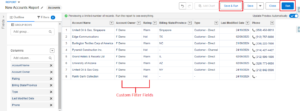
Note: Tabular reports have a limitation, as shown in the image above, where you cannot add a chart. You can see the “Add Chart” option is disabled for this report format.
Step 7: Save and Share the Report
Once your report is finalized, you’ll want to save and share it with others.
- Click Save & Run.
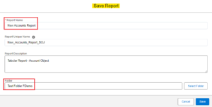
- Provide a report name, and optionally, a description to help others understand the purpose of the report.
- Select the folder to save the report in. Salesforce offers personal, public, or custom folders where reports can be stored.
- You can also define the report sharing settings if you want to share the report with specific users or groups in your organization.
Step 8: Export the Report (Optional)
If you need the report data outside of Salesforce, you can export it in several formats.
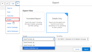
- After running the report, click the down arrow next to Edit.
- Choose Export.
- Select the export format: Formatted Report (includes column headers and report format) or Details Only (exports raw data).
- Choose the file format (Excel or CSV).
- Click Export as shown in the figure below.
Benefits of Tabular Reports
- Simple and Easy: Tabular reports are very easy to create and understand. They don’t require complex configurations, making them ideal for quick reporting needs.
- Efficient for Data Export: If your goal is to extract data from Salesforce for use in external applications or spreadsheets, a tabular report is a great choice.
Limitations of Tabular Reports
While tabular reports are useful, they do come with some limitations:
- No Grouping or Summarization: Tabular reports do not allow for grouping data by field or generating subtotals, which means they are not ideal for reports requiring more detailed analysis or complex data structures.
- Limited Dashboard Support: Tabular reports can only be used as a source for certain dashboard components, and they must have a row limit set to be displayed in dashboard charts.
Conclusion
Tabular reports in Salesforce offer a straightforward and effective way to view, analyze, and export data in a flat format. Whether you’re managing customer lists, tracking leads, or simply exporting data for further analysis, these reports provide the perfect tool for the job. While they are limited in terms of grouping and summarization, they excel in simplicity and ease of use.
So, by following the above instructions, you can easily create tabular report in Salesforce.
In the next part of this blog, we’ll learn about creating Summary Reports in Salesforce.
Until then, Keep Reading !! 😉
“Progress is less about speed and more about direction. Even small steps forward lead to great destinations”.
Related Posts:
You Can Also Read:
1. Introduction to the Salesforce Queues – Part 1
2.Mastering Salesforce Queues: A Step-by-Step Guide – Part 2
3.How to Assign Records to Salesforce Queue: A Complete Guide
4. An Introduction to Salesforce CPQ
5. Revolutionizing Customer Engagement: The Salesforce Einstein Chatbot

