Salesforce Dashboards are a powerful tool for visualizing and analyzing data, providing actionable insights for decision-making. Filters enhance these dashboards by allowing users to customize their view of the data, making dashboards dynamic and user-friendly.
In this blog, we will explore how to add filters to Salesforce Dashboards and highlight their benefits and best practices.
Before you Begin:
In the earlier parts of this blog series, we explored what Salesforce Dashboards are, their components, how to create them, as well as Dynamic Dashboards and the steps to set them up. Before diving into this section, I recommend reviewing those blogs for a better understanding.
What Are Dashboard Filters?
Dashboard filters in Salesforce enable users to adjust the data displayed on a dashboard without altering the underlying reports. By applying filters, users can view specific subsets of data, such as a particular region, product, or time frame, directly within the dashboard interface.
Benefits of Using Filters
- Enhanced User Experience
Filters make dashboards more interactive and user-centric by allowing users to focus on the data that matters to them.
- Improved Data Analysis
Filters enable deeper insights by providing multiple perspectives on the same set of data.
- Reduced Dashboard Clutter
Instead of creating multiple dashboards for different criteria, you can use filters to streamline the data presentation in one place.
Prerequisites for Adding Filters
Before adding filters to your Salesforce Dashboard, ensure the following:
- You have “Manage Dashboards” and “Edit Dashboards” permissions.
- The source reports used in the dashboard have fields available for filtering.
Note: If you’re interested in learning how to share Dashboards and Reports with Users, Roles, Partners, Internal Subordinates, and more, click on the link provided for a detailed guide.
Steps to Add Filters to a Salesforce Dashboard
Step 1: Open the Dashboard Editor
- Navigate to Dashboards in Salesforce.
- Select the dashboard you want to edit or create a new one.
- Click Edit to open the dashboard editor.
Step 2: Add a Filter
- Click the “+ Filter” button in the dashboard editor.
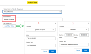
- In the Field dropdown, select the field you want to use for the filter. The available fields are determined by the source reports. So here, for example, we select the “Annual Revenue” field from Account.
- Once you select the field, specify the other filter options like Display Name: Annual Revenue.
- Click on the “Add Filter Value” button as shown in the figure below and start adding filter conditions.

- Once you add the conditions, click apply to save the filter and repeat the same procedure for more conditions as shown above.
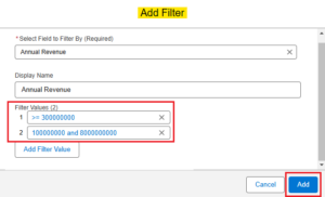
- After adding all the conditions, click Add as shown in the figure below.

- Click Save.
- Click Done.
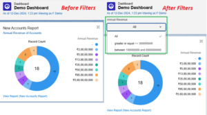
You can see the difference between a normal dashboard and a dashboard with filters in the below image.

Step 3: Save and Test the Dashboard
- Once all filters and components are configured, click Save.
- Test the dashboard by switching between different filter values to ensure the components update correctly.
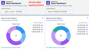
The results are as shown below:

With these simple steps, you can apply filters to the dashboard to view specific data sets without the need to create a new dashboard or modify the associated reports.
In addition to the above example, you can also apply filters to fields like “Region” in an object. For instance, by setting up a “Region” filter with values such as “North,” “South,” “East,” and “West,” the dashboard data will dynamically adjust to display insights specific to the selected region.
So this feature enhances data visualization by allowing targeted analysis without creating separate dashboards.
Note: The limit for dashboards filter options (also known as filter values or filter criteria) differs from the limit on the total number of dashboard filters. Each dashboard can include up to 5 filters, and each filter can have up to 50 filter options. So this allows for a flexible and detailed data analysis experience, ensuring users can narrow down their results efficiently within these limits.
Best Practices for Using Dashboard Filters
- Choose Relevant Fields Select fields that align with your user’s needs and provide meaningful data segmentation.
- Use Descriptive Names Clearly label filters to help users understand their purpose.
- Limit the Number of Filters Avoid overwhelming users by keeping the number of filters manageable.
- Validate Data Compatibility Ensure that the fields you use for filters are consistent across the source reports.
- Test Thoroughly Always test the dashboards filters to confirm they work as expected and provide accurate results.
Common Use Cases for Dashboard Filters
- Geographic Analysis
- Filter data by region or country to analyze location-specific trends.
- Product Performance
- Apply filters for product categories or specific products to measure sales or performance.
- Time-Based Insights
- Use filters for date ranges, such as months, quarters, or years, to study trends over time.
And many more examples.
Conclusion
Adding filters to Salesforce Dashboards is a simple yet impactful way to enhance data visualization and user experience. By allowing users to customize their view, filters make dashboards more dynamic and insightful. By following the above implementation steps and best practices, you can create powerful dashboards.
Happy Reading!
“Manifestation begins with belief—what you focus your thoughts and energy on becomes the blueprint for your reality. Dream it, feel it, and work towards it with unwavering faith.”
Related Posts:
You Can Also Read:
1. Introduction to the Salesforce Queues – Part 1
2. Mastering Salesforce Queues: A Step-by-Step Guide – Part 2
3. How to Assign Records to Salesforce Queue: A Complete Guide
4. An Introduction to Salesforce CPQ
5. Revolutionizing Customer Engagement: The Salesforce Einstein Chatbot

