
“POUR” has become mainstream lingo for the four main principles (Perceivable, Operable, Understand, and Robust) of web accessibility. These four essential guidelines created by the W3C organization are the “how-to” guide for digital teams of strategists, designers, developers, SEO, and content specialists to create accessible experiences. These guidelines were created so that digital consumers using adaptive strategies such as font sizing or using assistive tech (i.e., VoiceOver, Talkback, Narrator, NVDA, or JAWs), or mainly relying on a keyboard (i.e., tabbing and shortcuts), can access digital media like apps, videos, and websites.
In my previous post, we learned that designing technology to be perceivable minimizes or eliminates barriers to digital experiences within websites, apps, videos, and other forms of technology so users can take in the information through hearing, sight, and touch senses. In other words, designing “multimodal” takes advantage of using two different modes (sight and hearing) to process information, giving more access to more people. Now we’re going to cover the second term of POUR: Operable.
Why Your Designs Should be Operable
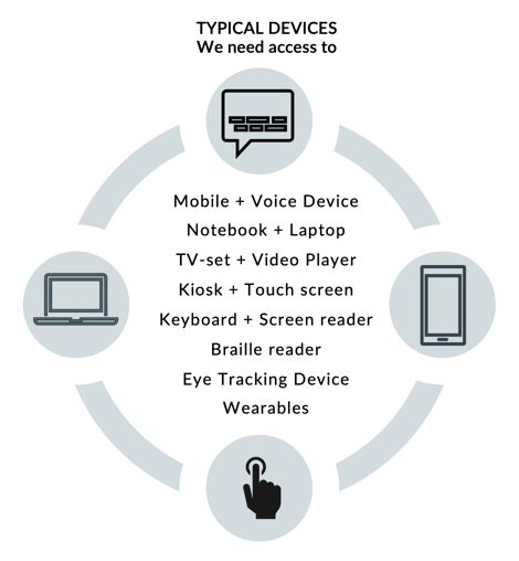
Designing to be operable means that user interface (UI) components and navigation are ideally programmed to work independently of the device that a person is using. Between 18 and 26% of the overall population within the United States use various devices to access digital content, such as a curved keyboard with a mouth stick, voice-activated tech, alternative keyboards, assistive settings for mobile devices, and eye-tracking devices. Of the devices everyone uses, a keyboard is one of the most important. Designing with keyboard-only access addresses a broad spectrum of disability types and technologies, and it’s a core guideline of the Web Content Accessibility Guidelines (WCAG).
How to Create Operable Experiences
Operable guidelines are some of the easiest to understand and adopt because they are more definitive and less subjective for designers and developers to implement. For example, guideline 2.1 requires any user interface (UI) components and navigation accessible by keyboard (independent of a mouse). In other words, users can tab through the UI with voice-activated tech like a screen-reader and interact with content and features, such as a form, without roadblocks in their way.
Here is a brief breakdown of the five main areas comprising the Operable principle and the WCAG 2.0 and 2.1 guidelines for implementing them at a high level. For a detailed list of how to make UI components and navigation operable, visit the W3C site.

2.1 Make all Functionality Available from a Keyboard
Examples of keyboard accessibility include:
- All functionality that is available by the mouse is also available by keyboard.
- Keyboard focus does not get trapped in any part of the content
- Web browsers, authoring tools, and other tools provide keyboard support
2.2 Provide Users Enough Time to Read and Use Content
Some people take more time to read, understand, and act on content like completing a form. Providing enough time allows users to:
- Stop, extend, or adjust time limits to complete a task, except where necessary
- Pause, stop or hide moving, blinking, or scrolling content
- Postpone or suppress interruptions, except where necessary
- Re-authenticate when a session expires without losing data
2.3 Do Not Design Content in a Way That is Known to Cause Seizures and Physical Reactions
Some interactive content that flashes at certain rates or patterns can cause photosensitive reactions. Animations or moving content might be difficult for some people to use. Examples of how to avoid causing seizures and physical reactions are:
- Avoid including content that flashes at particular rates and patterns
- Warn users before flashing content is presented and provide alternatives
- Provide mechanisms to switch off animations unless they are essential
2.4 Provide Ways to Help Users Navigate, Find Content, and Know Where They Are
Well-formed information architecture helps everyone find what they want and complete their tasks, whether they see the content, hearing it, or both. These six guidelines make it easier to navigate user interfaces:
- Pages have clear titles and are organized using descriptive section headings.
- There is more than one way to find relevant pages within a set of web pages.
- Users are informed about their current location within a set of related pages.
- There are ways to bypass blocks of content that are repeated on multiple pages.
- The keyboard focus is visible, and the focus order follows a meaningful sequence.
- The purpose of a link is evident, ideally even when the link is viewed on its own
2.5 Make it Easier for Users to Operate Functionality Through Various Inputs Beyond Keyboard
Now that we have other input modalities to use, such as touch, voice recognition (speech input), and gestures, a keyboard may not be used to access digital content. Here are key guidelines to maximize these input modalities:
- Provide alternatives for gestures that require dexterity or fine movement
- Provide undo functionality to avoid accidentally activating a component
- Labels are shown to users match corresponding object names in the code (supports voice activation)
- Functionality activated by movement can also be activated through UI components.
- Active components (e.g., buttons, links) are large enough to be easier to activate by touch.
Now We Know Operable, So What Comes Next?
Designing for operability is largely about the different devices everyone uses to access and use digital content. It ensures content is accessible on a variety of device types and input modalities. For further information on making your design operable to your audience, contact our experience design experts. Check out our Accessibility IQ today, download our guide, Digitally Accessible Experiences: Why It Matters and How to Create Them, stay tuned for the next installment to discuss the next principle of POUR: “Understandable,” and read more about the elements of accessible web design from our UX for Accessible Design series today.