Leverage Graphics to Showcase Your Digital Brand
In our media-first world, enhancing your content with visuals is critical in connecting with your audience. Using visual media, like graphics, gifs, and infographics help publicize your brand, grow your online following, and even influence whether or not you make the sale. However, with a myriad of creative options available, knowing where to start can be the hardest part.
To help with this process, we at Perficient have compiled our favorite tips and how-tos for elevating your marketing mix and improving your brand’s visual narrative.
First up in the series: graphics. Useful on so many platforms, pictures are an integral part of communicating your brand to the right audience. It is surprisingly easy to create eye-catching graphics that seamlessly blend into your company’s identity – it’s all about having the right design mindset. Keep reading for design rules to stick to when creating an appealing graphic.
How to Create the Best Graphics for Your Audience
Be Consistent with Your Content
As with all customer-facing content, your graphics should match the tone of the platform they are on. If your company follows a specific media policy, stick to those rules. If not, consider these standards:
Content Platform Guidelines
Social media messaging is generally more laid back, meaning more room for creativity and fun. On social channels, your graphic is your content – it’s what the viewer will see first. Create something attention-grabbing to draw followers, and potential customers, to your page. Marketing materials, like emails and blogs, are more professional platforms where the customer has sought out your brand and is curious about your offerings. Here, your graphic should assist your content, not overpower it. Balance your written and visual content to ensure your piece has a natural flow.

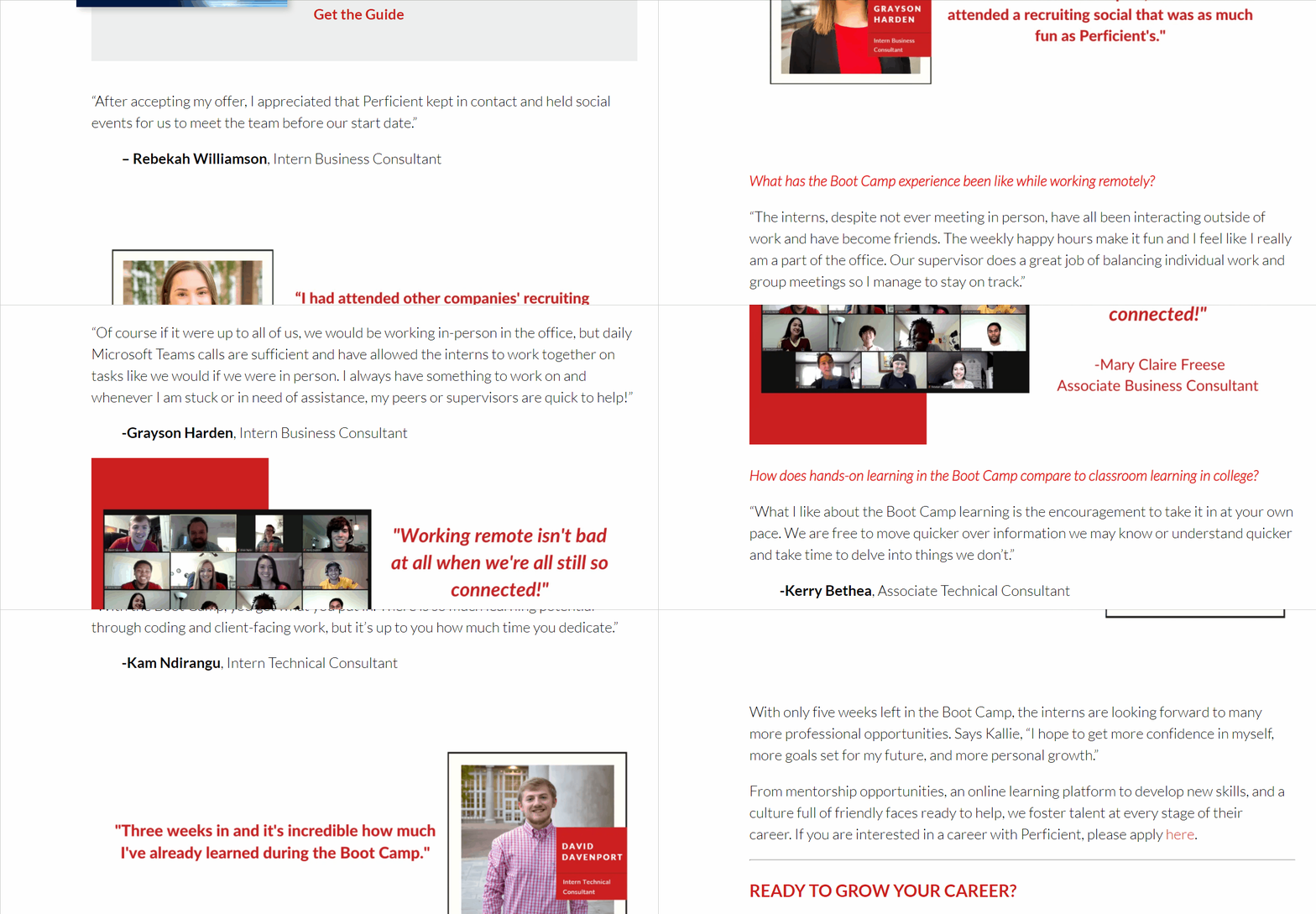
Your written and visual content should transition seamlessly, like in this blog about our New Hires.
Don’t Let Design Distract from the Message.
Increase Brand Awareness in the Viewer’s Minds
Though it can be fun to get overly creative, exercise restraint – maintain solid brand identity across platforms. Stick to brand colors, fonts, and logos within your design. At Perficient, our marketing team has curated a brand guidelines site, The Perficient Brand Center, that we utilize when creating any branded content. To avoid overwhelming the viewer, leverage only one or two fonts and three to four colors in a single graphic. And lastly, embrace whitespace within your design – just like in conversation, it’s okay to have unused space in your graphic to let the viewer breathe.

Using Perficient design elements, we created an engaging, informational graphic that fits with our brand personality. (Instagram: @perficient)
Take Advantage of Templates for Graphic Design
Creating an impactful graphic doesn’t mean starting from scratch – drawing inspiration from templates is a great time-saving practice.
Use Canva.com As a Go-To Graphics Resource
Canva.com is a valuable online platform for developing graphics and video. Start with one of their templates, incorporate your own design elements, and build a robust, custom graphic. Remember to save your Canva graphic as a template for future designs, as reusing similar components between your graphics promotes thematic consistency.

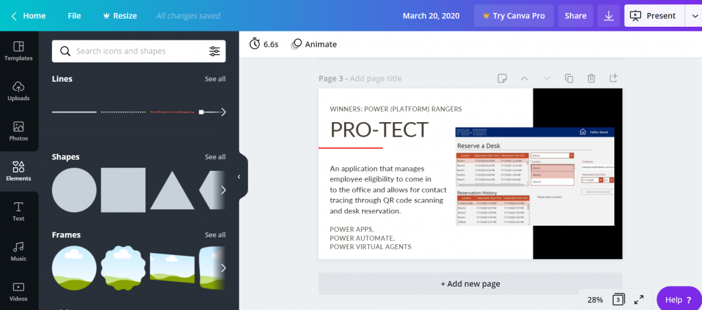
Creating graphics for our Hackathon article inside Canva.
Next Up in Visual Storytelling…
Compelling copy and engaging graphics will enhance your marketing story. Using these tips will make it happen. Stay tuned for the next installment of Visual Storytelling: Creating Meaningful Gifs.
READY TO GROW YOUR MICROSOFT CAREER?
At Perficient, we continually look for ways to champion and challenge our talented workforce with exciting projects for high-profile clients, encourage personal and professional growth through training and mentoring, and celebrate our people-oriented culture and the innovative ways they serve Perficient and the community.
Learn more about what it’s like to work at Perficient at our Careers page.
Go inside Life at Perficient and connect with us on LinkedIn, Twitter, and Instagram.

