I read an article by Chris Clark on CMSWire last week covering SharePoint, Yammer, and the way UI (User Interface) impacts use and adoption. The article itself was enjoyable and informative, and I found myself agreeing with Mr. Clark’s central argument– Yammer’s superior UI helps it win adoption where SharePoint’s more complex UI can sometimes hold it back.
That said, I feel pretty strongly that UI is only one component of UX (i.e., User Experience). I think it’s an elementary next step to extend the argument and note that if one dives a little deeper it’s UX– more than just UI– that makes Yammer the “killer app” in the SharePoint stable.
To agree with and echo Mr. Clark’s point about UI, then, UX is generally just as ignored in much of the buzz around SharePoint and Yammer. We hear about market trends, the cloud (and the cloud, and the cloud again), “disruption” and breaking down barriers, and of course the “viral” way Yammer is adopted. But why is successful Yammer adoption so “viral” at its core?
It’s the simple User Experience. Compare it to SharePoint beyond the UI and this point becomes crystal clear. Let’s look at two simple cases: (1) Getting Started and (2) Creating a Group.
Getting Started: Often the frustration of users with SharePoint boils down to fixable errors like password prompts in certain browsers, and/or users trying to get things done that require IT governance or intervention in many environments. That’s part of experience. Yammer typically doesn’t have hiccups of that nature– getting started with Yammer is easy. You go to a site, you give it your email, and BOOM. There you are, getting social (and that’s the point that the clean, Facebook-like UI takes over).
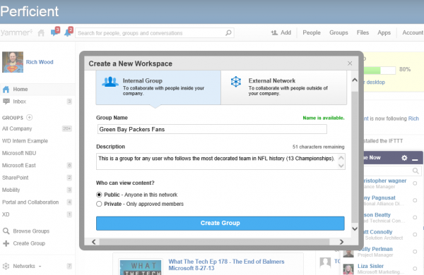
Creating a Group: Spinning up a Yammer group is something any user can do, and it only takes two clicks. You hit the “Plus” button under “Groups” in the left global navigation, fill out some fields, and choose Public/Private. BOOM. Group is done. No slow-moving governance processes, no provisioning hassles, no security hang-ups– just simple, immediate Yammering. Granted, this isn’t for everyone– often, one needs governance and security in enterprise use cases– but for seamless collaboration, it’s one heck of a lot easier to adopt.

An argument should be made, then, that Yammer is more than a superior UI; rather it’s a simply more intuitive experience. My gut feeling is that Yammer is a more intuitive UX, with less barriers to entry (and therefore adoption) and that’s why it succeeds.
