
Hello Trailblazers!
Accordions are powerful UI components that help organize and display large amounts of content efficiently by allowing users to expand or collapse sections as needed. In Salesforce Lightning Web Components (LWC), the lightning-accordion component provides a built-in way to implement an accordion with minimal effort.
This blog will cover everything you need to know about creating, customizing, and using accordions in LWC, including its properties, event handling, styling, and use cases.
In this blog post, you’ll learn:
- What is Lightning Accordion?
- Features of Lightning Accordions.
- Example of Lightning Accordions.
- Final Result.
So let’s get started.
What is an Accordion in LWC?
An accordion is a component used to display collapsible sections in a structured manner. Each section can be expanded or collapsed independently or as a group, providing a more user-friendly experience when dealing with large datasets.
The lightning-accordion component in LWC simplifies the implementation of accordions without requiring custom JavaScript or additional styling.
Lightning Web Component (LWC) offers two tags for working with the Lightning Accordion:
- lightning-accordion
- lightning-accordion-section
Features of Lightning Accordion
- Collapsible Sections – Users can toggle the visibility of sections.
- Single or Multiple Open Sections— You can Control whether only one or multiple sections can be open at a time.
- Customizable Headers – Define labels and icons for section headers.
- Event Handling – Capture and manage user interactions.
- Styling Options – Apply custom styles to match your application’s theme.
Examples of Lightning Accordion
To use the Lightning Accordion, we need the two tags mentioned earlier. Below is a sample code snippet for creating basic Lightning Accordions. You can customize the content as needed and reuse the Accordion wherever required.
<template>
    <lightning-accordion>
        <lightning-accordion-section name="A" label="Section 1">
            <p>Content for Section 1</p>
        </lightning-accordion-section>

        <lightning-accordion-section name="B" label="Section 2">
            <p>Content for Section 2</p>
        </lightning-accordion-section>

<lightning-accordion-section name="C" label="Section 3">
            <p>Content for Section 3</p>
        </lightning-accordion-section>

    </lightning-accordion>
</template>
So, this is the very basic example of Lightning Accordion. Don’t worry, we’ll decode it step by step to make it easy to understand.
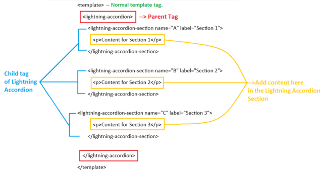

By analyzing the image above, you can see that we have structured the Lightning Accordions using a parent tag, <lightning-accordion>, which contains one or more child tags, <lightning-accordion-section>. The parent tag serves as a container for all the collapsible sections, while each child tag represents an individual section within the accordions.
The <lightning-accordion-section> tag supports several important attributes that help define its behavior and appearance:
- name – Specifies a unique name or identifier for the accordions section. This is useful when handling events or dynamically controlling sections.
- label – Defines the title of the accordions section, which is visible to users.
- if:true / if:false – Enables conditional rendering of sections, allowing developers to control the visibility of a section based on specific conditions.
Now, it’s time to see the final result.
Result
So, when you run the above code, the Lightning Accordions will appear as follows:
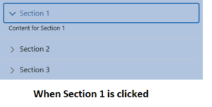
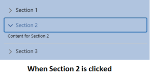
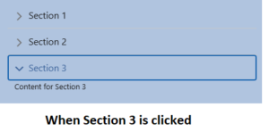
So, this is a simple and easy example of a Lightning Accordion. I hope you found it helpful and now better understand how it works.
Conclusion
Accordions in Lightning Web Components effectively display structured content in an interactive format. Using the lightning-accordions component, developers can easily implement collapsible sections, improving the user experience by reducing visual clutter.
To explore lightning accordions more, check out Part 2 of this blog.
Happy Reading!
“Your thoughts shape your reality. When you truly believe in your dreams, visualize them with clarity, and take inspired action, the universe aligns to make them happen. Manifestation isn’t just about wishing—it’s about trusting, acting, and receiving…”
Related Posts:
You Can Also Read:
1. Introduction to the Salesforce Queues – Part 1
2. Mastering Salesforce Queues: A Step-by-Step Guide – Part 2
3. How to Assign Records to Salesforce Queue: A Complete Guide
4. An Introduction to Salesforce CPQ
5. Revolutionizing Customer Engagement: The Salesforce Einstein Chatbot