
In our last blog, we have gone through the concept of what is skeleton component in React. Now we will continue to implement skeleton component in React.
The component supports 4 shape variants:
- text(default): represents a single line of text (you can adjust the height via font size).
- circular, rectangular, and rounded: come with different border radius to let you take control of the size.
Implementing Skeleton Components
Let’s get started with creating one skeleton component.
Step 1:
You will have to install the @mui/material module in your react project.
npm install @mui/material
npm i @emotion/react @emotion/styled
Step 2:
We will be creating one skeleton component for text. Open App.js file and add below code
import { Skeleton } from "@mui/material";
import React from "react";
export default function App() {
return (
<div>
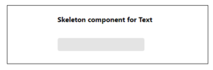
<h4>
Skeleton component for Text
</h4>
<Skeleton variant="text" width={200} height={50} />
</div>
);
}
Here we can add width and height for the skeleton. Output will be like this:
Similarly for Rectangle, Circle and Rounded component variant, we can add skeleton code as below.

<Skeleton variant=”rectangular” width={300} height={100} />
<Skeleton variant=”circular” width={40} height={40} />
<Skeleton variant=”rounded” width={210} height={60} />
Now let’s create a skeleton component for real-time data. For this we will be using one React plugin react-content-loader
Now What is React-Content-Loader?
react-content-loader is a React component library used to create placeholder loading states, often referred to as “skeleton screens” or “skeleton loaders.” The library provides a set of customizable components that mimic the structure of your actual content while it’s loading. This helps maintain the overall layout of a page and provides a better user experience compared to a blank or empty space.
Here’s a basic example of using react-content-loader:
Step 1: npm install react-content-loader
Step 2: Create one SkeletonComponent.js file and add the code below
import React from 'react';
import ContentLoader from 'react-content-loader';

const SkeletonComponent = () => (
  <ContentLoader
    speed={4}
    width={400}
    height={200}
    viewBox="0 0 400 200"
    backgroundColor="#f3f3f3"
    foregroundColor="#ecebeb">

    <rect x="0" y="0" rx="3" ry="3" width="400" height="10" />
    <rect x="0" y="20" rx="3" ry="3" width="400" height="10" />
    <rect x="0" y="40" rx="3" ry="3" width="400" height="10" />
    <rect x="0" y="60" rx="3" ry="3" width="400" height="10" />
    <rect x="0" y="80" rx="3" ry="3" width="400" height="10" />
    <rect x="0" y="100" rx="3" ry="3" width="400" height="10" />
    {/* Add more shapes as needed */}
  </ContentLoader>

);

export default SkeletonComponent;
Step 3: Create one file as DataList.js and add below code
import React, { useState, useEffect } from 'react';
import SkeletonComponent from './SkeletonComponent';

const DataList = () => {
  const [data, setData] = useState(null);
  const [loading, setLoading] = useState(true);

  useEffect(() => {
    const fetchData = async () => {
      try {
        const response = await fetch('https://jsonplaceholder.typicode.com/posts');
        const result = await response.json();
        setData(result);
      } catch (error) {
        console.error('Error fetching data:', error);
      } finally {
        setLoading(false);
      }
    };
    fetchData();
  }, []);

  return (
    <div>
      {loading ? (
        <SkeletonComponent />
      ) : (
        <ul>
          {data?.map(post => (
            <li key={post.id}>{post.title}</li>
          ))}
        </ul>
      )}
    </div>
  );
};

export default DataList;
Step 4: In the App.js, add below code
import React from 'react';
import DataList from './DataList';

const App = () => {
  return (
    <div>
      <h1>Data List</h1>
      <DataList />
    </div>
  );
};

export default App;
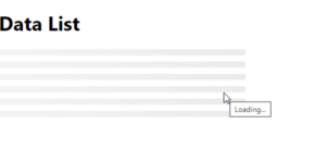
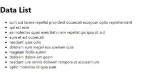
In this way, we can use the react-content-loader tool to enhance the user experience by providing a visual representation of content loading.
By using a Skeleton Component, react applications can manage loading states gracefully, contributing to a more engaging and user-friendly interface.
Thanks for reading !!!


Informative read, thanks!