
Sitecore developers transitioning from MVC to headless face something they are probably have not been used to in their time developing Sitecore solutions: “Choice.” While you could integrate whatever CSS and JavaScript libraries into your MVC solutions, it is nothing compared to the ecosystem that Next.js and React provide and how easy they make it to add large amounts of functionality into your websites.
In this series of posts, I’ll be looking deeper into that ecosystem and integrating libraries with Headless SXA to show how well these libraries work together and increase developer productivity.
About Next UI
According to the docs, Next UI is a “Beautiful, fast and modern React UI Library.” Built with Next.js support in mind, it provides a basic component library, support for theming, accessibility, and just really beautiful UX. Although not affiliated with Vercel, it’s built with Next.js in mind and MIT licensed.
The component library itself is fairly granular, focusing on the Atoms of atomic design with React components for buttons, inputs, dropdowns, radio buttons, tooltips, text blocks, images and more. There are a few molecule components for “Cards” and “Modal” dialogs, but it’s less a library that you’ll map to self-contained Sitecore components, but more of a library you’ll use when creating your own Sitecore components to make it easier to construct and theme them.
Next UI also has some layout related components including a Grid, Table and various containers. I was able to use some of these components within SXA’s own grid system with no conflict.
The framework itself was built for integration with Next.js and Typescript and focuses heavily on UX, styling and theming.
Notes on Setting Up Your Environment
To get up and running with Next UI, you first need an environment and project to work with. Although this should work just fine with an Headless Next.js solution, I decided to start with the XM Cloud SXA Starter kit. I found the instructions from Serge van den Oever’s blog post for getting up and running with this spot on. The instructions walk you through getting the containers running, setting up a new Tenant and Site and connecting your project to the instance.
I did note, that after getting the new Tenant and SXA site setup, I was seeing broken images when I tried to use images from the media library. The path in the rendered markup referenced “http://CM” in the image source. To fix, you need to create a patch file to set “IncludeServerUrlInMediaUrls” to false in the layout service configuration for your site.
<configuration xmlns:patch="http://www.sitecore.net/xmlconfig/">
    <sitecore>
        <layoutService>
            <configurations>
                <config name="sxa-jss">
                    <rendering>
                        <renderingContentsResolver>
                            <IncludeServerUrlInMediaUrls>false</IncludeServerUrlInMediaUrls>
                        </renderingContentsResolver>
                    </rendering>
                </config>
            </configurations>
        </layoutService>
    </sitecore>
</configuration>
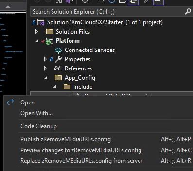
The SXA starter, comes with a “Platform” project that you can add this include to. Note that although the “App_Config” and “Include” folders are in the project, they didn’t actually exist on disk, so I was getting errors when trying to add a file until I went and manually created the folders on the file system first. Once that’s done, the project is already setup so you can right click and Publish the file directly into the running container.
One other tip I’ll give, is that you don’t need to run the entire “Up” powershell script every time you spin up your environment. The first time you need to, because it also synchronizes the solution with items and populates your SOLR indexes, but once that’s been done once, a simple “docker-compose up -d” will get things up and running again without you having to wait for the rest of it.
Enabling Next UI Support
Once you have an environment to work with, getting Next UI working with it was relatively easy. First navigate to the root of the Next.js app, and use npm to install it.
Npm i @nextui-org/react
Once installed, you need to make two changes to the starter kit project. Modify the app.tsx to include the “NextUIProvider”.
import type { AppProps } from 'next/app';
import { I18nProvider } from 'next-localization';
import { SitecorePageProps } from 'lib/page-props';
import { NextUIProvider } from '@nextui-org/react';
import 'assets/main.scss';
function App({ Component, pageProps }: AppProps<SitecorePageProps>): JSX.Element {
  const { dictionary, ...rest } = pageProps;
  return (
    // Use the next-localization (w/ rosetta) library to provide our translation dictionary to the app.
    // Note Next.js does not (currently) provide anything for translation, only i18n routing.
    // If your app is not multilingual, next-localization and references to it can be removed.
    <I18nProvider lngDict={dictionary} locale={pageProps.locale}>
      <NextUIProvider>
        <Component {...rest} />
      </NextUIProvider>
    </I18nProvider>
  );
}
export default App;
And create a new __document.tsx file under /pages with the following content.
// pages/_document.js
import React from "react";
import Document, { Html, Head, Main, NextScript } from "next/document";
import { CssBaseline } from "@nextui-org/react";
class MyDocument extends Document {
  static async getInitialProps(ctx) {
    const initialProps = await Document.getInitialProps(ctx);
    return {
      ...initialProps,
      styles: React.Children.toArray([initialProps.styles]),
    };
  }
  render() {
    return (
      <Html lang="en">
        <Head>{CssBaseline.flush()}</Head>
        <body>

          <Main />
          <NextScript />
        </body>
      </Html>
    );
  }
}
export default MyDocument;
With that you’re ready to start integrating Next UI components into your headless SXA components.
The Card Component
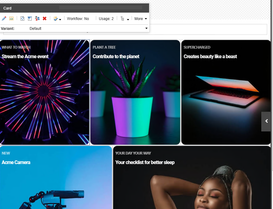
To really demonstrate the power of Next UI, I thought to create a SXA component to wrap Next UI’s Card component. This component is a container for text, photos and actions, and would be a good candidate for using within SXA’s promo component. There are tons of options for layout, styling and behavior, but for this example, I decided I wanted to recreate the “Cover Image” sample on the documents page, which shows the card in two configurations:
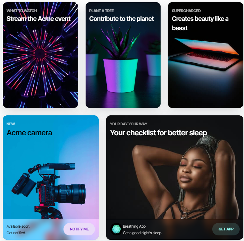
My plan for Sitecore was to clone the “Promo” component and create two variants. The Default which looks like the cards in the first row. And a “WithFooter” variant to render the additional text and CTA button we see in the cards on the bottom row.
Scaffolding the Component in Sitecore
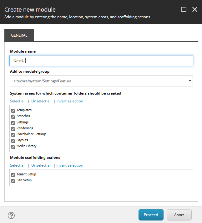
Before we clone the component, best practice would be to create a new “Feature” where it will live. To do this, we can right click on the feature folder under “System > Settings > Features” to create all the folder’s we’ll need for templates, renderings and more.
Later on, you can go back and add actions to the “Site Setup” boostrapper to automatically create the rendering variants and data folders when the feature is activated in a site.
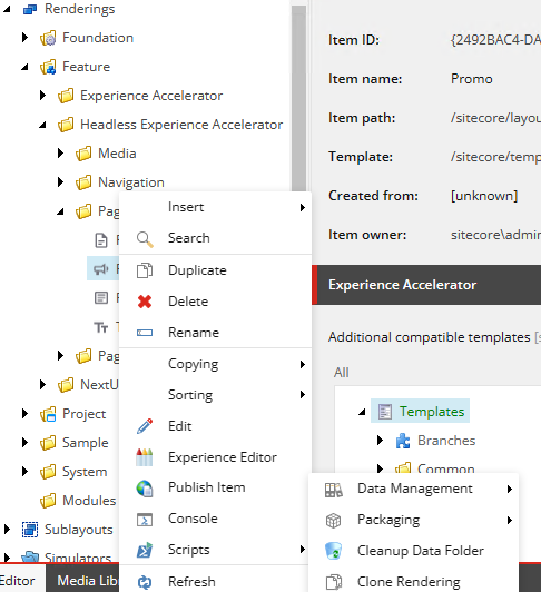
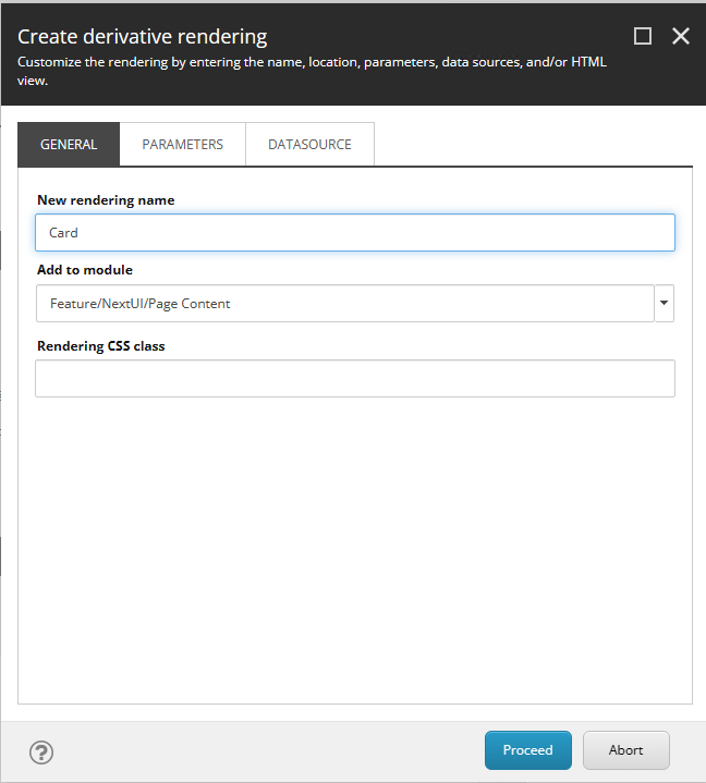
Next you’ll need to clone an existing component. Promo is a perfect example as it behaves the way we want our Card component to. It binds to its own data template and allows us to store the data sources in the Data folder. To clone it, we locate the Promo rendering in the “Layouts > Rendering > Feature > Headless Experience Accelerator > Page Layout” folder and right click it and select “Clone Rendering” from the “Scripts” menu.

This will launch a PowerShell dialog that allows us to name our rendering, choose the module and whether we want to create new rendering parameters or data source templates. As I wasn’t planning on extending the rendering parameters, I left the rendering parameters the same, but I did choose to create a new data source template as I wanted to rename all the fields.
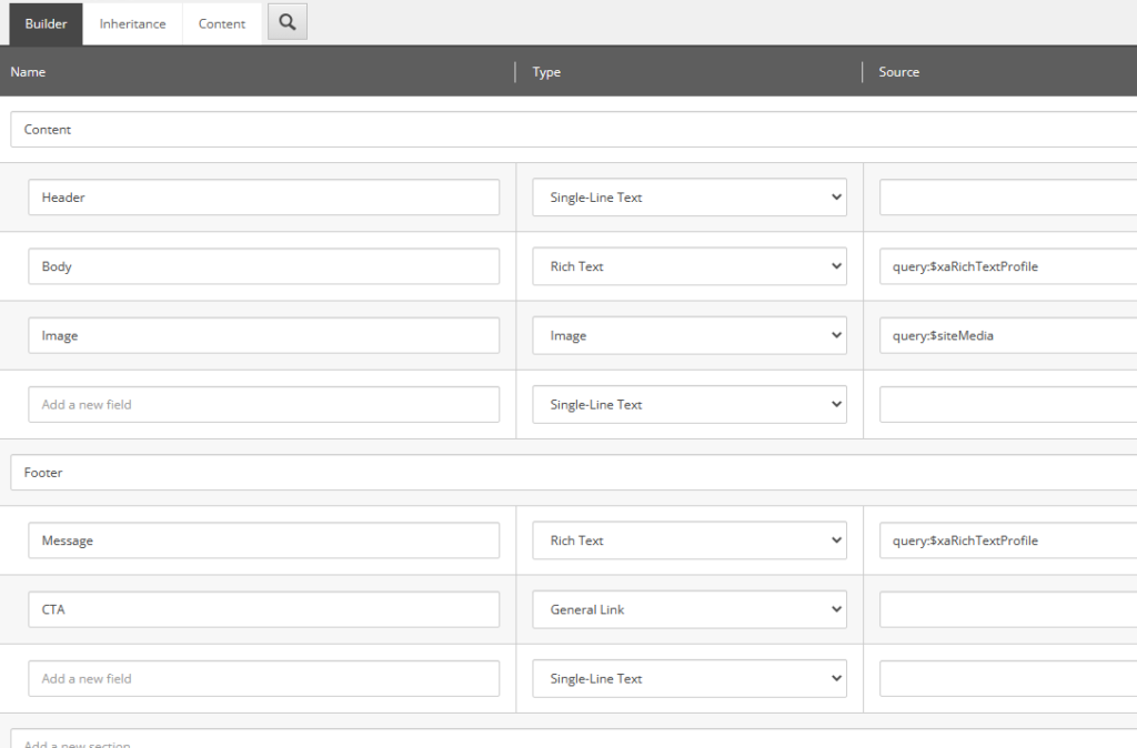
After the PowerShell Script finishes running, you’ll have a few new templates, including the data source template. I removed all the existing fields, and populated it to include the “Header”, “Body”, “Image”, “Message” and “CTA” fields that I wanted to bind to when recreating the Cover Image grid from the Next UI documentation. I borrowed some of the source field settings to use the SXA Rich Text profile and make sure the Image pulled from the right Media Library location.
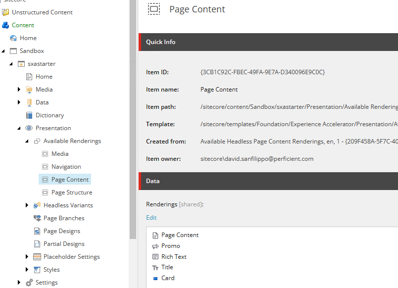
With that setup, I then manually enabled the “Card” component in the “Available Renderings” for the site, adding it to the Page Content section.
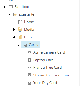
Next, I created a folder for the “Cards” within the SXA Data folder. The wizard created the Card folder template with the proper insert options, so I just added from template to select the proper folder.
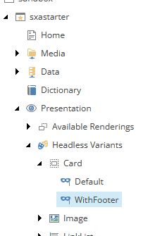
Lastly, I went and configured an entry for the component under “Headless Variants” with options of “Default” and “WithCard” so I could go create the variants in the React components.
While I did these manually for this sample, best practice would be to add the proper “bootstrapping” configuration items to the “Feature Site Activation” configuration so that these folders and options would automatically be configured when the feature was activated on a site.
Building the Component in React
To create the corresponding component, I added a new “Card.tsx” typescript file in the components folder. Here are the imports we’ll need:
import React from 'react';
import {
  Image as JssImage,
  Link as JssLink,
  RichText as JssRichText,
  ImageField,
  Field,
  LinkField,
  Text,
} from '@sitecore-jss/sitecore-jss-nextjs';
import { Card, Col, Row, Button, Text as UIText } from '@nextui-org/react';
import Router, { useRouter } from 'next/router';
Note the need to alias components as both the Jss Library and Next UI have components like Text. Next we’ll need to define our Interface to map the field types from our Template:
interface Fields {
  Header: Field<string>;
  Body: Field<string>;
  Image: ImageField;
  Message: Field<string>;
  CTA: LinkField;
}
And then define our Props type.
type CardProps = {
  params: { [key: string]: string };
  fields: Fields;
};
I noticed a lot of the other SXA sample components followed a pattern of defining a default component and returning that from each variant if props was undefined. So taking that pattern I created a “Card Default Component,” which would render simple text if there was a problem with how the component was initialized.
const CardDefaultComponent = (props: CardProps): JSX.Element => (
  <div className={`component card ${props.params.styles}`}>
    <div className="component-content">
      <span className="is-empty-hint">Card</span>
    </div>
  </div>
);
Note that this default component, as well as each of the variants start by defining two Divs: An outer div, that emits the SXA grid and styles configured through ${props.params.styles}, and an inner div that wraps the rest of the component. This is required to make the component properly support headless SXA.
Next, we define our “Default” variant, ensuring our props are of type CardProps, and using the Next UI Card Components exactly how they were defined in the sample.
export const Default = (props: CardProps): JSX.Element => {
  const id = props.params.RenderingIdentifier;
  if (props.fields) {
    return (
      <div className={`component card ${props.params.styles}`} id={id ? id : undefined}>
        <div className="component-content">
          <Card isHoverable variant="bordered">
            <Card.Header css={{ position: "absolute", zIndex: 1, top: 5 }}>
              <Col>
                <UIText size={12} weight="bold" transform="uppercase" color="#ffffffAA">
                  <Text className="header-text" field={props.fields.Header} />
                </UIText>
                <UIText h4 color="white">
                  <Text className="body-text" field={props.fields.Body} />
                </UIText>
              </Col>
            </Card.Header>
            <Card.Image
              src={props?.fields?.Image?.value?.src}
              objectFit="cover"
              width="100%"
              height={340}
              alt="Card image background"
            />
          </Card>
        </div>
      </div>
    );
  }
  return <CardDefaultComponent {...props} />;
};
Note that I use the Next UI Text Component aliased to “UIText” to leverage the styling options, but then embed the Jss Text component to ensure the editable field is inside of it.
You’ll also note the image is passed as the src property of the Card.Image component. This means it’s not editable, but there is already an OOB Experience Button that allows authors to edit the fields of the item, including the image. If not, we could have created an Image Experience button and configured the rendering to use it.
For the variant that includes the footer, we just export another component in the same file with the name of the Variant:
export const WithFooter = (props: CardProps): JSX.Element => {
  const id = props.params.RenderingIdentifier;
  if (props.fields) {
    return (
      <div className={`component card ${props.params.styles}`} id={id ? id : undefined}>
        <div className="component-content">
          <Card css={{ w: "100%", h: "400px" }} isHoverable isPressable variant="bordered" onPress={() => handlePress(props)}>
            <Card.Header css={{ position: "absolute", zIndex: 1, top: 5 }}>
              <Col>
                <UIText size={12} weight="bold" transform="uppercase" color="#ffffffAA">
                  <Text className="header-text" field={props.fields.Header} />
                </UIText>
                <UIText h4 color="white">
                  <Text className="body-text" field={props.fields.Body} />
                </UIText>
              </Col>
            </Card.Header>
            <Card.Body css={{ p: 0 }}>
              <Card.Image
                  src={props?.fields?.Image?.value?.src}
                  objectFit="cover"
                  width="100%"
                  height="100%"
                  alt="Card image background"
              />
          </Card.Body>
          <Card.Footer
            isBlurred
            css={{
              position: "absolute",
              bgBlur: "#ffffff66",
              borderTop: "$borderWeights$light solid rgba(255, 255, 255, 0.2)",
              bottom: 0,
              zIndex: 1,
            }}
          >
            <Row>
              <Col>
              <UIText color="#000" size={12}>
              <JssRichText field={props.fields.Message}/>
              </UIText>

              </Col>
              <Col>
                <Row justify="flex-end">
                  <Button flat auto rounded color="secondary">
                    <UIText span
                      css={{ color: "inherit" }}
                      size={12}
                      weight="bold"
                      transform="uppercase"
                    >
                      <JssLink field={props.fields.CTA} />
                    </UIText>
                  </Button>
                </Row>
              </Col>
            </Row>
          </Card.Footer>

          </Card>
        </div>
      </div>
    );
  }
  return <CardDefaultComponent {...props} />;
};
Note this closely follows the sample from the Next UI docs, leveraging the Row and Col components. Happily this worked as expected and didn’t conflict with the SXA grid system. I also wanted to make the whole Card pressable, and wire it up to the onPress event and trigger the CTA link. To do this, I created a “handlePress” method that received the props and then used the Next.js Router to navigate to wherever it was.
const handlePress = (props : CardProps) => {
  if (props.fields && props.fields.CTA && props.fields.CTA.value && props.fields.CTA.value.href) {
    Router.push(props.fields.CTA.value.href);
  }
};
This is triggered by the Card’s onPress method, which is wired up in the markup as an attribute on the Card component.
onPress={() => handlePress(props)} Putting it All Together
With the React component ready to go, we can use Experience Editor to recreate our Card Grid from the sample. I will note that “Sitecore Pages” seemed to jump to my XM Cloud instance and didn’t give me the ability to use pages with my local rendering host. Not sure if that is intended or I have a configuration issue, but Experience editor worked fine for my purposes.
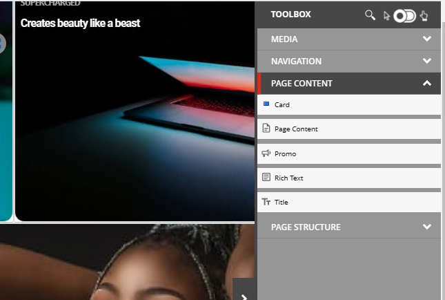
And yes, that is the SXA toolbox working with your Headless SXA site. Note that I had to move the rendering into a subfolder called “Page content” in order for it to show up in the right toolbox folder.
After adding the component, you can create a data source in the folder, and can immediately start configuring the header and body fields. When you configure the image, you may note that it doesn’t immediately show up. But saving the page reloads it and the image shows clearly.
After you set the image, you’ll also want to click the “Paint bucket” icon in the component’s setting bar, and configure the SXA grid settings to properly size the component. While the Next UI sample uses their grid component to set the column widths, SXA’s own grid works the same way and allows content authors control of the layout across device sizes. For the top row components, the width should be 4 so you can stack 3 card components in a row.
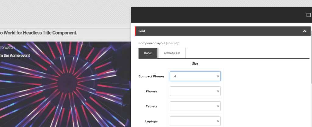
For the bottom row components, be sure to change the Variant to “WithFooter.” If you want to properly match the sample, the first item on the second row should span “5” and the second item should span “7.” You’ll also want to configure the Footer Message and CTA so that the “onPress” functionality can be tested.
With all that done, you’ll see the sample actually looks pretty good:
I was actually pretty impressed at how simple it was to get Next UI working with headless SXA. Most of the issues I had had more to do with my unfamiliarity with Next.js and React that any issues with the library itself.
Do you need help with your headless journey? We’d love to help. Reach out to me on LinkedIn , Twitter or fill out our contact form.
Hi David San Filippo
Thank you for such a good blog for headless component cloning. I just had one question in this that when i am trying to clone an component, it is showing me the “view” tab and in your screenshot it is not there. Can u let know what could be the reason for this. Ideally we would not require this “view” tab.