
Custom Visuals in Power BI
Custom visuals in Power BI have additional features and options beyond those supported by the standard visuals of Power BI Desktop, delivering unique and powerful capabilities. Custom visuals are available in AppSource and within the integrated custom visuals store for Power BI Desktop. They are categorized into two types in the Office Store: Office store approved and Power BI certified.
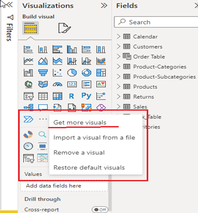
Figure: For getting custom visuals, click the underlined field shown in the figure, which opens up by clicking Ellipsis (those 3 dots)
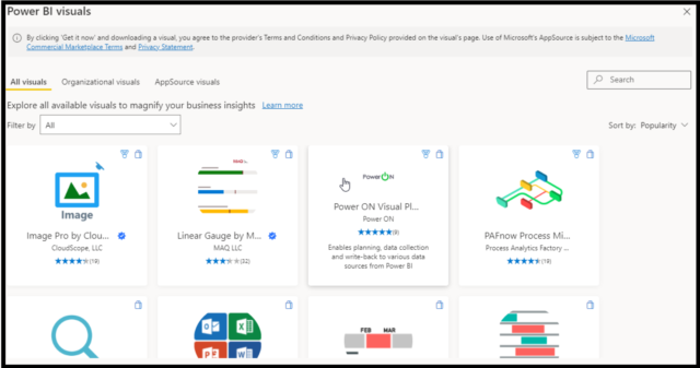
Figure: Power Bi Visuals dialog box opens after clicking ‘Get more visuals,’ which contains all custom visuals; their rating is also mentioned along with searching and sorting visuals capabilities. After clicking visuals, we need to click ‘Add,’ and visuals are added to the visualization pane.
Now we will see the most used and important custom visuals used in Power BI:
1. Textfilter Visual
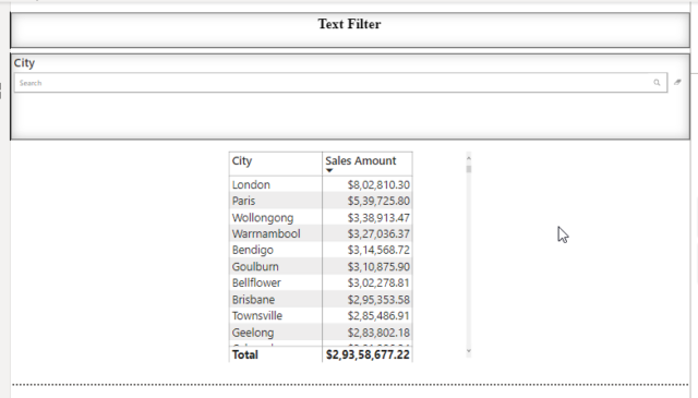
Figure: Here, a text filter is used to filter City, it will give city-wise ‘Sales Amount’ in the table for the mentioned city in the ‘Searchbox’ of the visual.
- Text Filter is mostly used as a search box filter that can be placed anywhere in your dashboard and can filter all other visuals on a report.
- It consists of a Search box and Eraser widget
- Search Box: Query term is mentioned here for filtering other visuals which only search on the specified field.
- Eraser widget: It’s used to clear the current search.
- This enables you to quickly find specific content being shown on your dashboard by keyword search.
Fields: - Text Filter requires a categorical field to perform a search on.
- Add your search term to the input field and click a search icon or hit Enter.
2. Chiclet slicer
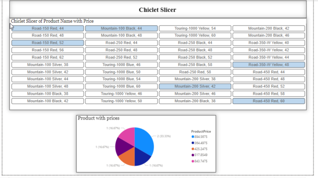
Figure: Chiclet slicer used to display ‘Product Name’ and selected data displayed in Pie Chart. This two-chart combo is to show how a chiclet slicer can be used to filter data.
- The Chiclet Slicer is similar to a Slicer filter available in Power BI but has a lot more flexibility and more customization.
- Chiclets are slicers made of buttons that can also be arranged horizontally and vertically or as a matrix for a super compact form.
- Chiclet slicer also supports cross highlighting, and images can be added there.
- Chiclet slicer also offers you a nice feature of using images as slicers.
- It consists of 3 major fields that are: Categories, Values, and Images.
3. Sunburst Visual
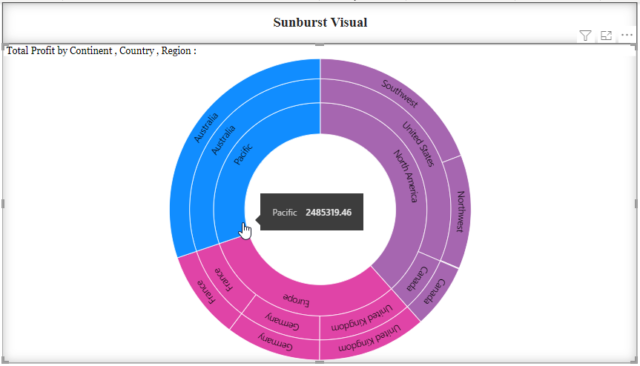
Figure: Sunburst Visual showing ‘Total Profit’ in a hierarchical manner, i.e., Continent> Country>Region, where each group is shown by unique colours.
It’s similar to a donut chart visual, but the Sunburst chart visual can display a nested hierarchy level through the category and subcategory options.
- A sunburst chart is used to visualize hierarchical data, depicted by concentric circles.
- The circle in the center represents the root node, with the hierarchy moving outward from the center.
- A segment of the inner circle bears a hierarchical relationship to those segments of the outer circle that lie within the parent segment’s angular sweep.
- The Sunburst chart has 2 mandatory fields as the following: 1) Group and 2) Values
4. Timeline Slicer
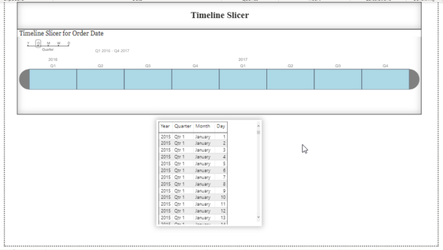
Figure: Timeline slicer for ‘Order Date’ selected for Quarter range shows only data for Quarter, we can also see other ranges of data like for year and month.
The Timeline slicer is a graphical date range selector in Power BI as a filtering component. This makes filtering data by date dimension easy as filtering becomes complex and tricky when you have to click through large numbers of date values to select the range you want. In such a situation, the Timeline slicer is very useful.
- With this simple slider control for dates, all you need to do is just click and drag to the range that you want.
- You can also switch to a Year, Quarter, or Month view to select ranges at a higher level than dates.
- Timeline visual is a kind of slicer. We can use it to select multiple ranges of data values and see specific period visuals.
- Timeline visuals can accept only “Date” values, and anything other than date values cannot be applied to this slicer.
- The field needed here is ‘Time’ which is a Date value that needs to be specified.
5. Gantt Chart

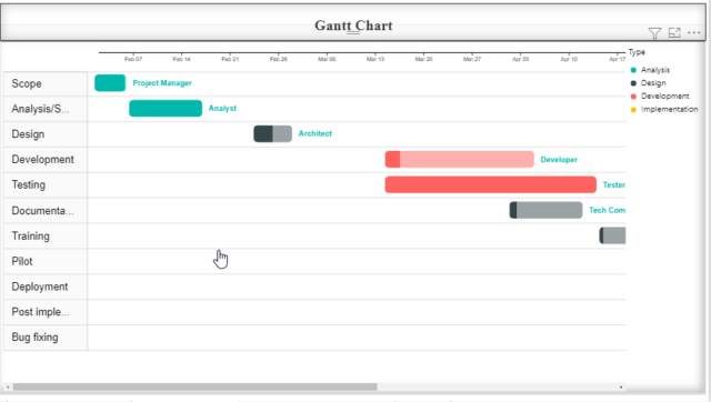
Gantt Chart for Power BI shows activities (tasks or events) displayed along a given timeline. It is one of the most widely used project planning tools.
- On the left side of the chart is the Data Grid, which displays lists all the tasks as part of the project or work breakdown the structure to be completed.
- It helps you visualize your project plan to articulate, communicate, and monitor the progress.
- A Gantt chart is used in project management to schedule tasks and manage and report the progress of key tasks.
- A Gantt chart displays tasks in horizontal bars along with timelines and resources assigned to each job.
- The status of tasks (Eg, completed, in progress, not yet started) is often shown by the colours of the chart.
- Field Required: Legend, Task, Start and End date, Duration, Milestones.
6. Tornado Visual
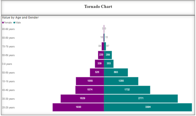
- The Tornado allows you to compare two categories of data vertically, similar to a bar chart.
- A bar chart with category values listed vertically. Use for comparing the relative importance of a variable between two distinct groups.
- It shows the effect on the output of varying each input variable at a time, keeping all the other input variables at their initial (nominal) values. Like in the above figure, we have a chart where we have ‘Male’ & ‘Female’ in legend and whose values are shown respective to the ‘Age Group’ mentioned.
- Fields Needed: Group, Legend & Values.
7. Sankey Chart
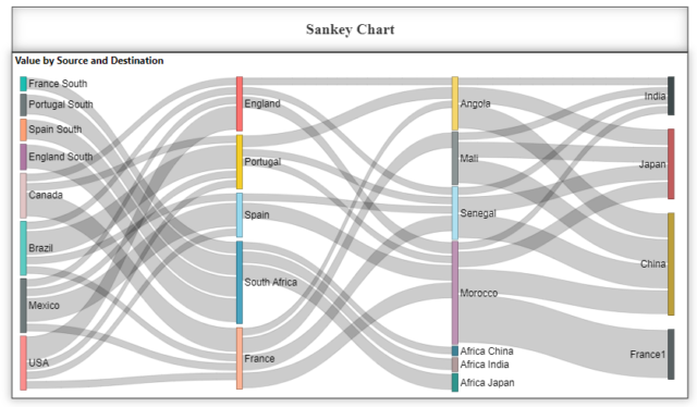
- The Sankey chart is a custom visualization used to illustrate data flow from multiple levels to multiple destinations. The things being connected are called nodes, and the connections are called links.
- The Sankey with Labels visualizes the magnitude of data flowing between two entities.
- As in the diagram, we can observe the source and destination and a thick line connecting them in a flowing manner showing magnitude.
- The fields that need to be mentioned are Source, Destination, Weight, and Source Labels.
8. Zebra BI Charts & Tables
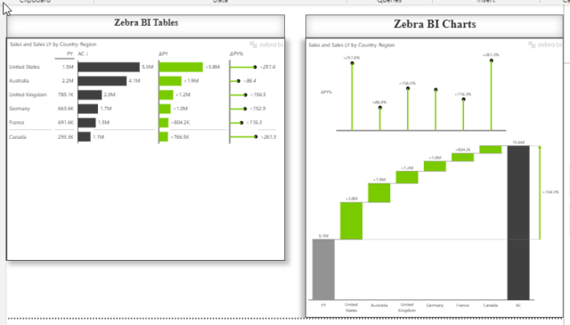
- Zebra BI Charts and Tables are multipurpose, and multi-featured custom visuals developed by Zebrabi.com are also PBI-certified visuals.
- Comparison tables
- Hierarchical tables
- Cross-tables
- Calculation tables Zebra BI Table: It’s a matrix visual in Power BI that combines tables with charts. It is a very versatile visual that provides you with several table options :
- Used in creating Income statements , cost vs. budget, variance analysis, and other business reports that are essential for understanding the performance of the business.
- Zebra BI Charts: Its advanced charts have more combined new features.
- Using Zebra BI Charts visual, you can choose from 36 different chart types, including waterfall, lollipop, variance, column, area, line, dot, hills & valleys, stacked, or even combo chart.
- Useful in showing and calculating variances, Previous year, Plan, or Forecast, YoY growth rates, and totals.
- With the help of many great features, you will be able to create complex yet transparent and presentable tables. So we can say that it offers extensive support for applying custom design.
So these were some of the most used and important Custom visuals in Power BI. Custom visuals are very crucial as they have more features with capabilities that we can’t get in standard visuals given on desktop.
Thank you for reading.
Hi Rohit, this blog was very helpful. I started using the TextFilter and Timeline Slicer and honestly, I can’t imagine not using them!