Digital design as we know it today is still a relatively new concept. It’s so new that only 22% of 557 organizations surveyed had the design operations to implement the design at scale in 2020, a surprisingly low number when considering the few organizations that tapped into the design for more than just the looks were able to outperform the S&P by 228% over a 10 year period.
It’s only a matter of time before all organizations realize they’re already too late to be early adopters. These companies now face a decision, scramble to become part of the new design majority or become digital design laggards.
But, it’s not too late. Any organization can catch up or leapfrog their competition even if they haven’t embraced design yet, and the past has a lot to teach us about that.
Back to the Beginning
Before the design was curated around the user experience, website designs were created simply to give brands a face to their name on the internet. The 1980s are known for creating web designs made from symbols and the tab key. This early design lacked style and visual aesthetic due to the lack of technical capability. But, it inspired others, such as physicist Tim Berner-Lee to push the envelope of design further.
On August 6, 1991, Berner-Lee created and launched the first-ever website page with information regarding the World Wide Web. This event created a roadmap for developers to strategically arrange content for businesses that didn’t involve using text and tables. In 1995, Donald Norman, Jim Miller, and Austin Henderson of what was then Apple Computer publicly used the term “User Experience” at the CHI ’95 Conference Companion on Human Factors in Computing Systems in a presentation covering human interface research application at Apple.
It wasn’t until 2000 that digital design as we know it today took form with the invention of JavaScript, flash, and cascading style sheets (CSS), opening the gates for the graphic design industry. These innovations helped the digital world transition from a functional experience only to a visual one too.
Where Design is Now, And Where it’s Going
We now have user researchers, user experience architects, visual designers, content strategists, and other specialists bringing harmony between aesthetics and functionality to drive business results through design for the digital landscape. After talking to the Perficient team who designed Wrigley’s Rooftop about the history of design and how it informed their solution, I took away these 5 key principles:
Innovative
Good design utilizes new technological developments to improve the user experience and deliver more business value. The Wrigley Rooftops team at the time created a 360-degree panorama through technological advancement in programmatic image stitch, which now powers an experience like Google Street Views to give users knowledge of exactly what they’ll see at the game from their seats.

Useful and Simple
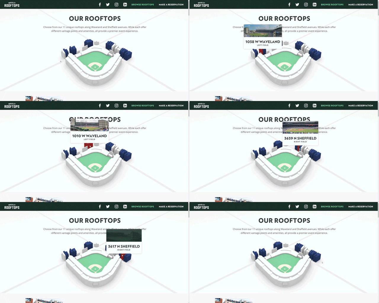
Good design must be useful to fulfill a functional, psychological, and aesthetic purpose. For example, the Wrigley Rooftops image is aesthetically pleasing to view with the blue buildings, but the buildings turn red when hovering or tapping to reinforcing information of each rooftop. Psychologically, the user gets the feeling and orientation of the space relative to the stadium. Not only is it a useful design, but the team made great efforts to provide focus and avoiding non-essential elements.

Intuitive
Good design must be self-explanatory and understandable to the audience. The 360° rooftop view feature is both a visually engaging and intuitive experience. When a user clicks the rotating button, their first hint at the functionality contained within, they are transported to the rooftop. As they move their mouse, the view pans subtly, indicating that there is more to explore. In conjunction with the ‘grab’ cursor, this screen movement entices the user to click and drag to spin the camera and check out the view. This interaction needs no instruction and is a behavior modern web users are familiar with because of experiences like Google Maps.

Sustainable
Good design must be sustainable, meaning it’s carefully planned with accuracy at all steps to make the product maintainable and long-lasting. Wrigley Rooftops turns five years old in 2021, almost twice the age of the average website lifespan of 2 years and 7 months.
The Future of Design
Regardless of where businesses are in their design maturity, now is the time to act. Whether the business is an early adopter trying to master DesignOps practices or just considering how design can impact the business, our experience design experts are here to answer your questions and share ways for how your business can act. To get started on creating good design, contact our experience design experts today.

