
A Functional Perspective on Community Design
Architecting reusable lightning components for a Lightning Community is very different from architecting a Visualforce page. A key value proposition of Lightning components is that they are reusable and can easily be added into Lightning Communities by system administrators. In order to realize that value, it is critical to architect them for scale.
In my opinion, here is what you are striving for your system administrators to be able to do after developing your custom Lightning component, written in the form of the ubiquitous user story: As a system administrator, I can go into any template-based community to easily drag-and-drop Lightning components onto anywhere on the layout, configure attributes on those components to ensure they meet business needs and publish those changes without ever speaking to a developer to reduce the cost of developing and maintaining communities.
Now that we’ve established what we are trying to achieve, here are the top 5 things to consider when designing a lightning component for a Lightning Community:
Think about what is likely to change over time and make those into attributes
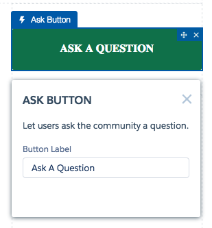
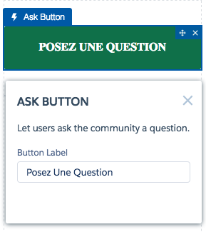
After doing so many communities projects, you start to see trends in the kinds of things that end users request to change once you go live, such as component titles and the number of records shown in the results. A custom attribute is something that system administrators can configure for that instance of the lightning component inside of the community. For example, when designing the Ask Button component, Salesforce architect would have asked themselves what about this is likely to be custom from customer to customer. The text shown on the button is likely to be variable from business to business, so they made button label a configurable attribute.
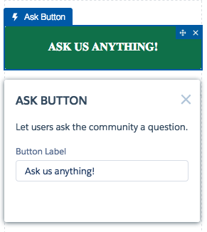
Pro tip: If you ever go to translate a community into another language, if you control the text shown on the component in the Community Builder through a custom attribute, you can translate it in the builder versus going to custom labels. It’s much easier to deploy than custom label translations. Don’t know how to deploy a Lightning Community? Check out my blog on how to do this.

Ensure nothing is hardcoded
This may sound like a no-brainer, but it is so critical that I’m going to state the obvious. While you may be building a component for a community you are launching now, a few months or years down the road, you may launch another community. Every Lightning component that you create custom in your Salesforce org and make visible to one community will be visible in the community builder of all communities, and it should seamlessly work in any community. From a back-end perspective, this means that your component is inheriting the CSS from the community builder using tokens and that you are using the $site.prefix tag to pull in the base community URL (e.g. mycompany.force.com/communityname/). If your component directs users to a custom page in the community, make the page name a custom attribute so that in one community the component can point to a page called ’news’ and in another community it can point to a page called ’newsfeed’, for example.
Before developing multiple similar components, try to get there with just one
The fewer components in the community builder, the easier it is for system administrators to find what they are looking for. Often, you will get requests for similar components that could be grouped into a single component. We recently had a customer who wanted to show the top 6 articles on their home page formatted with one set of styles and another page with the top 10 articles formatted with a slightly different set of styles. What we did to achieve this is create an Article List component that had 2 attributes:
- List Style
- # results to show by default
Take a look at the Salesforce ‘Feed’ component and look at how many different kinds of feeds that they’ve packed into a single component. This is what you’re striving for.
Define what should happen if no results are found
If there is no data returned in your Lightning component, do you want to hide the component, show “No Results Found” or does it depend on where you are using the component? You will notice that with most of the native Salesforce lightning components in the Community Builder, the components will not render it if there is no relevant data, which will make the page load faster and keep the noise on the page down. You may want to introduce some kind of “Collapse if no results found” attribute to the component if you think that sometimes you’ll want to hide the component and other times show a ‘No Results Found’ message.
Put on finishing touches to make it admin-friendly
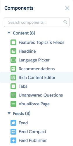
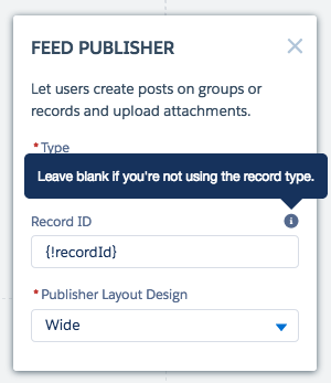
When you first create a Lightning component, if you do nothing, it will show up in the builder with the developer name. With a single line of code in the design part of the Lightning component bundle, you can give it a user-friendly name that will show up in the builder, helping your system administrator to understand what the component is. You can also give it a custom icon in the builder to help distinguish it visually from others; for example, Salesforce has given unique blue icons for all of their Feed-related components and unique green icons for all of their Content-related icons. Finally, don’t forget help text on the custom attributes that you introduce so that system administrators understand what those attributes are for and how to fill them out without needing to look at a separate how-to guide. For more on how to do this, check out this helpful guide.
Certainly, the above list is not exhaustive but offers you a starting framework to think through how to approach architecting your Lightning components. Remember to take advantage of custom attributes but don’t create too many that it becomes confusing or onerous to configure. If you’re looking for more guidance, spend some time looking at how Salesforce has architected all of their out-of-box components and notice the kinds of things that they have selected to make into configurable attributes and the things that they have not. This should help you think through the kinds of attributes you might want to create in your own components. As always, if you have questions or comments, post them below!