You’ve probably seen them before – colorfully illustrated characters with bendy limbs, accompanied by geometric shapes and friendly typography, portraying a sense of optimism and collaboration on the website or app from the latest startup. This style, known as Corporate Memphis, has become synonymous with the modern web and big tech. The style has become so ubiquitous that it’s drawn criticism from the design world. We’ll dive deeper into the origins and attributes of Corporate Memphis, why companies incorporate it, and what to consider when adopting it.
Bob Dylan inspires a post-modern design movement
Corporate Memphis originated in the fall of skeuomorphism, the predominant digital design trend since the advent of the iPhone. Skeuomorphism instills a sense of tactility by giving elements like icons and buttons physicality through the use of texture and lighting. In reaction to this trend and influenced by Apple’s own design moves, designers began to drop the physicality of elements in favor of flat color and simplified shapes.
Illustration and motion design soon followed, and the combined effect spread rapidly through the tech world. It was the web’s own post-modern movement, much like the original art and design movement referenced in the name – Memphis. In the 1980s, a group of Italian designers led by Ettore Sottsass formed the Memphis Design Group (named after a Bob Dylan song, believe it or not) in reaction to the predominant modern design movement. The Memphis Group designed architecture, furniture, and decor that was garish in color and shape, highly geometric, and referenced classical forms in an almost cartoonish manner.
An Expression of Optimism and Community
It was this movement that advertising producer, Mike Merrill referenced when he coined the term ‘Corporate Memphis’ for this prevailing style popularized by the likes of Facebook (now Meta), Google, and Slack, among others. In this style motif, designers use flat, bright colors like pinks, purples, and teals that harken back to the original movement.
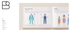
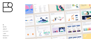
Shape and typography are bold and geometric, reinforcing an elementary approach to communication. Perhaps the most recognizable element of the trend is the cast of illustrated characters accompanying corporate brand messaging. These humans are often illustrated with unrealistic, colorful skin tones, exaggerated limbs, and wacky proportions. Most notably, these characters were defined in the Alegria style guide by the design firm Buck for Facebook (Meta) in 2017. Alegria designer, Xoana Herrera, states that the characters were “designed for expression, rather than individual identity,” and are usually seen in dynamic, in-motion poses that evoke joy and community. Below is the Alegria example for Facebook (Meta).


All these stylistic elements come together to effuse a sense of optimism, bliss, and childlike wonder. Companies gravitate to Corporate Memphis because it gives their brand a friendly and playful tone. The colors, typography, and characters welcome users with smiling faces (literally) and portray a world of possibilities and collaboration. Humaaans also does a great job of using these stylistic elements in their brand.

This style can also simplify the complexity. The products and services produced by technology companies today are difficult to understand for the average customer. Corporate Memphis distills the product story to its essence in the same way a children’s book relays an intricate moral message to its readers with friendly characters and visual simplicity. This simplicity also lends itself to benefits in efficiency. It’s easier to replicate flat colors and geometric shapes in today’s design tools than in a style that requires more detail or hand skills. Many designers across time can design from the same palette and maintain brand consistency.
Slipping into the “Pop Music” of Design
It’s some of these same benefits that have drawn criticism from the design community. The spread of Corporate Memphis across the web created a homogenizing effect in which it has become difficult to visually distinguish between brands. In the process, the original intentions of the style – joy, optimism, movement – have become watered down and lost meaning with every new copycat. What is gained in efficiency through ease of replication can also be interpreted as laziness; as it has roundly been criticized as a style that’s easy to pull off and safe.
Because this style simplifies the message brands want to portray, critics point out that it’s easier to mislead customers. Corporate Memphis becomes a facade that big tech can hide behind, portraying a utopian worldview that simply isn’t accurate. In its desire to treat all individuals the same, it has left behind the things that make individuals unique. This can be seen as tone-deaf in a modern world that values the diversity of our society and the inclusion of all people.
Recent evolutions of the trend have provided answers to some of these issues. For example, Meta’s illustration style has moved toward realistic skin tones and body shapes, putting the emphasis back on the individual. The style also outlines a more hand-drawn feel with texture and warmth that previous styles lacked in addition to the more prominent use of photography. Typography trends are also swinging back toward serif and semi-serif typefaces, giving experiences a more mature aesthetic appearance than the friendly, geometric sans-serifs of Corporate Memphis. The web will see more of this evolution over the next couple of years as the benefits of this trend are retained, while the ephemeral elements fade away.
Next Steps: Walking in Memphis
You may be wondering whether Corporate Memphis is the right style direction for your business or maybe you’re already using this style. It’s important to consider these questions when weighing whether it’s the right style for your business:
- Who is our customer base and what do they care about?
- What is the tone I want my brand to portray? Is my brand-friendly, playful, or optimistic?
- Is it important that my brand represents people realistically?
- Is illustration right for my brand?
- Is standardization important to me? Do I have multiple vendors contributing?
- Are our products and services difficult to understand for our customers? Would we benefit from visual storytelling?
Stay tuned for our next piece in the web design styles series. For more information on our practice, contact our experience design experts today.

