After the introduction of AEM Core Components, custom component development has been drastically changed. In some use cases, there is zero customization and core components can be directly used for authoring. Even in those situations, the custom component is needed. It can be quickly built by extending the existing core components. Thus, the development cost and time to production are reduced.
Embed Component
In this era of social networking, we have faced the use case of embedding media or HTML from other social media sites. For these instances, OOTB AEM Core – Embed Component comes in handy.
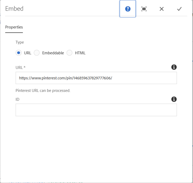
Embed Component helps authors to embed three types of external content within a page:
- URL-based – This feature supports the URL-based resource which is as per oEmbed Standards. This is used for use cases like embedding Facebook, Twitter, Instagram, etc.
- HTML – This feature allows the author to directly add HTML content to the AEM page.
- Embeddable – This feature allows customization of embedded resources like YouTube. Whereas, it provides flexibility for the author to provide additional information and parameters to embed the resource to the page. This functionality uses a backend pre-processor.
All the above-mentioned options can be configured using component design dialog for enabling or disabling the feature.
Security
Embedding content dynamically can lead to security vulnerability. AEM uses XSS Protection using the Anti Samy. For more information on XSS Protection, do AEM documentation on Security.
That said, what if embedded content needs custom dynamic behavior using JS or style changes using CSS? If XSS Protection config.xml file does not have <script> and <style> tag in the proper location, it will be stripped out from the generated HTML.
For the basic use case, AEM Core Component’s Embed Component will be sufficient. What if the author needs advanced functionality like JS Scripting, adding custom CSS directly on web pages using authoring dialogs?
Integrating Third-Party Editor
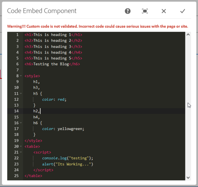
Here, I will show how to integrate a web-based code editor into AEM Authoring Dialog. For this integration, I have chosen Ace Editor. Ace Editor has an embeddable code editor API that will provide the actual look and feel like a simple text editor. Also, this plugin provides additional supports for HTML, JS, and CSS syntax highlighter and auto-closing tag feature.
The below steps elaborate on how to integrate Ace Editor into a custom component dialog box.
Creating the Component
Let’s create this component in these simple steps:
- First, create one component named Code Embed component.
- Next, create the cq:dialog for rendering the external HTML contents into the page. cq:dialog code should look like as below:
<?xml version="1.0" encoding="UTF-8"?> <jcr:root xmlns:jcr="http://www.jcp.org/jcr/1.0" xmlns:nt="http://www.jcp.org/jcr/nt/1.0" xmlns:granite="http://www.adobe.com/jcr/granite/1.0" xmlns:cq="http://www.day.com/jcr/cq/1.0" xmlns:sling="http://sling.apache.org/jcr/sling/1.0" jcr:primaryType="nt:unstructured" jcr:title="Code Embed Component" sling:resourceType="cq/gui/components/authoring/dialog" extraClientlibs="[surajk.editor.aceeditor]"> <content jcr:primaryType="nt:unstructured" sling:resourceType="granite/ui/components/foundation/container"> <items jcr:primaryType="nt:unstructured"> <column jcr:primaryType="nt:unstructured" sling:resourceType="granite/ui/components/coral/foundation/container"> <items jcr:primaryType="nt:unstructured"> <warning granite:class="surajk-warning-heading" jcr:primaryType="nt:unstructured" sling:resourceType="granite/ui/components/coral/foundation/heading" level="6" text="Warning!!! Custom code is not validated. Incorrect code cacould use serious issues with the page or whole site."/> <container granite:id="surajk-ace-container" jcr:primaryType="nt:unstructured" sling:resourceType="granite/ui/components/coral/foundation/container"/> <htmlmarkup granite:class="hide" granite:id="surajk-ace-editor" jcr:primaryType="nt:unstructured" sling:resourceType="granite/ui/components/coral/foundation/form/textarea" fieldLabel="" name="./htmlMarkup"/> </items> </column> </items> </content> </jcr:root> - Now, create one client library folder with the following properties.
<?xml version="1.0" encoding="UTF-8"?> <jcr:root xmlns:jcr="http://www.jcp.org/jcr/1.0" xmlns:cq="http://www.day.com/jcr/cq/1.0" jcr:primaryType="cq:ClientLibraryFolder" categories="surajk.editor.aceeditor"/> - Next, create two folders JS and CSS. Please Copy and paste the code from this Repository.
- JS folder should contain the following files
jquery-ace.min.js
ace.min.js
theme-monokai.js
mode-markdown.js
author.js
- CSS folder should contain the following files
ace.css
- JS folder should contain the following files
- Then, add custom logic in the author.js file. You need to open the file and put the following code in order to render the actual text editor environment in component dialog.
$(document).on("dialog-ready", function() { var textarea = $('#surajk-ace-editor'); $("#surajk-ace-container").html($(textarea).html()); var editor = ace.edit("surajk-ace-container"); editor.setTheme("ace/theme/monokai"); editor.getSession().setMode("ace/mode/html"); editor.getSession().on('change', function () { textarea.val(editor.getSession().getValue()); }); textarea.val(editor.getSession().getValue()); }); - After that, open the code-embed.html file from the component and add the following line of code.
<sly
     data-sly-test.empty="${!properties.htmlMarkup}"
     data-sly-use.template="core/wcm/components/commons/v1/templates.html"
     data-sly-call="${template.placeholder @ isEmpty=empty}">
</sly>

<sly data-sly-test="${!empty}">
  ${properties.htmlMarkup @ context='unsafe'}
</sly>
Note: For Demo purposes, I am using simple HTL logic. You can also use the Sling model for the same.
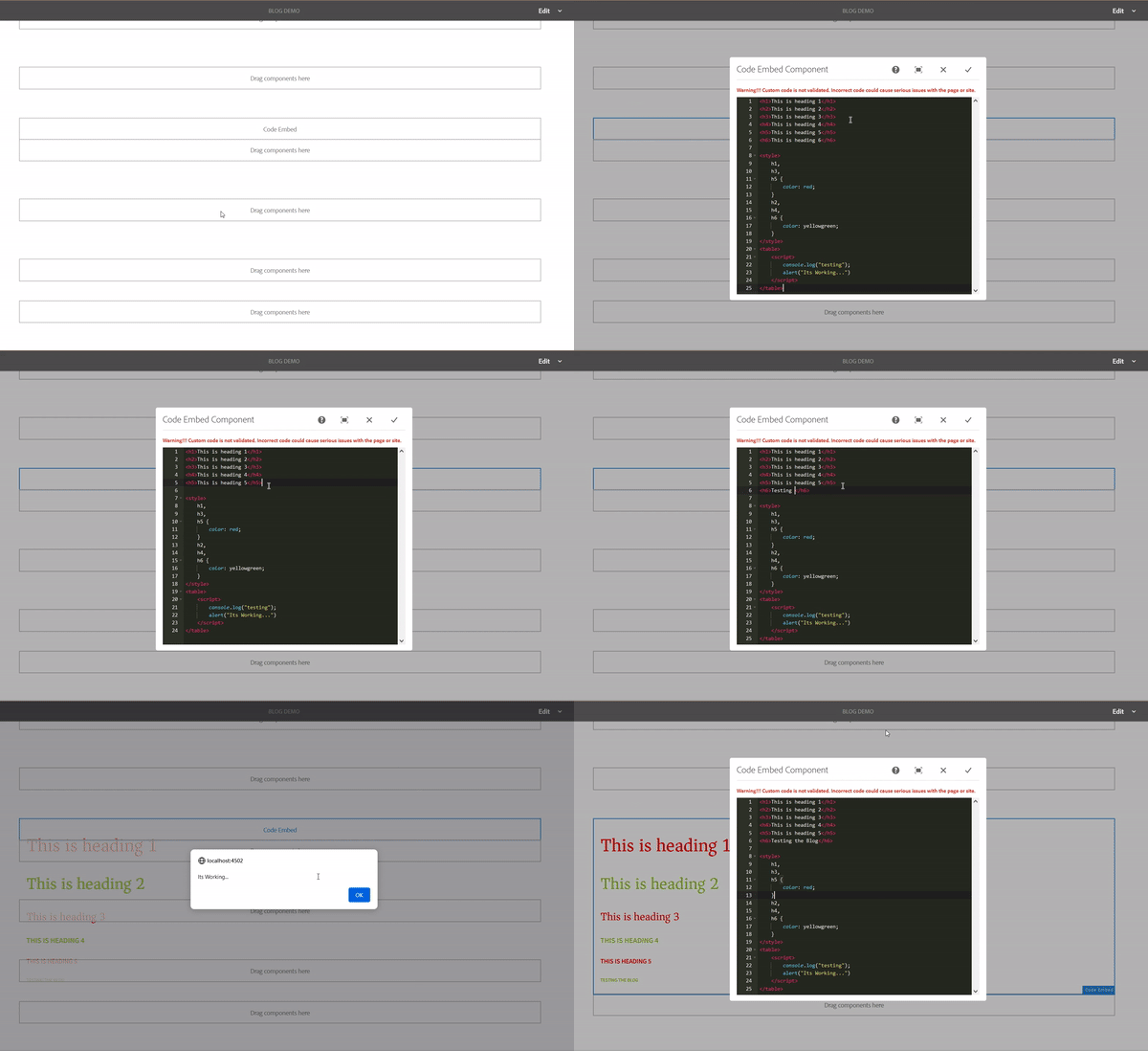
- Once we are done with all the above steps, the next thing is to check the component functionality. Allow and add this component into the layout container. You will see component dialog will render actual HTML mark-up text on the page.

You can also integrate your favorite JS-based 3rd party text editor plugin into AEM components cq:dialog.
Resources
Download this package for reference. If you have any questions, please reach out to me.


