Does your website have the proper contrast ratio? The contrast ratio is the property of a web display and the ratio of the luminance of the brightest shade to the darkest shade that the system produces. A high contrast ratio is desired, and having the proper contrast ratio for all users, including those with disabilities, ensures they can understand and interact with your page. An insufficient contrast ratio will make it difficult, and sometimes impossible, for a user to perceive the content on a page. When designing a page, color contrast and the ability for all users to interact with the page should be top of mind – and it can be if you follow the success criteria from the Web Content Accessibility Guidelines (WCAG).
The Main Color Contrast Criteria
Let’s review some of the main criteria to keep in mind:
Success Criterion 1.4.3 Contrast (Minimum)
This is a Level criteria, which is the standard for every company to follow, and states that there must be a contrast ratio of 4.5:1. The contrast for large text is 3:1 and there some other exceptions that are defined in the requirement.
Success Criterion 1.4.6 Contrast (Enhanced)
This is a Level AAA criteria, which is advanced criteria that’s selected when asked, that states there must be a contrast ratio of 7:1. The contrast for large text is 4.5:1 and there some other exceptions that are defined in the requirement.
Success Criterion 1.4.11 Non-text Contrast
Non-text contrast is a Level AA criteria that was expanded into non-text areas with the adoption of WCAG 2.1 in 2018, changing the contrast ratio to be 3:1. Examples include colors used in charts, graphs, and icons.
At a minimum, designs should follow AA criteria, and the ratios stated are the minimum ratio to pass the criteria. The higher the ratio the higher the contrast, and the more accessible a page becomes for all users. It’s much easier to design for AAA when done in the early phases of the project. But it becomes more difficult, timely, and expensive if these changes are done as part of a remediation process.
But Wait, Accessibility Tools Can Help
Fortunately, there are several tools to help detect and define the proper color palette for your style guide. Depending on the situation, you can use one or all of these tools to help determine the correct ratio.
WebAim Contrast Checker allows you to check for the ratio by adding the hex codes for the foreground and background to identify if the color combination passes or fails the applicable WCAG success criteria.

In some cases, the background color is either from an image or a gradient and will not have a hex code.
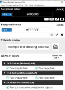
Colour Contrast Analyzer is a local application (available for both Windows and Apple) to assist in determining contrast ratio. In addition to checking by hex code, additional features include checking with RGB and other color formats. The application also has an eyedropper tool to drop on a page and have the hex code displayed based on where the eyedropper was placed. As with WebAim, this tool also provides a summary of how the color combination compares to the criteria, and you can also expand the criteria for additional information.

The background image tool will allow you to check the contrast ratio for text on background images. This comes in handy if you have an image and you need to find the most appropriate area to place the text. To use the tool, you can upload the image and determine the color and size of the text. Then, move the text around the image to find out the most accessible place. Depending on where the text is placed, this tool will determine if the design is accessible. It can pass in one area and fail in another area. If you have restrictions on where the text can be placed, this can help you decide if you need an additional gradient or if the text should even be placed on the image.


Easily Resolve Color Contrast Issues
There are many other tools to assist with identifying and determining color contrast ratios. This is one of the most common accessibility errors, but once identified, it’s also one of the easiest errors to resolve. To prevent errors from appearing on your site, use these tools during design, development, and testing. By using these tools, you can identify and resolve any issues before your customer sees them. For more information on accessibility tools, download our guide, Digitally Accessible Experiences: Why It Matters and How to Create Them, read our UpSkills series, and to learn if your website is accessible, contact us about our Accessibility IQ.

