The purpose of SharePoint is to store and share content so that multiple users can simultaneously manage, access, and collaborate on documents, tasks, and related resources in one place. SharePoint supports two user interface (UI) designs — the “classic” experience and the “modern” experience.
Understanding the Key Differences Between These Experiences
The Classic
The classic UI integrates SharePoint lists and libraries so that even customization of the UI can easily be done. In the classic experience, you can use the script editor web tool to add your own CSS, jQuery, and more. But on mobile, the classic experience isn’t as updated or optimized as the modern.
The Modern
The modern experience is faster, easier to use, and is optimized for mobility. The user can easily configure and manage content, however, there is no web tool to apply styling in the modern.
Other benefits of the modern experience:
- We can easily edit and publish the page
- Pages are responsive and cross-browser compatible
- More user-friendly interfaces
- Configuring a web part is simpler and self-explanatory
- Hub sites allow a more flexible hierarchical structure
- Search will be able to search across Office 365 and results that are more relevant to the current user
- Reduced customizations of UI
How to Switch Your Experience from Classic to Modern
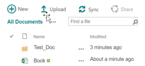
The classic experience looks like this:
Steps to change classic experience to Modern:
- Select “settings”
- Select “library” (document or pages)
- Select “library settings”
- Select “Advanced settings”
- Select “list experience”
- Select “new experience”
- Select “ok.” The classic experience will be changed to modern.

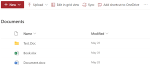
The modern experience:
Classic and Modern: List and Libraries
The Classic
The “library settings” exists on the ribbon as shown below:

The “list settings” also exists on the ribbon as shown below:

The Modern
For a list or document library, select “settings” and then select “list settings” or “library settings.”

Classic and Modern: Library
The Classic
The document library displays a list of files, folders, and key information such as who created or last modified a file, as seen below:

The Modern
The modern document library has more options as compared to classic document libraries, such as “edit in grid view,” “add shortcut to OneDrive,” “format current view,” and more.

Classic and Modern: Team Sites
The Classic
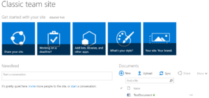
When you create a classic team site, web parts for announcements, a calendar, or links, they are automatically added to the home page.
The Modern
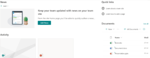
Modern team sites are connected to Microsoft 365 groups. The modern team site homepage features include news, quick links, site activity, and the document library. It also automatically displays recent activity on the site, such as files uploaded, changes made, lists and libraries created, and more.
Classic and Modern: Pages
The Classic
The classic experience includes web parts and pages such as blog pages and wiki pages. SharePoint web parts are segmental components that shape the basic building block of a page on SharePoint sites. Web parts can also be used to add custom functionality to SharePoint pages.

The Modern
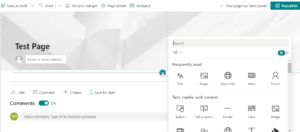
Modern pages provide a quick and simple way to develop responsive pages using the modern web parts.
Classic and Modern: Search
The Classic
We use the SharePoint admin center to manage the classic search.

The Modern
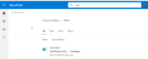
We use the Microsoft 365 admin center to manage Microsoft Search.
Classic and Modern: Layout
The Classic
While creating a classic web part page, we choose a layout with web part zones to use. We can change the page layout by editing the page. In the ribbon, click on the “page” tab, click the “page layout” dropdown, and select the layout you want.
The Modern
The layout is flexible and can be changed at any time.
Level Up Your SharePoint
You can easily update your SharePoint UI from classic to modern at any time you like. For more help and information on SharePoint, contact our experts today.


Good Read!
Thanks Sapna!
Excellent blog!!!
Thanks Tushar!
Thanks for sharing the information.