Sitecore Experience Editor is so 2018…will be what you say in a few years. Sure, with EE you get visual editing, a library of developed components and a great deal of control, but you are a content author, you want more more MORE! As I write this (New Year’s Eve 2018) I have a resolution – to take over the world with SXA! That being a bit much, I will stick with a strong intent to share more about Sitecore Experience Accelerator. Oh, and if you are reading this in the middle of the new year, just work with me, and consider this an opportunity for a new beginning of a superior authoring experience.
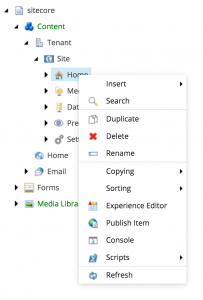
fig. 1
Sitecore’s Experience Editor was a big leap from the form-based editing of the 7.x days and earlier, but then along came SXA (Sitecore Experience Accelerator). Admittedly when it first arrived, this add-on needed some feature and functionality improvements, but with version 1.7 and now v1.8, SXA is ready for prime time. This post is focused on the grid controller for content authors, but before I dig into that, I should give the basics around why SXA should matter to you and your business deciders.
Business Time
Sitecore Experience Accelerator (SXA) is not an alternative to the Experience Editor (EE). It is a toolset that sits “on top” of the Experience Editor. If you are familiar with Sitecore authoring, you will still continue to open the Experience Editor (or Content Editor and access the EE through the tree). In fact as an added bonus, a little shortcut that comes with SXA is the ability to right-click a page in your content tree and access the Experience Editor from the fly-out menu (fig. 1). Nice – it’s the little things!
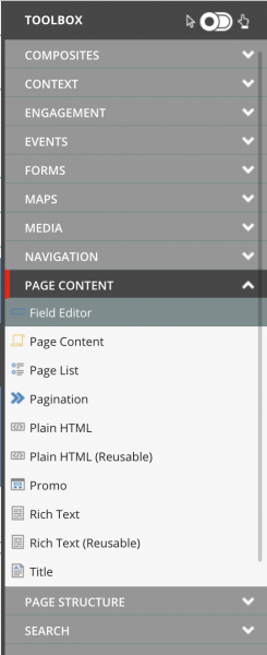
fig. 2
SXA is also a drag and drop authoring tool that adds a new fly-out toolbox (fig. 2) on the right of the edit window. Fine, drag and drop and a toolbox, that is nice, but wait…a key consideration here: It comes with a robust starter set of out-of-the-box components. A lot of power here, especially when you start to dig into components like the Snippet and the fact that this toolbox can be extended. More importantly, the code-base of those OTB components is owned and managed by Sitecore. This means, if your development partner does their job right, these components will weather upgrades and dot releases far better than custom components.
Lastly (at least for this post) there is a new tab at the top of your edit window. (fig. 3) This tab contains elements that definitely put the “A” in accelerator. Partial Designs, will help you and your team build out reusable page elements (think header, footer, meganav). Then there is the Creative Exchange and Theme controls. Simply put, these tools help to align the Dev, Front End, and Content work-streams to nearly parallel. Instead of waiting for development for six weeks to get started on content entry or design, how about week two? From several real-world experiences, this is achievable, and recently helped make an impossible deadline reachable. There are cautions for the authoring team, as you have to get comfortable with an agile process, but once embraced, content can be added to a wireframe page, and over time, your content and the components take shape to the brand and style guide. A good partner will get your team comfortable as quick as possible and all teams will be working in tandem. (Jazz hands)

fig. 3
So, those are three key considerations when looking at SXA, but I want to look further ahead for the content author and one of the key elements of control built in to the toolset. Where the Experience Editor allows you the ability to place components, those components are “static” in form and can limit the content author’s ability to build a page without dev support. A banner is a banner and a promo is a promo; as defined when the site was developed. What if you want the banner to be three-fourths width and then place a one-fourth width promo component or micro-survey next to it on a campaign landing page (for example)?
Sitecore SXA Grid Control and Variants to the rescue

fig. 4
Here’s where the palette that is your page becomes extremely flexible. Here (fig. 4) we have a full width hero. It should be noted that in this case, full width means all 12 columns on a (Bootstrap) grid. (SXA supports multiple grid definitions.) The contextual floating toolbar that will be familiar to any Experience Editor author has some new features.
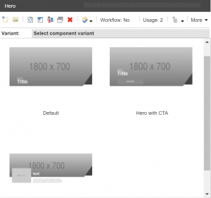
fig. 5
- Variant Control: SXA components support multiple variants. Want a hero with no text? Text on the left with a button? Text on the right, no button? These and all the variants you can think of can be defined and made available to the author. Imagine the possibilities of a good number of your components having multiple looks and and even multiple functional possibilities all available from the click of a drop down. You can even provide thumbnails in the drop down for visual reference (fig. 5), and yes, you can control access to different variants based on page, author, component.
- The Paint Bucket: This little icon opens the door to multiple controls and these controls can be defined individually per SXA component. Click to open the control where you will see the ability to change the variant (another way to pick the variant than the drop down on the toolbar). You will also see checkboxes that allow you to change basic styling (ie: left, right, center alignment) and anything else added per business requirements per component. At the top you will see the Grid control (fig. 6). Here’s the power of that control:
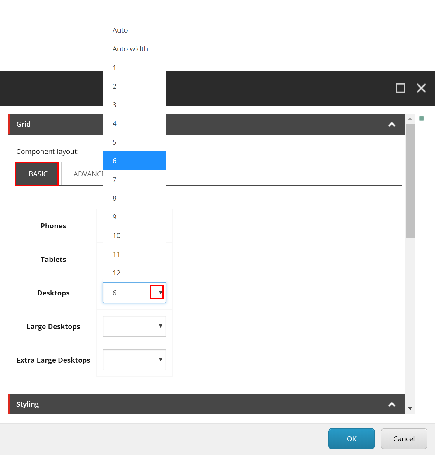
fig. 6
On the Basic tab you will see a list of standard devices (breakpoints). The phones item will be pre-filled with a 12 which is full-width on your Bootstrap grid. (In most cases on your phone you will want each of your components to stack as full width.) In this example I will leave the Hero as full-width on phones and tablets, but make it half-width (six columns) for Desktop monitors and larger by clicking the dropdown next to “Desktops” and selecting 6.
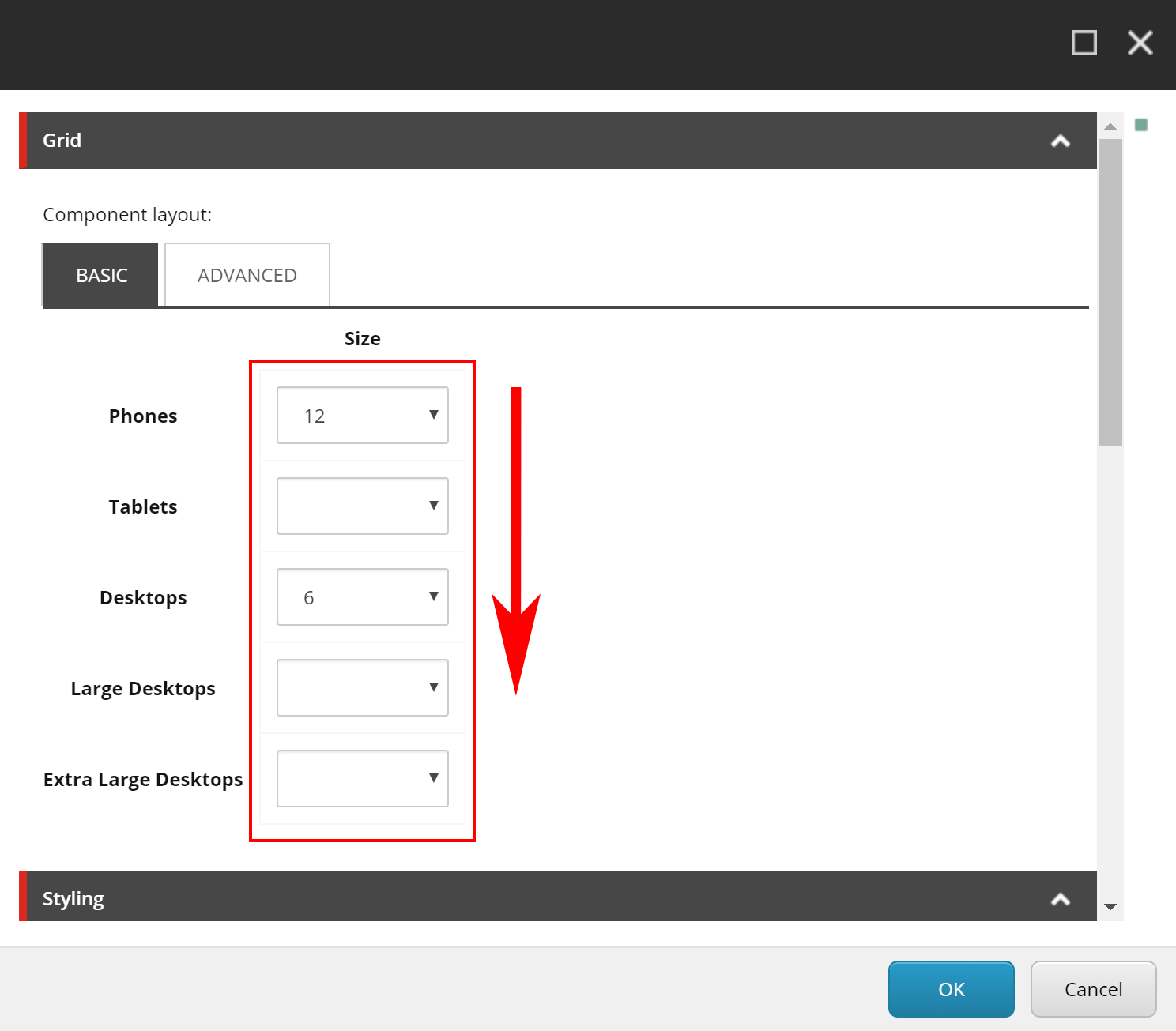
fig. 7
That’s it. Empty boxes next to the other devices do not need to be filled out. In the Sitecore SXA grid control the empty fields will automatically inherit the column width definition from the last defined device above it. In this example (fig. 7) Phones and Tablets will have a full width Hero and Desktops, Large Desktops and Extra Large Desktops will have a Hero that takes up half of the page. As an author you certainly need to consider then what wraps into that space, but again you now have the flexibility to control the visual across devices. Now in your Experience Editor you can see the affect of this SXA bootstrap grid definition. (fig. 8) The hero is now half the page leaving room to build.
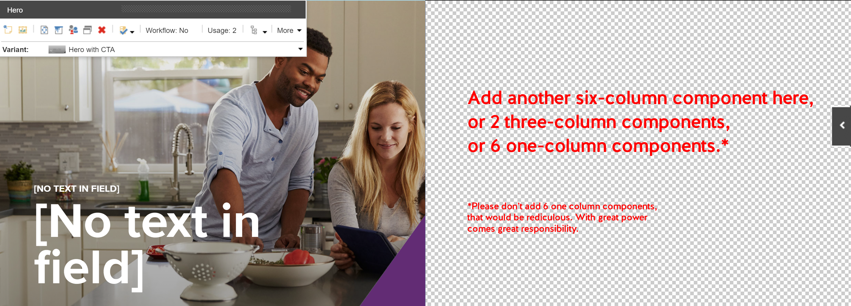
fig. 8
Golly! Each of these OTB components can have multiple variants, and then I can control the size of each of them across devices? What next?!! I know…me too.
Advanced Grid Control
What if I want content to appear on phones but not on desktop (or other way around)? What if I want a promo component that sits in the center of three to show first on a phone instead of second (standard to responsive design)? Well my friend, click that paint bucket again in the floating toolbar on the component you want to affect.
When you see this control, first off, let’s not worry about Offset or Float. Not a fan of either. I feel they conflict with the fine CSS for which you paid good money. If anyone has a strong opinion otherwise, please share in comments or on Twitter. That said, let’s look at the Advanced tab:
Visibility
Here you can control content showing per component per device. In this example (fig. 9) I have hidden the component for phones and tablets but am showing it for Desktop (Laptop) screens or larger. Like the basic grid controls, the empty fields inherit the last declared value above it.
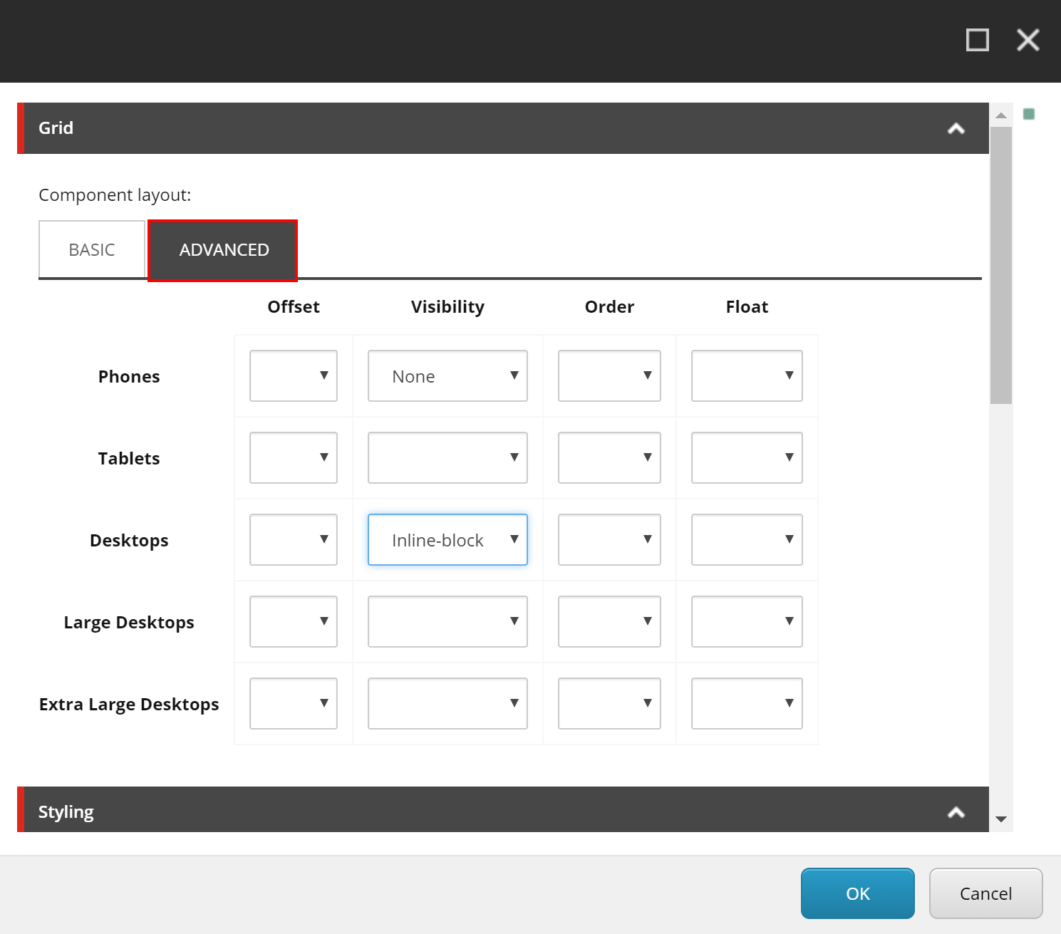
fig. 9
Order
Like I mentioned above, what if I have three components across a page (four-columns each) but on phones I want the content that is in the center (on large screens) to show first. Like in this example (fig. 10) I have changed the sort order to have this item first for phones and tablets and then second (center of three) on larger screens. Now, I have to define the other components order and have to take into account what container or page placeholder they are in, but the control is there and once the basics are grasped, it is easy to define the order across devices.

fig. 10
SXA Grid Controls and Variants advance the power of the page layout for the content author.
If you are quickly starting to panic and are picturing pages that look more like a bad quilt and think that this could be too much control over your brand and content, know that all of the variant controls and grid controls can be controlled per component and across user roles. Give authors complete flexibility through governance and security over (say) campaign landing pages, but lock down the paint bucket and variants on key brand pages.
Experience Editor provided the power of visual editing. Sitecore Experience Accelerator moves the needle for the content author while reducing the need for constant dev interaction for small changes. I am only scratching the surface of SXA here and look forward to diving into more details of specific components. Please reach out to me on twitter or leave comments.
