Why Brand My Salesforce Community?
A brand is much more than a memorable logo, clever tagline, and a cohesive palette of colors or clean lines and typography. Bottom line, it’s about providing added value for your customers, building trust through quality and consistency, and ultimately boosting customer satisfaction and loyalty.
Beyond a customer’s perception of your company’s products and services, your brand identity goes hand-in-hand with every interaction across marketing, sales, and service, with every touchpoint serving as an opportunity to increase customer loyalty for your brand.
BONUS: How to Create a Salesforce Community Brand Kit
UX Design Tips to Create a Branded Community
 Be Consist
Your Customer Community should be viewed as an extension of your public-facing website. We recommend applying key branding and design constants to ensure a seamless transition from one environment to another.
Be Familiar
Besides the look and feel, you also need to be consistent with the design of the user interaction of custom pages. When entering a community, customers bring with them previous website and user interface (UI) experiences and expectations, so it’s important to leverage common ‘online consumer’ paradigms. Salesforce strives to capture these paradigms with built-in features like Chatter, which uses the ‘Like,’ ‘Feed,’ and ‘Comment’ features many people have grown accustomed to on popular social networks.
Be Mobile
The terms “mobile friendly” and “mobile responsive” are often used interchangeably, but they’re actually quite the opposite. A mobile-friendly community refers to a user interface (UI) that retains a single layout and aspect ratio that fits on both desktop and mobile devices. So when it’s viewed on a mobile device, it scales down to the viewport size resembling a shrunken version of the desktop interface. A mobile responsive community is actually more mobile friendly. This is because a mobile responsive UI re-aligns its asset hierarchy to accommodate the device screen-size by resizing images, text and form fields appropriately.
When in Doubt, Wireframe
Ensure usability with wireframes and design mock-ups. If you’re having any kind of UI/UX design done in your community, wireframes can help make the design process iterative. Instead of trying to combine branding aspects and community design, page elements, functionality, and navigation all at once, wireframing ensure that these elements are presented independently. Wireframes allow you to see all the pieces of functionality and how they fit together (the UX), without being burdened by trying to envision it in the brand. Once these are approved, you can just focus on what branding you want to apply to these pieces of functionality in the mockup stage. The mockups show you exactly how the community or page will look once built, but ensures that any changes are done in a much less time-consuming phase.
Learn More UX Design Tips for Salesforce Lightning Communities
In our guide about Killer UX Design Tips for Salesforce Lightning Communities, we will take a look at community and branding basics, the importance of user experience (UX) design, and tips to take your online community to the next level. We’ll also share a few UI designs for Lightning Communities we’ve built that embody the “art of the possible” with Salesforce to help bring your Customer Community to life. This guide is packed with real-world examples that show you how to harness the power of Salesforce Lightning Communities to connect, inspire, and engage your customers.
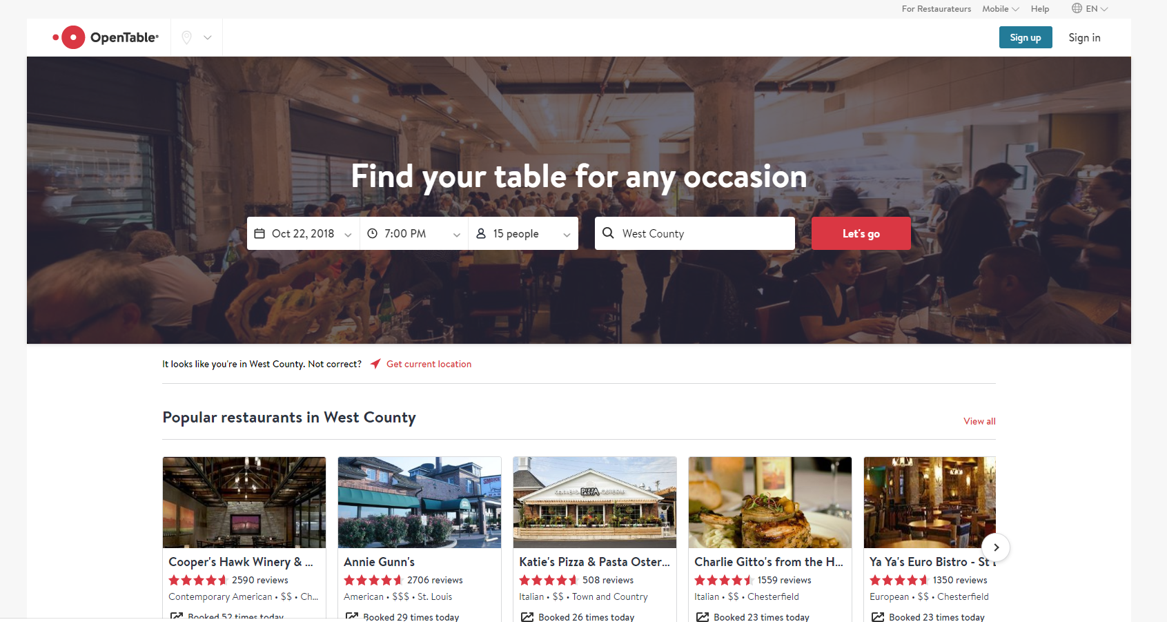
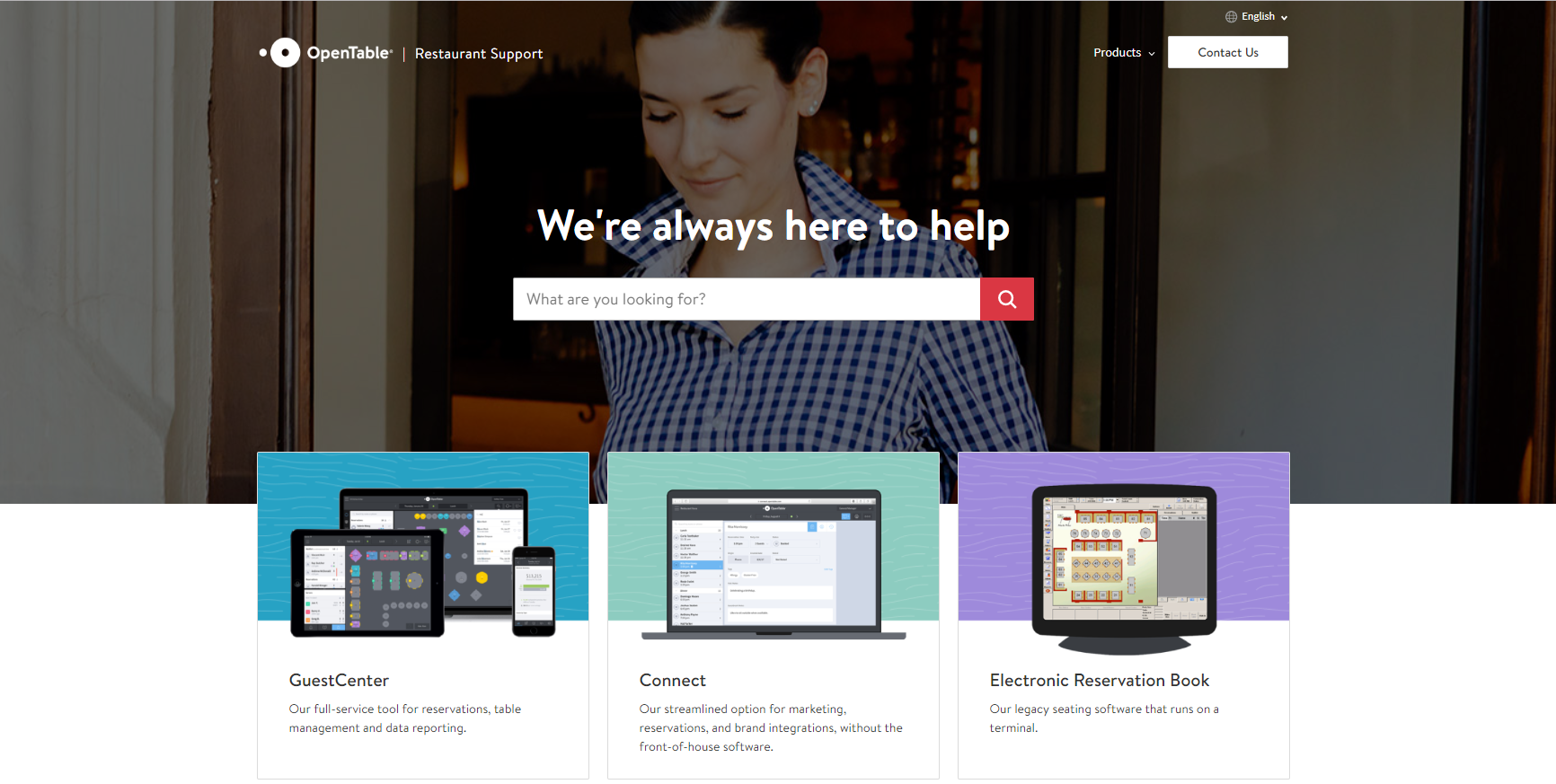
Example of Branded Help Communities: OpenTable
We worked with OpenTable’s branding team using a specific set of design components we replicated to create a consistent look and feel across both help sites.


