Native advertising formats are not new to the industry, but still, some brands seem reluctant to run them.
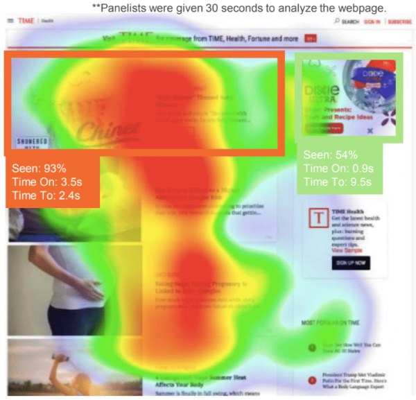
A recent eye-tracking study completed by TripleLift and Chinet compared native ad placements to banner ads. The goal was to determine how much consumer attention the in-feed native ad garnered compared to a 300×250 banner ad at the same page depth. They found that the native ad was seen by almost two times as many users, had three times the amount of attention, and it took consumers almost seven seconds longer to find the banner ad. Overall, they found the majority of users (70%) recalled the Chinet brand the most, while 30% recalled the Dixie banner ad most.

There are various similar case studies proving the value of native ad formats. Considering how much more in view these ad placements are (reference graphic above), it’s no wonder brands see strong results compared to standard banner placements.
Here are some tips to help get you started:
1. Native ads do NOT need to drive to a custom landing page or article
A common misconception is that native ads need to drive to an article or to a prettied-up page with lifestyle imagery. Native ads can be successfully used to drive action with a product page as well.
2. Who can I target with these ads?
Native ad formats can be purchased through some of the popular demand-side platforms (DSPs) like the Trade Desk. Native ad partners like TripleLift can also run managed-service campaigns. The inventory is purchased programmatically, so you have access to many of the same targeting segments like contextual, behavioral, or interest-based targeting and remarketing.
3. Choosing your format – video, carousel, image, cinemagraph
- Cinemagraphs can be highly successful in grabbing attention and jumping off the page at readers. Subtle movements are key. This format works well for increasing traffic and brand awareness.
- Video can be set to play automatically with sound off when 50% in view. Videos should not require sound or include closed captioning. Shorter works best – 15 seconds or less. Product or brand message should be featured as early as possible. The format works well for driving video views and increasing brand awareness.
- Use a carousel format for driving engagement and sales. Showcase multiple products, features, or tell a story with up to five unique images in a single ad unit.
4. Create a strong image
- Lifestyle outperforms infographics and product images.
- Remove text from images – it can get cut off if the image is resized or cropped to fit a placement.
- Use a 5% transparent padding around the logo on the image.
- The focal point of the image should be as centered as possible to ensure nothing important is cropped out. Avoid excessive focal points.
- The larger the image, the better – as long as it’s under 2MB. Native ads can run in numerous placements based on site availability. Stretching small images to fit larger placements will diminish quality.
- Use a clear message and call to action. Headline and body copy should form a cohesive message, be relevant with the image, and contain a clear call to action.
Adding these tips into your planning and design processes will draw eyes to your brand and products and help you make the most of your advertising dollars.

