Here at Perficient Digital, we use Adobe XD on a daily basis for very large and sophisticated enterprise projects. They typically require fast turnarounds and usually up to 10-15 versions or rounds of revisions per feature. While the Adobe UX tool’s improvements have been a life saver, we’ve found a few Adobe XD shortcuts and workflow techniques that help maintain efficiency no matter the project complexity or size. Enjoy!
1. Selecting Outlined Icons & UI Elements
Whether you are using an existing Adobe XD icon library or creating your own, outlined icons can be a nuisance to select with the pointer tool. Adobe users have long known that keyboard shortcuts can be huge time savers for repetitive or frequent tasks. Navigating to menus and toolbars painstakingly slows down production and creativity. Nevermind the anxiety I am consumed with when observing this behavior, but I digress.
The same inefficiency applies if we are repeatedly zooming in and out or selecting layers just to select an outlined icon or UI element. Luckily, I had just created a guidelines template in Illustrator for a custom set of icons and UI elements that led to an “ah ha!” moment. If I keep the container with the element vs. just exporting the individual element, it would be much easier to size them consistently, i.e., 32px, 24px, 16px, 12px, etc. Awesome, right?
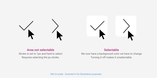
Well… almost. Now the only problem was that I have a white background behind each icon or UI element. Not so awesome, as they are not always placed on a white background. Simply turning the container layer off or unchecking the fill just puts us back where we started. However, making the fill transparent will allow the entire container and icon/element to remain selectable.
Obviously, we would just want to container transparent in Illustrator. It made sense to outline the process within XD, as some users may be making icons directly within their project.
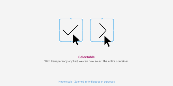
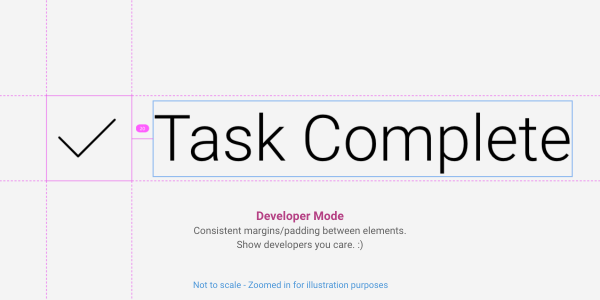
Added bonus: The uniform sizing for all the icons and UI elements also allows us to align and space them consistently in relation to other elements. This is especially helpful for developers looking at prototypes in developer mode. A tall but not very wide icon would have the same spacing as an icon that was wide. Just using the icon itself provides no reference to the space or container it would live in.
2. Custom Grids
Yeah yeah, we know this was a recent feature added in one of the latest updates – thank you Adobe! However, I was still finding it useful to create a grid as a symbol for use on various artboard screen widths. This really comes in handy when you need to compare screens that show full-width elements that span wider than your established max-width. If we simply use the built-in grid, we would have to adjust our margins with some math to display the grid at the appropriate max-width. For those who like having the visibility of the outer gutter vs. just having a gutter that sizes the grid appropriately, creating a grid as a symbol could also be useful.
For this walkthrough, we will use a standard 1200px max-width grid (1170px w/ outer margins).
Here are the quick steps we use to create a simple, reusable grid for any Adobe XD project:
1. First, pull up a blank canvas at 1920×1080 or simply use an area outside of your canvas in your current document.
2. Now, using the rectangle tool, let’s create two shapes: one at 15×15 and one at 15×70. Align shapes next to each other, select and copy the smaller shape using the keyboard Option key, and move it to the right side of the larger shape.
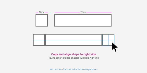
We will address the height once we group our column and gutters and make our repeat grid. Technically we don’t need to group the shapes as it becomes a group once we turn it into a repeat grid. This just allows the group to be automatically selected as we’ll see in step 4.
3. Next, we want to set a color for our grid and group the shapes. The two smaller shapes should already be white, just remove the border. Then, select and color the larger shape to a color of your choice and remove the border.
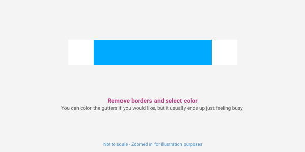
I prefer sticking to a saturated blue like #00AAFF or magenta #FF00FF, as these are similar to what we typically see for guides.
4. Now let’s make our grid with the awesome Repeat Grid tool! Select the all three shapes, group them together, click the Repeat Grid button, and then manually set the width to 1420px. Wait a minute… why 1420px, you ask? XD automatically adds a 20px margin between each repeating column. When we select and size the margin to 0px, we don’t have to resize our column to the appropriate width. Efficiency for the win!
The grouped shapes make adjusting the height easier in the last step without having to use a shortcut for select all or the multi-select. I left shortcut key commands out as not everyone uses them. If you are an advanced user, by all means, add those to your workflow to speed things up.
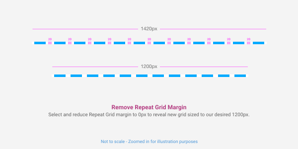
5. Almost there! Now we just need to adjust the height of the grouped column within the repeat grid. Simply double click the Repeat Grid (the grouped object within the grid will already be selected) and set the height to 2000px.
You can set a shorter height for the grouped shape within the Repeat Grid, in which you would likely need to adjust the vertical margin when it repeats, like we did on the horizontal margin. This is unnecessary though, unless you have ridiculously long page comps.
6. Now start creating some beautiful grid based mockups and prototypes!
Sorry, you’ll have to use your own creative awesomeness for this step. 🙂
3. Dotted Lines & Leaders
This is a very common design element. Users expect this functionality from XD, as Illustrator and Photoshop have both had this feature for some time. Adobe XD does currently have dotted lines and leaders listed in their feature requests backlog with a promising 747 votes! So, I am optimistic that they will include this feature in a release in the very near future.
In the meantime, let’s do what creatives do best and find a solution, not complain about the problem. Here are a couple of ways to build and incorporate this element into your designs and prototypes.
Using the text tool
This approach is simple, effective, and gets the job done. However, it is not our preferred method. Not having the ability to refine the style of each element effectively was the biggest issue (e.g., longer or taller dashes, squares instead of circles for dots, etc.)
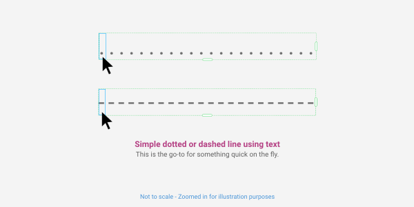
Selection of the repeater grid and alignment issues were also becoming apparent as we started using this in our layouts. While switching the text container from point text to container text did solve some issues with alignment and selection, as you could set a height to match (Again, thank you Adobe for putting in this feature!), we are still faced with the styling issues mentioned above.
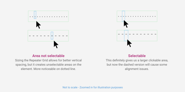
Quick Tip: Go ahead and use either of the quick methods and simply turn your Repeat Grid into a Symbol for updating later. No need to shift rapid prototyping to focus on details of a design element. This can be updated later to desired style using shape tool method below.
Using the shape tool
While it takes just a few more steps to set up, this method allows the most flexibility and control for this element. We can use the same method mentioned in the Selecting Small Elements tip earlier to address alignment and some frustrations encountered when selecting the element.
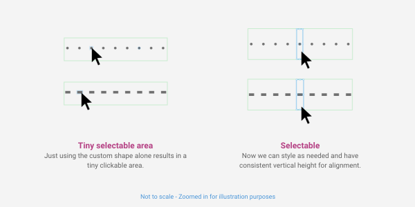
Bonus examples
Here are just a few examples of using the shape tool method to create styled UI dividers.
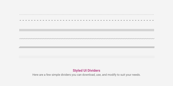
4. Global Prototyping Menu/Nav
We had created a side navigation used to prototype a design system we were creating. However, keeping this updated as we made changes, added navigation, etc., became very tedious. There is a simple method for designing Adobe XD prototypes that some may not be aware of.
If we create a single global nav and link to appropriate pages, we can simply copy and paste this onto artboards while retaining all our updated/changed linking and positioning of the menu. The key is doing this in Prototype mode, not Design mode.
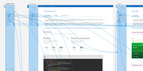
Quick Tip: We still convert the menu to a symbol so any style changes will be applied globally. So, if we are just updating a logo or changing the font size, we don’t have to replace the menu like we do when we update prototyping changes.
And there you have it! Check back for more Adobe XD shortcuts, tips, insights, and helpful illustrations, as they continue to add and enhance features. In the meantime, we hope these Adobe tips will help your workflow, save a bit of time, and make prototyping just a little bit easier!
