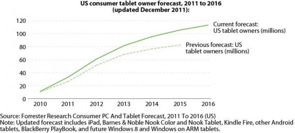
Believe it or not, an astounding 19 percent of Americans over the age of 18 now own a tablet of some sort. This is double the number Forrester noted in 2011.
It’s true that tech penetration is lower among adults over 47, but not by much. This demographic is now at 14 percent ownership, which is also double the figure recorded in 2011.
Tablet penetration in the market is still in its infancy, only being around for the past few years. However, we’re already seeing multiple variations that are able to play with different price points, and also address some early issues owners were having, (ease of use, portability, and muscle fatigue). What does this mean for your financial institution in 2013?
Simply put, it means you should be just as concerned about having a tablet strategy as you are with having a mobile strategy.
Unfortunately for us, they are not always the same thing and should be considered individually. Going into 2013, the trend is showing that tablet growth may surpass smartphones. In my opinion this does not signify an end of the smartphone reign, but just another gadget in the tool belt that consumers will be using for managing their personal finances.
Here are some things to consider on where to start.
- Your marketing/technical teams should invest in tablets. Not just a tablet, but look at the trends and purchase the top 5 tablets in the market. Here’s a list to get you started, though I would add the iPad Mini to this list as a rising star and different size that needs to be considered.
- Have your team review how well your current website works on them. Have your team get to know them all very well. Assess how well your website scales to these new platforms. Consider your consumers top 10 reasons to come to your website and test out each task flow. What tasks become harder? What content no longer makes sense on this smaller platform?
- Consider the “Tappiness” of your website. Yes, I know you might be thinking that this is not a real word… but it is in fact a real thing. Here’s a definition of what I mean by this:
“When a website exhibits “Tappiness,” it’s easy—or even delightful—to use on a mobile or tablet device. Tappiness encompasses smart use of space, text that is easy to read, logical interaction clues, and large touch targets that allow visitors to navigate with confidence.”
So how do you assess your online banking “Tappiness”? Here’s a great article from uxmag.com for you to reference.
After these three steps are taken to review your current site, consider how your tablet strategy may evolve. Perhaps rethinking your strategy to accommodate both platforms is right for you, or even developing a unique tablet offering provides the best tablet customer experience.
Taking Your Tablet Strategy to the Next Level
Create an engaging tablet-specific experience. Simply porting over your smartphone app isn’t enough for the banking experience when it comes to tablet users. Customers can use tablets to take a deeper dive into their personal finances. The larger screens with tablets allow for more interaction and graphical information by integrating personal finance management (PFM) tools. Tablet banking provides financial institutions with a great opportunity to deepen their relationships with customers. Citibank took this approach by identifying experiences and functionality not available on Citi.com and found this to be a successful strategy.
But designing apps for different devices doesn’t mean you have to start from scratch either. Responsive web design continues to pick up steam if you’re looking for a user experience to accommodate desktop, tablet and mobile experiences.
There isn’t one “best solution” that fits all situations. Consider bringing on a consultant to help assess what solutions might be best for you and your products.
Educate customers by marketing your tablet app. The Financial Brand has published a number of mobile banking articles for financial marketers on how to address this critical channel. In several studies, results showed that only a small fraction of users were first prompted to use their bank’s mobile channel. Financial institutions need to more adequately promote their online, mobile and tablet offerings, and get more engaged with users by providing tutorials and interactive videos, reinforcing security measures, and addressing customer support better to drive mobile and tablet adoption.


