
3D Transformation of Elements
Dive into the exciting realm of CSS3 3D transformations! Experience the magic of moving, rotating, scaling, and skewing elements in three-dimensional space, adding depth and flair to your web design. With CSS Transform and Transform Functions, unleash your creativity and elevate your website with stunning visual effects while ensuring seamless layout integration.
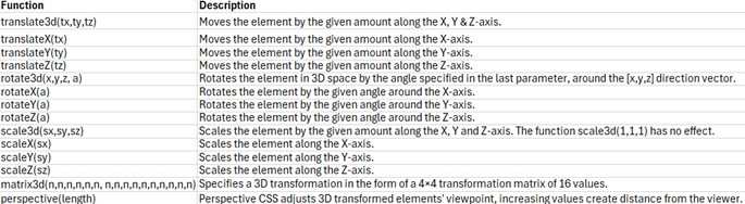
The following section describes the 3D transform functions:
translate3d() Function:
The translate3d() function shifts the element to a new position along the X, Y, and Z axis from its current location. It’s denoted as translate(tx, ty, tz). Note that percentage values are not permitted for the third translation-value parameter (tz).
<!DOCTYPE html>
<html lang="en">
<head>
<meta charset="utf-8">
<title>CSS3 3D-Transformation</title>
<style>
.container{
    width: 200px;
    height: 200px;
    perspective: 500px;
    border: 4px solid #e5a043;
    background: #fff2dd;
    margin: 30px;
}
.transformed {
    transform: translate3d(25px, 25px, 50px);
}
</style>
</head>
<body>
    <div class="container">
        <img src="Images/red-rose.jpg" alt="red-rose">
    </div>
    <div class="container">
        <img src="Images/red-rose.jpg" class="transformed" alt="red-rose">
    </div>
</body>
</html>
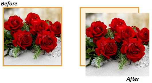
- translate3d(25px, 25px, 50px) moves the image on X, Y, and Z axis.
- Despite 3D transforms, Z-axis movement might not be noticeable on flat elements.
- Use perspective and perspective-origin CSS properties for depth perception.
- Closer elements appear larger; distant ones appear smaller.
- Without perspective, 3D effects won’t be visible.
Output:
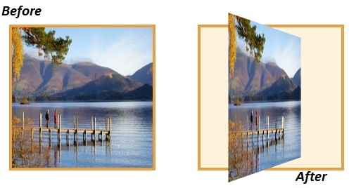
rotate3d() Function:
The rotate3d() function rotates elements in 3D around a specified [x,y,z] direction vector by a given angle, expressed as rotate(vx, vy, vz, angle).
For example, rotate3d(0, 1, 0, 60deg) rotates an image around the Y-axis by 60 degrees, and negative values rotate in the opposite direction.
.transformed {
    transform: rotate3d(0, 1, 0, 60deg);
}
Output:

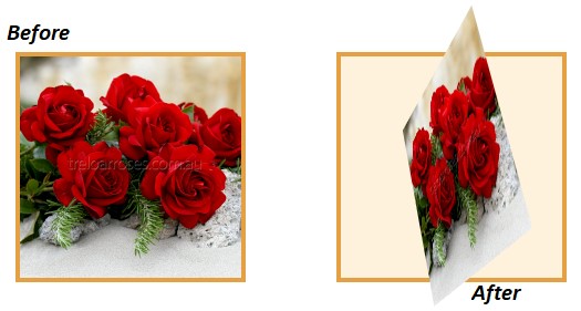
scale3d() Function:
The scale3d() function adjusts an element’s size along the X, Y, and Z axes. Its impact becomes noticeable when combined with other transform functions like rotation and perspective.
For instance, using scale3d(1, 1, 2) adjusts the size along the Z-axis, and rotate3d(1, 0, 0, 60deg) rotates the image around the X-axis by 60 degrees.
.transformed {
    transform: scale3d(1, 1, 2) rotate3d(1, 0, 0, 60deg);
}
Output:
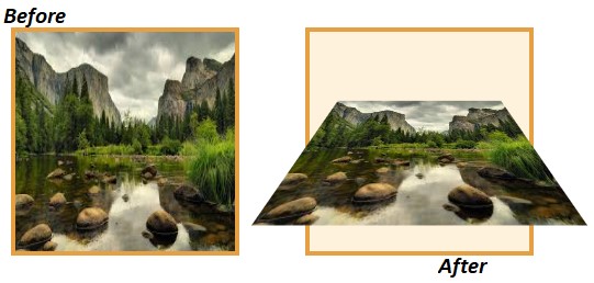
matrix3d() Function:
The matrix3d() function enables comprehensive 3D transformations like translate, rotate, and scale simultaneously, utilizing a 4×4 transformation matrix with 16 parameters.
Below is an illustration demonstrating a 3D transformation implemented through the matrix3d() function.
.transformed {
    transform: matrix3d(0.359127, -0.469472, 0.806613, 0, 0.190951, 0.882948, 0.428884, 0, -0.913545, 0, 0.406737, 0, 0, 0, 0, 1);
}
Output:
When applying multiple transformations simultaneously, it’s easier to utilize individual transformation functions and arrange them sequentially, as demonstrated here:
.transformed {
    transform: translate3d(0, 0, 60px) rotate3d(0, 1, 0, -60deg) scale3d(1, 1, 2);
}
Output: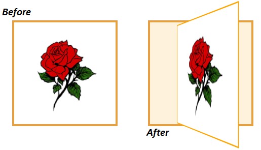
3D Transform Functions
The table below offers a concise summary of the various 3D transformation functions available.
In simple terms, CSS-3 3D transformations are like special tools for making cool stuff on websites. You can move, spin, resize, and change things in 3D to make your designs more exciting.