
Ready to take your website from static to sensational? Dive into the world of 2D transformations in CSS3 and discover how you can effortlessly enhance your web design with dynamic effects! Say goodbye to boring layouts and hello to eye-catching animations and transitions. Let’s unleash the power of CSS3 together!
2D Transformation of Elements
Using CSS3, you can spice up your webpage with cool effects like moving, spinning, resizing, and tilting elements.
There’s no need to worry about messing up your layout—these transformations will not affect the rest of your page layout.
translate() Function
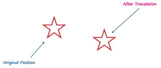
Let’s slide things around using the translate() function!
The ‘translate()’ function in CSS shifts elements on the page with ‘translate(tx, ty).’ Omitting ‘ty’ moves sideways, ‘translate(200px, 50px)’ moves the image 200 pixels right and 50 pixels down.
<!DOCTYPE html>
<html lang="en">
<head>
    <meta charset="UTF-8">
    <meta name="viewport" content="width=device-width, initial-scale=1.0">
    <title>CSS 3 2D-Transforms</title>
    <style>
        img {
            transform: translate(200px, 50px);
        }

        .box {
            margin: 50px;
            width: 150px;
            height: 150px;
            background-image: url("/images/star.png") no-repeat;
        }
    </style>
</head>

<body>
    <div class="box">
        <img src="images/star.png" alt="star">
    </div>
</body>

</html>
Output:
rotate() Function:
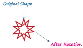
Let’s give elements a spin with ‘rotate()’!
The ‘rotate()’ CSS function rotates an image clockwise about its origin by a specified angle, like rotate(30deg). Negative values rotate the element counter-clockwise.
img {
transform: rotate(30deg);
}
Output:
scale() Function:
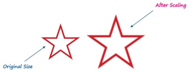
Let’s Make things bigger or smaller with ‘scale()’!
The ‘scale()’ CSS function adjusts element size with scale(sx, sy), where ‘sx’ is horizontal scaling and ‘sy’ is vertical (defaults to ‘sx’ if not specified). ‘scale(1.5)’ enlarges both dimensions; ‘scale(1)’ maintains original size.
img {
           transform: scale(1.5);
    }
Output:

skew() Function:
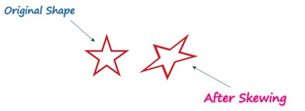
Let’s tilt elements with ‘skew()’!
The ‘skew()’ CSS function tilts an element along both the X and Y axis; skew (-40deg, 15deg) tilts 40 degrees left on X and 15 degrees down on Y.
    img {
            transform: skew(-40deg, 15deg);
        }
Output:
matrix() Function:
The ‘matrix()’ function in CSS combines various transformations like moving, rotating, resizing, and skewing an element all at once. It requires six numbers in matrix form.
Syntax: transform: matrix (a, b, c, d, e, f):
- a (horizontal scaling)
- b (horizontal skewing)
- c (vertical skewing)
- d (vertical scaling)
- e (horizontal translation)
- f (vertical translation)
translate (tx, ty):
Moves the element horizontally by tx and vertically by ty. Represented as matrix(1, 0, 0, 1, tx, ty).rotate(a): Rotates the element by angle ‘a’ (in degrees). Shown as matrix(cos(a), sin(a), -sin(a), cos(a), 0, 0).
scale (sx, sy):
Changes the element’s size. Horizontal scaling is sx, and vertical is sy. Matrix form: matrix(sx, 0, 0, sy, 0, 0).
skew (ax, ay):
Tilts the element horizontally by ax and vertically by ay (in degrees). Matrix: matrix(1, tan(ay), tan(ax), 1, 0, 0).
Combine these matrix values to perform multiple transformations at once for your desired element effect.
Here is an example of performing the 2D transformation using the matrix() function.
       img {
            transform: matrix(0, -1, 1, 0, 200px, 50px);
        }
Output:

However, when you need to apply multiple transformations simultaneously, it’s often simpler to use the individual transformation functions one after the other in the desired order, like this:
 img {
 transform: translate(200px, 50px) rotate(180deg) scale(1.5) skew(0, 30deg);
}
Output:

2D Transform Functions:
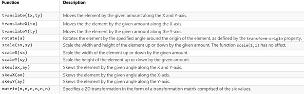
The following table provides a brief overview of all the 2D transformation functions.
Adding 2D transformations to your website using CSS makes it look better without messing up its layout. Functions like translate(), rotate(), scale(), and skew() let you do cool stuff with elements, making your site more engaging. They’re easy to use and give you lots of ways to make your website look awesome. Try out 2D transformations today and see the difference!