
In Bootstrap, the embed-responsive and embed-responsive-item classes create responsive embeds for videos, maps, or any other embedded content. These embedded classes ensure the embedded content scales properly and maintain its aspect ratio across different screen sizes. Let’s explore how to use Bootstrap embed classes for responsive embeds.
Bootstrap Responsive Video Embed
Bootstrap provides a simple and effective way to embed responsive videos using the embed-responsive and embed-responsive-item classes. Here’s an example with an embedded YouTube video: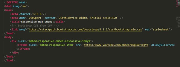
Output:

Before using the embed classes: 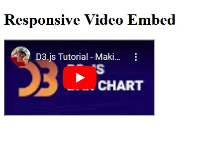
After using the embedded classes:
In this example:
- In this scenario, the embed-responsive class creates a responsive wrapper with a fixed aspect ratio (16:9). This ensures that the content adapts appropriately across various screen sizes.
- The embed-responsive-item class is applied to the <iframe> element inside, ensuring the embedded content scales properly.
Responsive Google Maps Embed
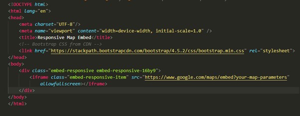
Similarly, you can utilize the same classes for embedding Google Maps or any other map provider in a responsive manner.
In this example:
- The embed-responsive class sets the aspect ratio, and the embed-responsive-item class is applied to the <iframe> for proper scaling.
- The utilization of classes can also be applied similarly for integrating Google Maps, etc, functionality into web applications.
Custom Aspect Ratios
If you need a custom aspect ratio for your responsive embed, you can create a custom class using the padding-bottom property. The calculation of the padding-bottom value is based on the desired aspect ratio. For example, for a 4:3 aspect ratio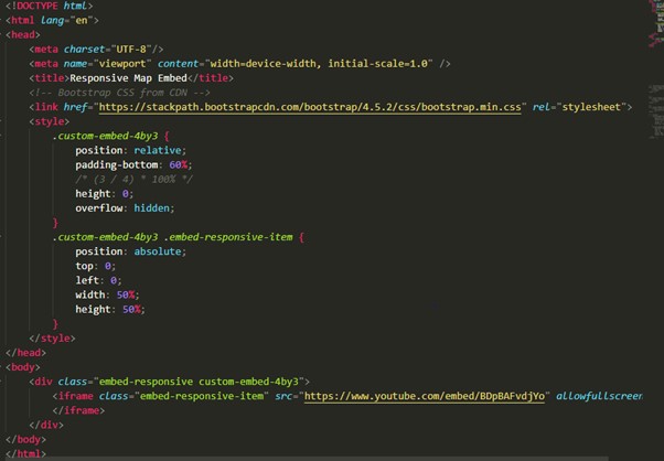
In this example:
- The parent container applies the custom-embed-4by3 class, and the custom CSS provides the necessary padding-bottom for the desired aspect ratio. The. embed-responsive-item class ensures proper scaling within the container.
Output: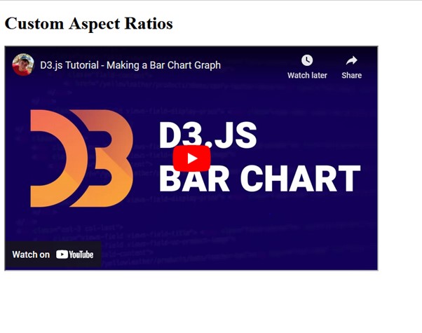
- Ensure that the allowfullscreen attribute is included in the <iframe> to allow users to view the embedded content in fullscreen mode.
- Customize the <iframe> src attribute with the appropriate URL or embed code for your specific content.
Tips and Best Practices for Bootstrap Embed Classes
Accessibility Considerations
- Ensure that embedded content is accessible to all users, including those with disabilities. Provide alternative text descriptions for videos and maps to assist users who rely on screen readers.
- Test the accessibility features of embedded content to ensure compatibility with assistive technologies and adherence to web accessibility standards.
Performance Optimization
- Optimize the loading speed of embedded content by minimizing file sizes and employing lazy loading techniques. This helps improve the overall performance of web pages, especially on mobile devices with limited bandwidth.
- Consider utilizing Content Delivery Networks (CDNs) for serving multimedia content, reducing latency, and enhancing the delivery speed for users across different geographic regions.
Responsive Design Principles
- Embrace responsive design principles beyond embedded content to create a cohesive and adaptable user experience across the entire website. Use media queries and flexible layouts to effectively accommodate varying screen sizes and orientations.
- Conduct thorough testing across different devices and screen resolutions to ensure that embedded content renders correctly and maintains functionality across the spectrum of user environments.
User Interaction Enhancements
- Implement interactive features such as play/pause controls, volume adjustments, and map navigation tools to enhance user engagement with embedded content. Provide intuitive user interfaces that empower users to interact effortlessly with multimedia elements.
- Consider incorporating gestures and touch-based interactions for mobile users, allowing for intuitive manipulation of embedded content on touchscreen devices.
Cross-Browser Compatibility
- Test embedded content across multiple web browsers and platforms to ensure consistent rendering and functionality. Address any compatibility issues promptly to deliver a seamless experience for users regardless of their choice of browser.
Conclusion
By utilizing the embed-responsive and embed-responsive-item classes in Bootstrap, you can easily create responsive and visually appealing embeds for videos, maps, or other embedded content on your website. These classes help maintain a consistent and user-friendly experience across various screen sizes and devices.