
Reports In Power BI
A Power BI report is nothing but a multi-perspective view of a data set with visualizations that represent different findings and insights from that data set. A report may be a single visualization or pages full of visualizations.
Visualizations can be pinned to dashboards and if you select the pinned visualization, it will open the report from where it was pinned. One important point to remember is that reports are based on a single data set.
The visualizations in a report represent a nugget of information. These visualizations aren’t static, you have the option to add and remove data, change visualization types, and apply filters in your quest to discover insights and look for answers. Like a dashboard, a report is highly interactive and highly customizable, and the visualizations update as the underlying data changes.
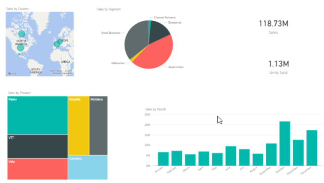
The image below represents how a sample report looks.
Power BI Dashboard
A Power BI dashboard is a single page, often called a canvas, that uses visualizations to tell a story. Because it is limited to one page, a well-designed dashboard contains only the most important elements of that story.

The visualizations visible on the dashboard are known as tiles. These tiles are pinned to the dashboard from reports. The visualizations on a dashboard come from reports and each report is based on one data set. In fact, one way to look at a dashboard is to consider it as an entry point into the underlying reports and data sets. Selecting a visualization takes you to the report (and data set) which was used to create it.
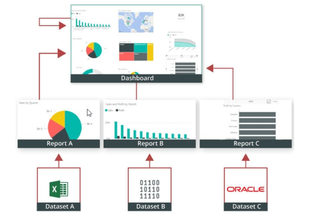
Power BI Dashboards are a wonderful way to monitor your business, look for answers, and to see your most-important metrics at a glance. The visualizations on a dashboard may come from one underlying data set or many, and from one underlying report or many. A dashboard combines on-premises and cloud-born data, providing a consolidated view regardless of where the data lies.
A dashboard isn’t just a pretty picture, it is highly interactive and highly customizable. The tiles update as the underlying data changes
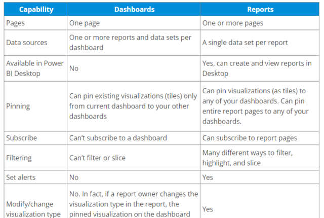
Dashboards vs Reports
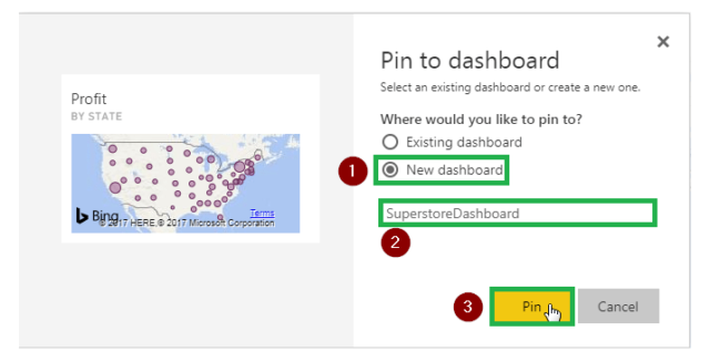
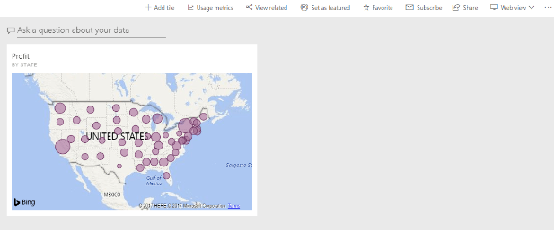
The image below shows how a visualization looks on a dashboard once you have pinned it.
Conclusion
A Power BI dashboard gives you the following functionalities:
- Add tile
- Usage metrics
- View related content
- Set as featured
- Subscribe
- Share
- View
- Use Power BI Q&A to ask a question.
Thank you for reading.
Great overview of the Power BI Dashboard! This article gives you a sneak peek into how powerful and easy-to-use these dashboards can be for visualizing data