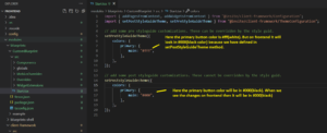
In Spire, we have two main methods for changing the style of global elements. We refer to this as the Style Guide, which covers the style of HTML elements such as headings, paragraphs, input tags and so on. For front-end components, we use the Mobius library, which is a configurable and extendable React Styles component. Below are the two methods:
setPreStyleGuideTheme: This method is primarily used for Mobius Theme changes and comes before the “setPostStyleGuideTheme” method.
setPostStyleGuideTheme: After the “setPreStyleGuideTheme,” we use this method to override our styles in our Style Guide, and it’s the final change to our Style Guide. The Style Guide from an admin cannot override the style defined here.
For example, let’s say we want to change the color of the primary button in the Spire blueprint. Here we’ve created a custom blueprint with the name “CustomBluePrint” inside the “src/Start.tsx.” In the “Start.tsx,” we write the “setPreStyleGuideTheme” and “setPostStyleGuideTheme” methods.

Note: Any variables from the “Base Mobius Theme” can be modified by Pre and Post-Style Guide methods.
Tip: Instead of using the using the “setPostStyleGuideTheme, use the “setPreStyleGuideTheme” for updating Style Guides. As a result, you can update the style guide from the admin console Style Guide panel if necessary.
Why Utilizing These Methods are Useful
By using these two methods, you’re able to significantly reduce the total time required for website style-related changes, avoid making style changes to individual React Components, and boost your website performance and user experience. For more information, contact our experts.

