
Cascading Style Sheets (CSS) Viewport is defined as the visible area on a window screen that refers to the displays of the devices. It’s been a couple years since CSS originally introduced viewport units. Viewport units let you size items and fonts as a proportion of the user’s screen’s total width or height (the viewport). A viewport unit value changes when the browser resizes, meaning they’re actually “responsive length units.”
Types of Viewport Units (VW & VH)
There are four viewport-based units in CSS, which are the values of viewport units:
Height of the viewport (vh):
This unit is dependent on the viewport’s height. A value of “1vh” corresponds to 1% of the viewport height.
Ex: The value of “1vh” will be 10 pixels (px), and the value of “10vh” will be 100px if the viewport is 1200px wide and 1000px high.
Width of the Viewport (vw):
The width of the viewport is used to calculate this unit. A value of “1vw” corresponds to 1% of the viewport width.
Ex: The value of “1vw” will be 12px and the value of “10vw” will be 120px if the viewport is 1200px wide and 1000px high.
Minimum Viewport Dimensions (vmin):
This unit is based on the viewport’s reduced dimensions. If the viewport height is less than the width, “1vmin” equals 1% of the viewport height. In the same way, if the viewport width is less than the height, the value of “1vmin” will be 1 percent of the viewport width.
Ex: If the viewport is 1200px wide and 1000px high. The value of “1vmin” will be 10px and the value of “10vmin” will be 100px because the viewport’s height is smaller than its width.
Maximum Viewport Dimensions (vmax):
This unit is based on the viewport’s greater dimensions. If the viewport height is more than the width, “1vmax” equals one percent of the viewport height. In the same way, if the viewport width is more than the height, “1vmax” will be equal to 1% of the viewport width.
Ex: If the viewport is 1200px wide and 1000px high. The value of “1vmax” will be 12px and the value of “10vmax” will be 120px because the viewport’s width is bigger than its height.
Let’s look at how these units will perform in various scenarios:
- The value of “10vw” will be 120px and the value of “10vh” will be 100px if the viewport is 1200px wide and 1000px high. The value of “10vmax” will be 120px and the value of “10vmin” will be 100px because the viewport’s width is bigger than its height.
- If the device is now turned so that the viewport is 1000 pixels wide and 1200 pixels high, the value of “10vh” is 120 pixels and the value of “10vw” is 100 pixels. The value of 10vmax will remain 120px, even though it will now be decided by the viewport’s height. Similarly, the “10vmin’s” value will remain at 100px.
- If you resize the browser window so that the viewport is 1000 pixels wide and 800 pixels tall, the value of “10vh: becomes 80 pixels and the value of “10vw” becomes 100 pixels. The value of “10vmax” will become 100px, and the value of “10vmin” will become 80px in the same way.
Viewport Units vs. Percentage
Viewport units represent a proportion of the viewport’s size, meaning it may appear that giving sizes as percentage values is identical at first glance. That units are always a percentage of the viewport’s overall size, but a percentage value applied to an element is a percentage of the element’s parent, not necessarily the entire viewport.
VW and VH units may appear to be percentages at this time. They are, however, vastly different. In the case of percentages, the child element’s width or height is decided by its parent. This is shown in the coding example below:
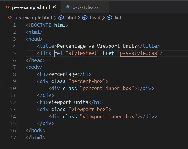
The width of the “percent-box” and “viewport-box” is set to 60% in the example above. As demonstrated in the output image, both sections take up the same amount of area. The “percent-inner- box’s” width is set to 90% of its parent section’s width. In comparison to the “percent-box,” the “percent-inner-box” takes up 90% of the space. The “viewport-inner- box’s” width is set to “90vw.” As demonstrated in the figure below, the “viewport-inner-box” takes up 90% of the viewport size, which is larger than its parent section.
Output:
When to Use Viewport(VW & VH) Units
These units are especially useful in cases when the width, height, or size of items must be specified relative to the viewport because they are dependent on viewport dimensions.
Full-Screen Mode Sections or Background Images
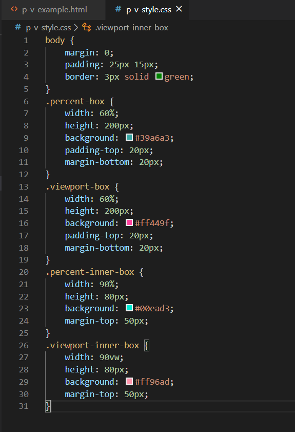
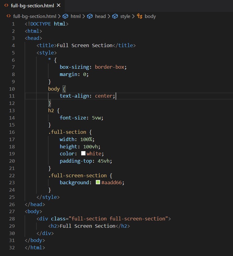
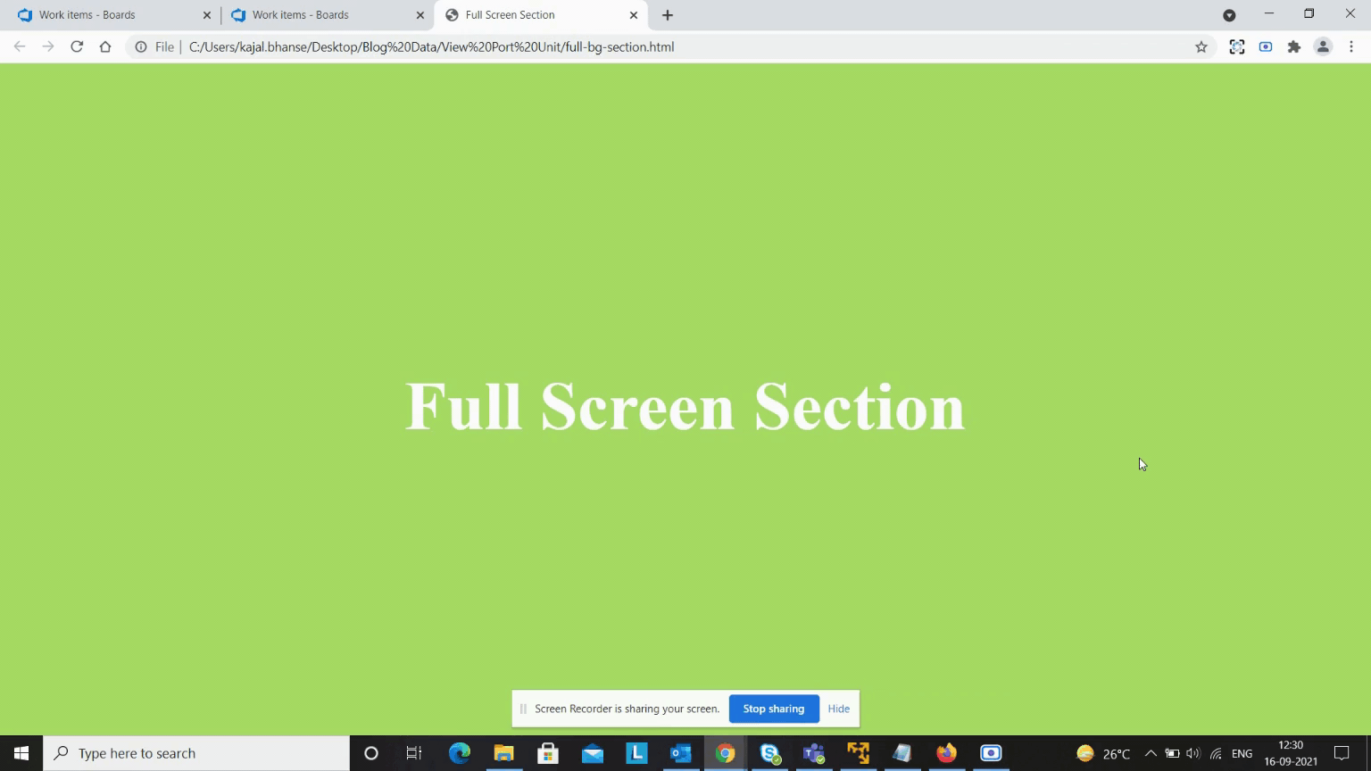
Setting background images on items that completely cover the screen is popular. Similarly, you might want to create a website where each product or service part takes up the entire screen. In such circumstances, you can make the width of the corresponding elements 100 percent and the height of the elements “100vh.” You can see this in the background image example below:
The above code is used to display the background image as a full-screen image. To accomplish this, we must set the width of “full-section” to 100 percent and the height to “100vh.” In addition, we must pass the image path to “full-screen image.” We can use this to make the background image fill the entire screen, as shown in the image below.

Below is an example of a full-screen section:

The above code is used to display the full-screen section. To accomplish this, we must set the width of “full-section” to 100% and the height to “100vh.” As shown in the image below, we must set the background color to “full-screen-section.”
Output:

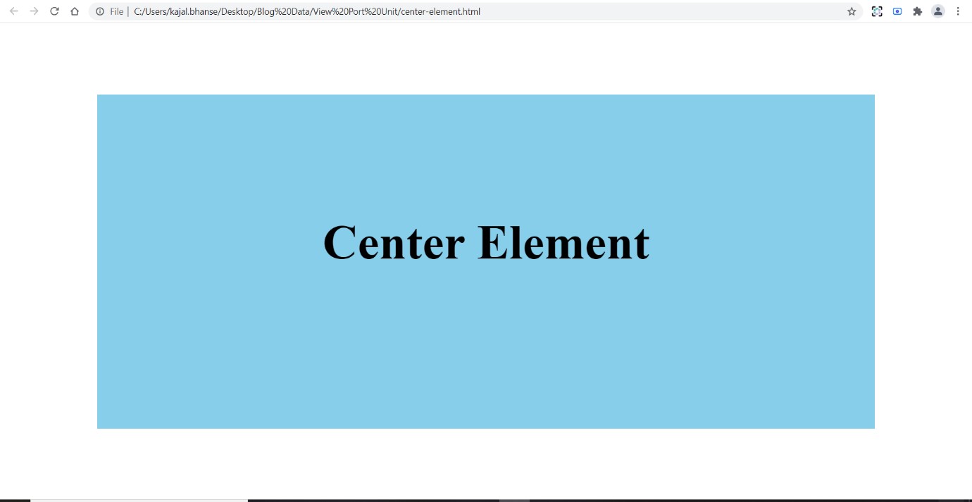
How to Use Viewport Units to Make Elements Centered:
When you want to place an element in the exact middle of your user’s screen, viewport units might be quite useful. If you know the element’s height, all you have to do is set the margin property’s top and bottom values to [(100 – height)/2]vh.
However, we can now center components both vertically and horizontally using Flexbox or CSS Grid. This is shown in the example below:

In the example above, we use a viewport unit to center the element. We need to know the element height to do this. We set the height of the “centered” portion in the example above to “70vh.” Now we use the formula [(100 – height)/2]vh to get “30vh” [(100 – 70)/2 = 30vh] as our output. Top and bottom margins must be set to “centered” and “30vh,” respectively. As shown in the image below, this allows us to effortlessly center the elements.
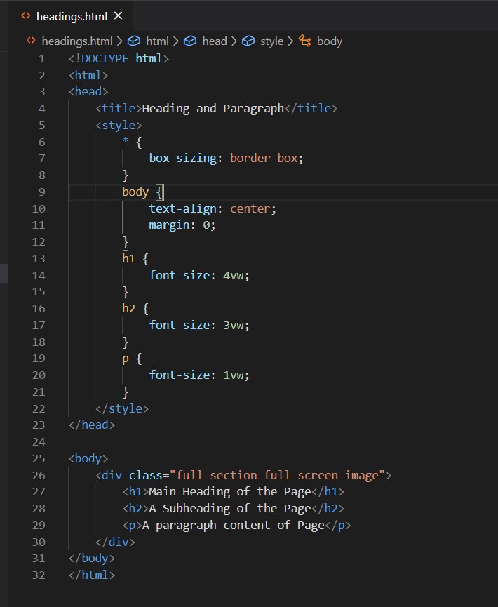
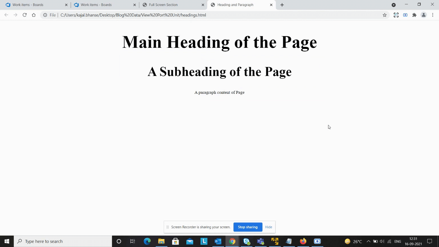
Headlines with Viewport Units
The size of the viewport directly affects the value of viewport units. If you select the font size for your headings using viewport units, they will fit precisely on the screen. When the width of the viewport changes, the browser will automatically scale the headline text to fit. All you have to do now is find out the proper font-size beginning value in viewport units.
It works, and on large viewports, our title will be larger, while on tiny viewports, it will be smaller. One issue is that on very big viewports, the title may become too huge, while on very small viewports, it may become too small. As a result, we may need to utilize breakpoints to set static font size
You can see the code in the example below:
values for viewports larger than or smaller than a given size.
Alternatively, we may address part of the issue by utilizing the “vmax” unit to ensure that our title does not get too small. Our title will be four percent of the largest font size between the width and height of the viewport:
h1 {
font-size: 5vmax;
text-align: center;
}
You can see the code in the example below:
Output:

Important Things to Remember While Using Viewport Units
There are a few things to bear in mind if you decide to use viewport units in your projects.
Be cautious when using viewport units to set the width of an element. If the root element’s overflow property is set to auto, browsers will assume the scrollbars don’t exist. As a result, the elements will be a little wider than you think. Consider the following markup with four div elements:
div {
height: 50vh;
width: 50vw;
float: left;
}
Each div should normally take up a fourth of the available screen. The width of each div, on the other hand, is calculated assuming there is no scrollbar. The div components are somewhat broader than the required width for them to appear side by side because of this.
This problem can be solved by changing the div’s width from “50vw” to 50%. The conclusion is that when defining the width of block components, you should use percentages so that the scrollbars do not interfere with the width calculation.
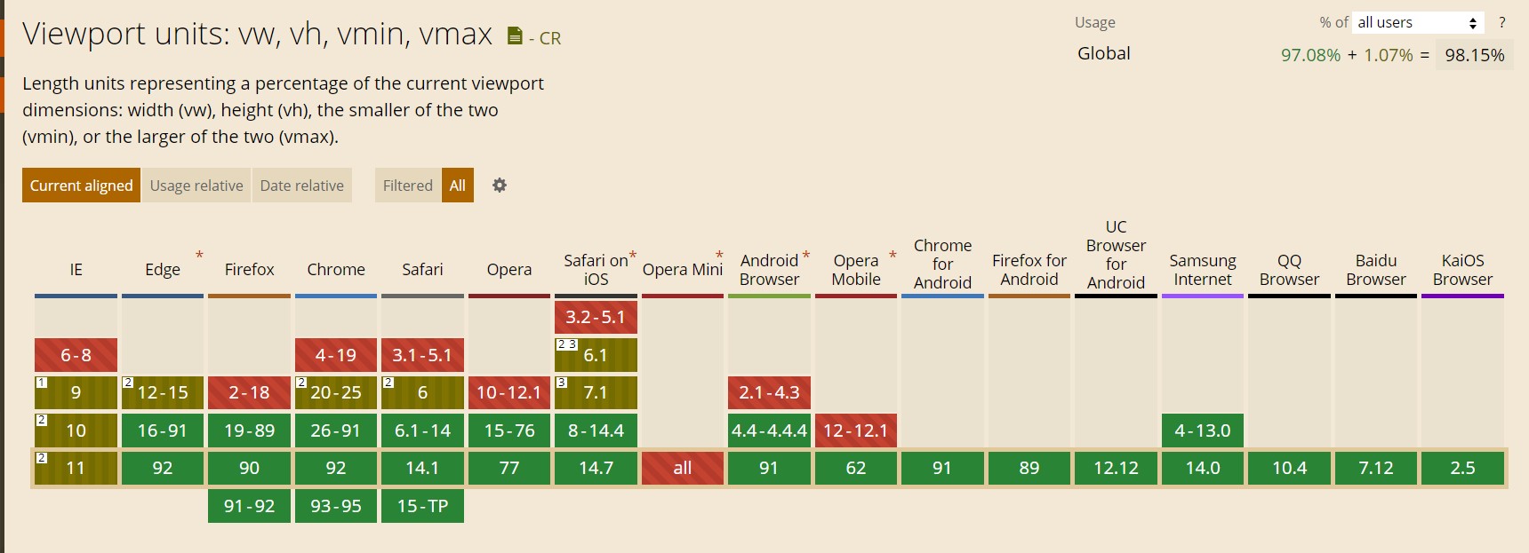
Browser Support
Every major browser appears to support these units. When employing viewport units, however, there are still a few flaws and difficulties to be mindful of. In Firefox, for example, “100vh” has no effect on any element whose display property is set to table. Chrome doesn’t support viewport units for border widths, column gaps, transform values, and box shadows.
The Final Form
You can see how I increased or reduced the screen sizes in the gif images below. The layout remains the same regardless of screen size. It remains stable across all screen sizes. As a result, you can fix the higher resolution issue by utilizing viewport units. For higher resolutions, the CSS’s viewport units function seamlessly.
In recent years, one of my favorite browser enhancements has been viewport units. Viewport units are ideal if you want a lot of versatility when it comes to customizing a site’s features to a variety of devices. In my opinion, viewport units are an excellent fit for a wide range of devices. I hope you’re already a fan of viewport units if you’ve read this far. If you have any questions, contact our commerce experts today.
Cool! I didn’t know about this feature but already know I’m going to use it! Thanks!