As the basis for content presentation in Sitecore, well-built components are critical for a successful Sitecore implementation.
Content Authors and Editors will be interacting with components in the Experience Editor on a daily basis, and there will be a wide range of technical expertise among these users. With that in mind, Sitecore developers should always remember this: the Content Author is your customer.
Yes, there will be end-users browsing the websites created in Sitecore, but they are consumers of content. Sitecore developers should be concerned with building robust tooling to allow authors to create that content – hence, components.
From the perspective of a Content Author, what constitutes a bad editing experience? What is considered to be a good editing experience? What core concepts and best practices should developers be aware of when building Sitecore components?
Empathize with the Content Author
Designing a bad editing experience in Sitecore is as simple as doing the bare-minimum amount of work needed to get content from a draft state to a published state. This is surprisingly easy to do in Sitecore. No workflow? No Experience Editor? No content organization? All too easy to do without the right strategy.
Empathy can be a powerful tool when developing for Content Authors, so take a moment to step into their shoes and see how some of the following issues can severely affect an author’s productivity.
Relying on the Content Editor for everything
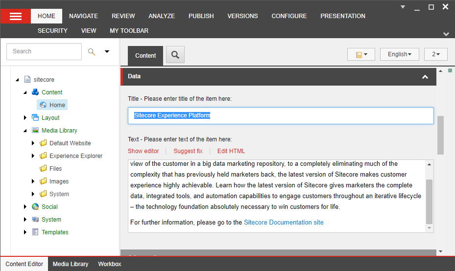
While the Content Editor can manage all items in Sitecore, it isn’t the ideal interface for editing content, positioning components, or quickly understanding the look of a page. There are different tools for different tasks in Sitecore. Forcing a Content Author to use only one of them will lead to frustration.
Using Presentation Details for content placement

When adding or removing renderings (read: components) from the Content Editor, the Presentation Details dialog is the go-to interface, but it isn’t pleasant for Content Authors. There is no obvious placeholder hierarchy, ordering components is a pain, and choosing the correct placeholder for a rendering is nearly impossible thanks to a textbox that accepts any value (not just valid placeholder names). My colleague Eric Sanner transformed this textbox into a dropdown (a much better interface) early last year, so that’s a big help.
Not customizing the content tree
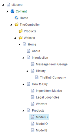
Mentally parsing a large content tree is slow and difficult when folders, pages, and content all share similar visual elements. Productivity will always suffer due to a generic and poorly designed content tree.
Components with too much or too little functionality
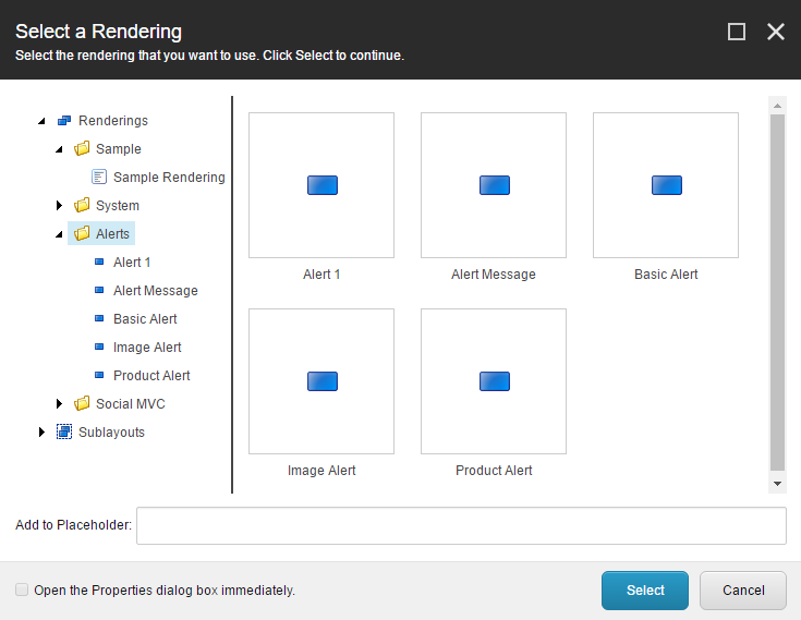
Are five components with similar functionality better or worse than one component with five different functions? How does a Content Author know which component to choose, or how to configure it? Striking a balance between flexible components and rigid control of layouts is key to a good Content Author experience.
Not enforcing organization
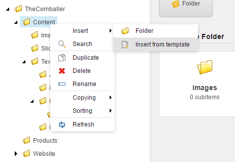
Content Authors can have the freedom to create new content anywhere in the content tree, place it anywhere on a page, and move or copy items at any time to any place. This freedom will quickly lead to a haphazard content tree, with content items placed at random and Media Library files being buried in an ever-expanding tree. Without strict CMS organization, how will a Content Author know if they are building the right component with the right content on the right page?
Improving the Editing Experience
Why do we want Content Authors to have a good editing experience? A successful website is a combination of a few things:
- Strategy + Plan
- Infrastructure
- Software
- Content
While all four pillars are critically important, the first three really exist to support the fourth: content. Content is the heart of all websites, so creating and managing content is of utmost importance. Here are a few tips that consistently improve the editing experience for content authors.
Governance, strategy, and training

Before ever letting a user sign in to Sitecore as a Content Author, make sure you understand what the role of the Author should be – then find the right people to fit that role. Only let properly trained users sign into Sitecore. Look into style guides and pattern libraries to help Content Authors understand component usage and functionality.
Develop for the Experience Editor
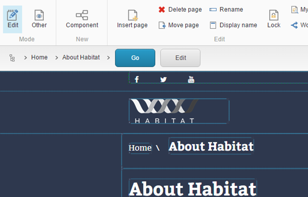
Sitecore’s Experience Editor is one of the best features of the platform. Develop components that work well in the EE and expect Content Authors to use the EE more often than not. In fact, there is a rule I use when considering Content Author UX: the 80/20 split of responsibilities.
That is, 80% of a Content Author’s time spent editing should be in the Experience Editor, with 20% reserved for those functions that the Content Editor does better. Play to the strength of each interface. The Experience Editor is perfect for editing content inline, component placement, personalization, and configuring A/B testing. The Content Editor is perfect for item ordering, managing lists of content items, and working with folders.
Use intelligent defaults
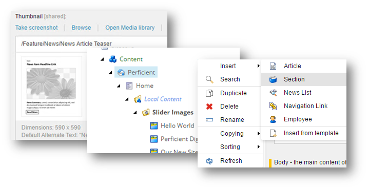
Sitecore offers a lot of configuration options for every part of the platform. Although most of these are simple and obvious, they all add up and contribute to an improved Content Author UX. More importantly, these configuration options can be used to set good, reliable default options that help steer a Content Author to the correct options and locations when creating or editing content.
- Insert Options. Specifies what types of items (based on template) can be added to a node in the content tree.
- Datasource Template. Determines what data template a Rendering should use. Enables lots of intelligent defaults when adding components via the Experience Editor.
- Datasource Location. Determines where a Rendering’s datasource items should be located in the content tree.
- Formatted Content Tree. Styling items in the content tree is an easy way to provide context to content. A well-formatted tree is also easier for Content Authors to explore.
- Rendering Thumbnail. Skip the tiny blue icons that Sitecore uses to represent renderings. Create examples of components and use them as thumbnails for renderings. This lets a Content Author see what components look like before choosing one.
- Allowed Controls. Limit what renderings can be added to a placeholder. This ensures design consistency across pages and simplifies the workflow of a Content Author when placing content.
- Branch Templates. If a page requires local content or additional data structures in Sitecore, use Branch Templates to define that structure. A Content Author never has to think about creating the correct items under a page with proper use of Branch Templates.
Study Habitat
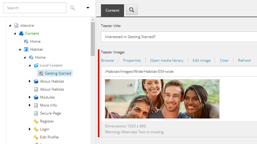
Sitecore’s open-source Habitat solution is filled with great Content Author UX ideas. If you’re taking the time to read Helix, then be sure to spend extra time studying Habitat’s implementation and use of things like Datasource Templates, Rendering Thumbnails, and Allowed Controls.
Core Concepts of Content Author UX
In my experience, a quality user experience in any application boils down to a few core concepts: consistency, focus, and intuitive discovery. These three concepts are the result of many small things working well together. Keep the following concepts in mind when designing an editing experience for Sitecore Content Authors.
Consistency
- Minimize learning. Learning requires significant mental resources. By teaching a user to do something well one time, they should be able to repeat that action forever.
- Exercise muscle memory. Don’t put a user through learning exercises again and again. Let a user rely on familiar positions and locations in a GUI or process to enable repeatable actions.
- Utilize patterns. Patterns in actions, patterns in UI layouts, and patterns in functionality help set expectations that will be familiar to a user in the future.
Focus
- Possible actions are obvious. Important actions or options in an application should be easy to discern from non-functional pieces. The user should always be able to answer the question, “What do I do next?”
- Correct actions are foolproof. A user that succeeds in their task should get the output they expect. For example, in Sitecore, adding the correct type of new page to a site should be foolproof with Insert Options.
- Reduce clutter. Clutter can be reduced visually in the UI, while functionally can be simplified whenever possible. This creates the need to balance simplicity (great for inexperienced users) with complexity (typically preferred by power users).
Intuitive Discovery
- Context is easy to parse. Content or functionality should be self-documenting and describe its purpose. In Sitecore, the context of content should be understood by its location in the content tree or its location on a webpage. Well-defined components should steer a Content Author to an understanding of their purpose (through name, description, fields, etc.).
- Functional output is as expected. The end result of a user’s choice or configuration does what the he or she expected it to do.
- Wrong choice does not break the system. If a user makes a wrong selection, the system and related applications do not fail or crash. This allows a user to be comfortable experimenting without losing trust in the system. In Sitecore, this means that server-side and JavaScript error messages are handled gracefully.
Do you have questions or comments? Want to discuss Sitecore Content Author user experience some more? Comment below or find me on Twitter: @BrandonMBruno

Lots of great things to think about when building interfaces for content authors.