More than 16 million people are living with a cognitive impairment in the U.S. That is a lot of people. That means almost all of us know someone with a cognitive impairment. And, for most companies, that means that a number of customers—or potential customers—will have a cognitive impairment.
Many people with cognitive impairments are of “normal” intelligence. However, they have differences in how they absorb, retrieve, and make sense of information. Some of them don’t even know they have a cognitive disability. All they may know is that they don’t always “get” what others seem to be getting.
Some of the types of cognitive disabilities you may be most familiar with are autism, ADHD, and traumatic brain injury. While each of these has some unique challenges, there is a lot of overlapping issues for designers of digital experiences to consider.
About 3.5 million Americans live with ASD (Autism Spectrum Disorder). ACD characteristics that are particularly important to digital designers include:
- Problems interpreting others’ emotions
- Ease in getting lost
- Challenges filtering out noise
- Confusion shifting between tasks
About 5% of kids in the United States have ADHD, which presents some similar—and some different—design challenges as ASD. Typical characteristics include:
- Attentional bias
- Episodic memory limitations
- Problems choosing the correct word/sentence structure
Of the 2.2 million ER visits a year for TBI in the U.S., about 75% are classified as “mild.” Mild TBI may include short- or long-term problems with thinking, sensation, language, and emotions, such as:
- Developing a mental map
- Seeing relationships
- Episodic memory limitations
- Understanding symbols
What does this mean for designers—and for companies that are providing the digital experiences?
Since the specific manifestation of cognitive impairments differ from individual to individual, it is helpful to focus on functional impairments. Functional impairments often cross specific diagnoses. For example, episodic memory limitations are characteristic of both ADHD and mild TBI. Someone with autism may have trouble filtering out background noise, but so does someone with ADHD. By focusing on designing to solve for these functional disabilities, designers can increase the number of users that can use their design.
Consider some examples:
Challenge #1: Abstract Concepts
Mental models are how we make sense of novel experiences. But abstract concepts can be really confusing to a large number of people. Metaphors, analogies, mental models…don’t assume everyone can make sense of them. If you are designing your digital experience (or a portion of it) around a specific mental model, analogy, or metaphor (for example, putting your homework “in a (digital) locker”) remember to:
- Provide alternative explanations for concepts
- Include graphical and textual explanations
- Limit otherwise cognitively taxing activities
- Use significant words or phrases to prime users

Source: tvcommercialspots.com
This Ace commercial uses humor to communicate both the benefits of Ace and the perils of misunderstanding a metaphor.
Challenge #2: Social and Emotional Cues
Many users can’t interpret social and emotional cues, and if the cues are integral to the brand – warm, skeptical, collaborative – the information will be lost if it is only presented in graphics. Consider:
- Providing an alternative way of understanding the content, such as copy or alt text
- Shooting for two different media types to express major social/emotional concepts
Challenge #3: Symbols, Pictures, and Icons
Go ahead: Be mysterious and use pictures and icons for navigation and communication of key content! Some users just can’t make sense of them. To maximize the number of users who can understand your site:
- Provide textual explanation of icons
- Avoid using head shots as the sole way to identify someone — include their name, too
- Don’t use icons or symbols if they aren’t very clear
- Don’t rely on graphics alone to communicate

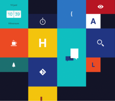
Source: blocklevel.nl
This website communicates using iconography alone, an approach that can be hard for some users to understand.
If this seems like a lot of trouble to go through for a few people, remember these are prospective customers. Remember, too, people with ASD, ADHD, and mild TBI are only some of the users with cognitive impairments. Not only are there a lot more people with cognitive impairments (especially considering the aging population), but most of us experience temporary cognitive disabilities every day. Lack of sleep, stress, and depression can each lead to functional disabilities similar to those of people with ASD, ADHD, and mild TBI (Just another reason to go to bed early.)
Like most design considerations that benefit people with disabilities, designing for users with cognitive impairments benefits everyone. The sleepy student trying to get his or her homework done will be able to make sense of your site. The stressed-out parent trying to find the right gift for that upcoming wedding will be able to make the purchase. The best designers know this, and accommodate users with cognitive impairments in their interaction design, creative, and content.
