I am marrying a man who happens to dislike the Salesforce1 mobile app. Over the past few days, it has been a big subject of debate as he tried to figure out ways to work around using it on his iPad mini, such as using Opera as his mobile browser which does not support Salesforce1. Being the die hard Salesforce champion that I am, I got tired of hearing him complain and finally grabbed his phone to see what his issue was. After a few minutes of exploring, it quickly became clear where his pains came from:
- Salesforce1 was turned on, but no customization was done, so he was seeing a ton of quick actions that were not relevant to his daily routine or sales workflow.
- No training was done to explain to him how to get the most out of the app, so he was missing out on some key features and benefits.
- He was not taking advantage of “Today”, which makes logging activities in Salesforce from calendar appointments stored on your iPhone really easy. Upon learning what it could do, he perked up because no sales person loves data entry and anything that can be done to reduce the number of clicks they needed to track activities is a huge bonus.
By the end of our conversation, he had set up the Today app and was taking notes on the things he wanted to ask his Salesforce Admin to look at so that he and his teammates could get more out of the mobile app. The good news is that his asks take minutes, not hours, to setup. They represent low hanging fruit than can quickly increase sales adoption.
Why Mobile Matters for Sales Leaders
When you have sales teams who travel frequently (e.g. my fiance who is in field sales and travels an average of three days a week), it is crucial that they can be productive on-the-go.
In fact, according to Salesforce’s recent “2015 State of Sales” annual report:
Nearly 60% of high-performing sales teams already use or are planning to use a mobile sales app (2x more likely than underperformers). Among all sales leaders surveyed, mobile sales app use will more than double in the next two years (125% growth).
You may have turned on Salesforce1, but if you have not optimized it for your team or trained them on how to use it, chances are, adoption and productivity could be far better. The good news is that you can easily fix this!
Take a Mobile-First Approach When Creating Page Layouts
In the user experience world, there is a philosophy called “mobile-first” which essentially means that when you are rolling out a website, you should optimize it for mobile-first then scale up to a full browser view. This forces you to put the most important fields at the top of the page so users don’t need to scroll or navigate much, if at all, to get to the fields they need. It also helps to identify non-critical fields that may not actually be needed. To take a mobile-first approach when creating new page layouts, structure them so that the fields that users will be filled out most often on-the-go are are the very top section of the page. I would also recommend that any required fields be towards the top of the record to minimize the scrolling a user needs to do, or that a quick action be created to update fields lower on the page.
How to Make Salesforce1 Work for Your Team, Quickly
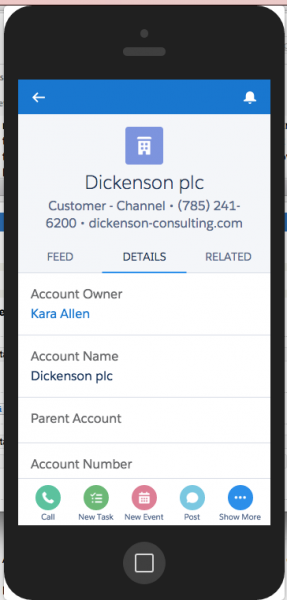
If you turned on Salesforce1, but didn’t do much to customize it, the first thing you’ll want to do is modify the standard Salesforce1 and Lightning Experience Actions. Each page layout can have a different set of actions that your teams will use to effectively manage records in Salesforce1 or the new Lightning Experience. By default, there are a set of pre-defined actions assigned to each page layout. These can and should be overridden to improve your users’s experience. Sit down with your users and reorder the native actions, remove those you don’t want on there and identify any that are missing. Here are all of the quick actions that come out-of-the-box on an Account. Once you make these changes, do a quick training for your users so they can learn how to get the most out of Salesforce1.
Also, be sure to customize your compact page layouts to control which fields show up at the top of the page below the account name and above the details. Try to keep the number of fields shown here to around 3 due to limited real estate. 
There are a lot of other ways to take Salesforce1 to the next level. These are just a few of the basics that every sales organization should be looking to do. Stay tuned for a follow-up blog post in the near future on using Quick Actions for Salesforce1.


