 In a prior blog we talked about portal adoption strategies and suggested a combination of approaches that would improve adoption, including:
- Simplifying portal content
- Targeting compelling content to specific user tiers or geographies
- Reinforcing your brand by matching your portal with your corporate brand
All sound like great ideas. But how can you control content and branding to easily accomplish them in Salesforce, whether for your partner portal or your customer portal?
- Branding:How do you match your portal brand to your corporate brand?
- Content:How do you target, and periodically update, different messages by user type (customer, SLA level, reseller, distributor, etc) without having many different HTML files to maintain?
These are common challenges our clients look to us for answers and guidance to overcome. Let’s take each one in turn.
Branding:
What you thought you were getting:
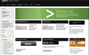
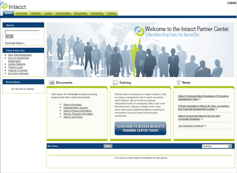
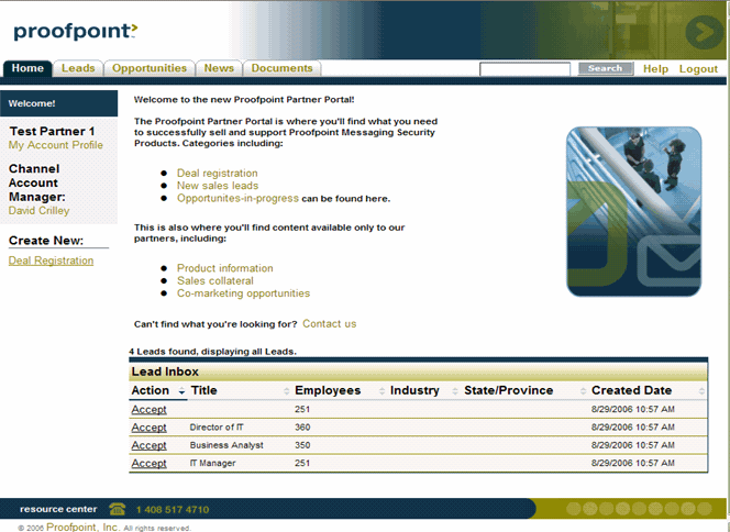
If you search Google images for Salesforce PRM you will see some pretty nice PRM portal home pages, such as the following. Many of us have also seen the polished PRM demos either at Dreamforce or during sales cycles.
 |
 |
 |
What you needed:
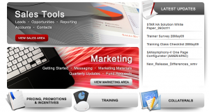
The following is an example (shared with permission!) of a portal that Perficient created, which has the look and feel our customer needed.
What you get out of the box:
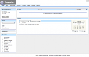
Unfortunately what you get out of the box when you turn on Salesforce portals is something like the following:
So what do you do now?!
There is work involved in going from the out-of-the-box defaults to your desired look and feel. How much work is a question of time, money, skill level, and need. At a high level there are two options:
| 1. Use the native portal fonts and colors page. | 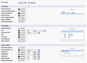 |
| 2. Go to a more granular level by overriding the underlying out-of-the-box stylesheet (css). |  |
The native set up page can get you part of the way there, and you may get lucky if you have a simple corporate Web site/ brand. But the page exposes only a small subset of the underlying styles so you only get to impact the most visible parts of the portal design.
Getting down to the css level is not everyone’s idea of fun, but it does give you ultimate control over almost every page element, so you can make the portal look exactly the way you want it to. We have found the best people to handle css work are design-oriented, not development-oriented. While this takes a little more time and expense, we strongly believe it is worth it because it is repaid by user adoption and appreciation of the portal.
Content:
So you’ve made your portal look beautiful. Now how do you manage and target content?
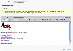
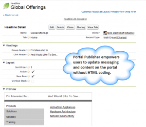
There are 3 high-level options:
Closing Recommendations
- Drive your branding and content management strategy based on your need. If you have simple branding requirements and a largely homogenous set of users, you may be able to accomplish what you need with native Salesforce features.
- If you need a highly-branded site to reinforce your corporate identity you’ll likely have to get under the hood and modify css files.
- If it’s important to you to easily and frequently update and target messages and content to different users, you will need to consider alternatives to the out-of-the-box static html files.
- If the out-of-the-box branding and content management don’t suffice, invest the money in doing it right. It’s a small price to pay for the return you get in terms of user adoption and productivity.
How will you manage your portal? Let Perficient help.

