
Story within Story:
In Storybook, “Story within Story” means using parts of one story in another. Instead of remaking stuff, developers just import existing stories and use their parts in a new story.
This helps make complex UIs by combining simpler parts from different stories, making coding faster and more efficient.
- Suppose you have two components: one for a button (Button) and one for an input box (Input).
- Each component has its own set of stories defined in separate story files.
- If You want to combine these stories into a single-story file to showcase how they can be used together.
- Below is an example demonstrating how to achieve this by using “Story within Story” concept:
Button.js:
//Path src/Button/Button.js
import React from 'react';
import './Button.css';

function Button(props) {
  const { variant = 'Primary', children, ...rest } = props;
  return (
    <button className={`button ${variant}`} {...rest}>
      {children}
    </button>
  );
}

export default Button;
Button.stories.js:
//Path src/Button/Button.stories.js
import React from 'react';
import Button from './Button';

export default {
  title: 'Form/Button',
  component: Button,
};

export const Primary = () => <Button variant='primary'>Primary</Button>
export const Secondary = () => <Button variant='secondary'>Secondary</Button>
export const Success = () => <Button variant='success'>Success</Button>
export const Danger = () =><Button variant='danger'>Danger</Button>
Input.js:
//Path src/Input/Input.js
import React from 'react';
import './Input.css';

const Input =(props) =>{
    const {size= 'medium', children, ...rest}=props;
  return (
    <>
      <input type="text" className={`input ${size}`}  {...rest}/>
    </>
  )
}

export default Input

Input.stories.js:
//Path src/Input/Input.stories.js
import React from 'react';
import Input from './Input';

export default {
    title: 'Form/Input',
    component: Input,
};

export const Small = () => <Input size='small' placeholder='Small'>Small</Input>;
export const Medium = () => <Input size='medium' placeholder='Medium'>Medium</Input>;
export const Large = () => <Input size='large' placeholder='Large'>Large</Input>;
Subscription.stories.js:
- In this example, the “Story within Story” concept is showcased.
//Path src/Subscription/Subscription.stories.js
import React from 'react';
import { Secondary } from '../Button/Button.stories';
import { Large } from '../Input/Input.stories';
export default {
title: 'Form/Subscription'
}
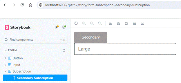
export const SecondarySubscription = () => {
return (
<>
<Secondary />
<Large />
</>
);
};
- Within the Storybook configuration file (Subscription.stories.js), the SecondarySubscription story is defined.
- It incorporates components from other stories (Button/Button.stories.js and Input/Input.stories.js), such as the Secondary button and Large input, respectively, rendering them within the SecondarySubscription
Output:
Advantages of “Story within Story” approach:
- Reduces Code Redundancy: Avoids the repetition of importing and defining props for components like the Secondary button and Large input, streamlining code.
- Automatic Updates: Modifications in original stories automatically propagate to the composite story. Changes made in the Secondary button story, for example, seamlessly update in the SecondarySubscription story.
- Enhanced Code Maintenance: Eliminates the need to manage code across multiple files, leading to improved code maintenance practices.
- Improved Efficiency: By reducing redundancy and automating updates, the approach enhances overall development efficiency, allowing developers to focus on building and refining UI elements effectively.
Decorators:
Decorators are component that wrap individual stories, providing additional functionality or styling.
Let’s Understand with an example:
Now, within this src directory, let’s establish a folder named ‘Center.’ Inside this folder, let’s generate two files: ‘Center.js’ for the Center component, and ‘Center.css’ for its associated styling.
//Path src/Center/Center.js
import React from 'react'
import './Center.css';
const Center =(props) =>{
  return (
    <div className='center'>
      {props.children}
    </div>
  )
}
export default Center
//Path src/Center/Center.css
.center{
    display: flex;
    justify-content: center;
}
- Enclosing the Button’s “danger” variant within the Center component ensures centralized alignment without altering the Button’s code, promoting reusability.
- Adjustments to the centering feature can be made effortlessly by modifying or removing the Center component.
//Path src/Button/Button.stories.js
import React from 'react';
import Button from './Button';
import Center from '../Center/Center';

export default {
  title: 'Form/Button',
  component: Button,
};

export const Primary = () => <Button variant='primary'>Primary</Button>
export const Secondary = () => <Button variant='secondary'>Secondary</Button>
export const Success = () => <Button variant='success'>Success</Button>
export const Danger = () =><Center><Button variant='danger'>Danger</Button></Center>
Output:

Now, to use the Center component as a decorator for the Button component, we can do the following:
- Storybook simplifies specifying decorators by enabling universal application after defining them once.
- Within the default export, the “decorators” property holds an array of functions. Each function wraps a story with a desired component, ensuring consistent application across stories effortlessly.
//Path src/Button/Button.stories.js
import React from 'react';
import Button from './Button';
import Center from '../Center/Center';

export default {
  title: 'Form/Button',
  component: Button,
  decorators: [story=><Center>{story()}</Center>]
};

export const Primary = () => <Button variant='primary'>Primary</Button>
export const Secondary = () => <Button variant='secondary'>Secondary</Button>
export const Success = () => <Button variant='success'>Success</Button>
export const Danger = () => <Button variant='danger'>Danger</Button>
Output: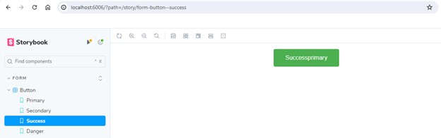
Global Decorators:
- If an input component lacks centered alignment, similar to the button component, we can address this by applying decorators in the default export.
- However, this could involve adding the decorator to every story in our Storybook.
- To simplify this process, we can utilize global decorators.
//Path storybook/preview.js
import React from 'react';
import { addDecorator } from '@storybook/react';
import Center from '../src/Center/Center';

addDecorator(story=><Center>{story()}</Center>)
Remove the addDecorator line from the //Path src/Button/Button.stories.js file, as we’ve defined this globally. Consequently, all components are now automatically centered.
Conclusion:
“Story within Story” method, along with decorators, makes UI development faster by reusing components, cutting down on repetition, and automating updates. This simplifies coding, maintenance, and encourages reusability for bigger projects.