
Introduction:
Storybook works alongside your app, giving you a separate area to create and test UI components without being tied to the main code and context of your app. It’s like having a special workshop just for building and trying out different parts of your website or app.
What & Why?
It’s a place where you can:
- Build and test different parts of your website (like buttons or menus) by themselves.
- See how these parts look and work without needing the whole website.
- Share these parts with others to get feedback.
What it means for you:
Storybook works separately from your main website. This means you can:
- Focus on making each part perfect without worrying about the rest of the website.
- Easily see what parts have already been made.
- See what options (called props) each part can have.
- Show these parts to others (like your team or clients) to get their thoughts.
- Also, you can test things like how easy it is for everyone to use your parts.
Let’s understand this with example:
Imagine you’re building a house. Storybook is like a workshop where you can make each piece of furniture (like a chair or a table) separately from the house.
You can build and test these pieces (UI components) without worrying about how they fit into the house (main React application). This way, you can focus on making each piece perfect before putting it all together.
Quick Start Guide: Setting Up React and Storybook
- Begin by creating a folder for your React project using the command: npx create-react-app your_project_name.
- Then, to install Storybook, use the command: npx sb init.
- Start Storybook by running command: npm run storybook.

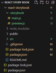
After installing the React app and setting up Storybook, the directory structure will look like this.
Writing Stories:
Here, we’ll craft stories for the Button component, each showcasing different variants.
- To create stories for the Button component, first, make a folder named Button inside the src folder.
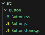
- Inside this Button folder, create three files: one for JavaScript (to write the Button component code, reusable for different versions), one for stories (to define variations), and one for CSS (for button styling).
//Path: src/Button/Button.js
import React from 'react';
import './Button.css';

function Button(props) {
  const { variant = 'Primary', children, ...rest } = props;
  return (
    <button className={`button ${variant}`} {...rest}>
      {children}
    </button>
  );
}

export default Button;
//Path: src/Button/Button.stories.js
import React from 'react';
import Button from './Button';

export default {
  title: 'Button',
  component: Button,
};

export const Primary = () => <Button variant='primary'>Primary</Button>;
export const Secondary = () => <Button variant='secondary'>Secondary</Button>;
export const Success = () => <Button variant='success'>Success</Button>;
export const Danger = () => <Button variant='danger'>Danger</Button>;
//Path: src/Button/Button.css
button{
    display: inline-block;
    font-size: 16px;
    border-radius: 4px;
    cursor: pointer;
    border: none;
    color: white;
    padding: 15px 32px;
    text-align: center;
    text-decoration: none;
}
.primary{
    background-color: #008CBA;
}
.secondary{
    background-color: #8d8787d3;
}
.success{
    background-color: #4CAF50;
}
.danger{
    background-color: #f44336;
}
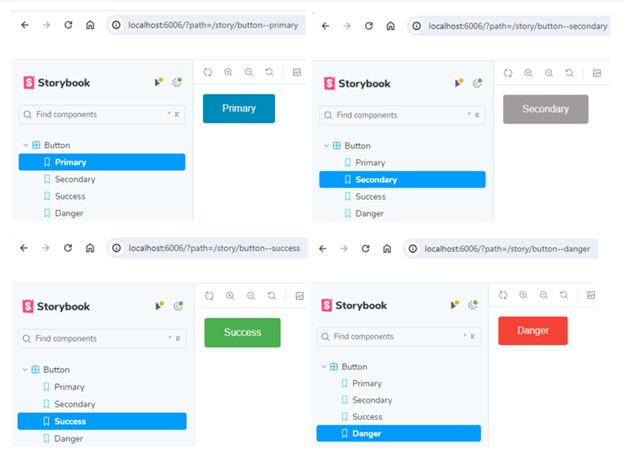
Output:
This code creates a reusable Button component in React.
In ‘Button.js’:
- It imports React and a CSS file for styling.
- Defines a functional component named Button which takes in props.
- Destructures props to get variant (default is ‘Primary’) and children (content inside the button).
- Renders a button element with a dynamic class based on the variant prop.
- Exports the Button component.
In `Button.stories.js`:
- It imports React and the Button component.
- Exports a default object which configures storybook settings for the Button component.
- Defines multiple stories (variations) for the Button component, each with a different variant (Primary, Secondary, Success, Danger).
These stories help developers visually test the Button component in different scenarios.
Conclusion:
Storybook lets developers create and test website components separately, improving focus and collaboration. It’s like a workshop where parts are perfected before assembly, making development more efficient. The guide and Button example show its practical benefits for building better websites.