AEM components dialog is the most important part of AEM. We cannot reuse components without the AEM components dialog.
What is a Design Dialog?
A design dialog is a special kind of dialog that is available only in page design mode in AEM. It allows authors to customize the design of a component by adjusting properties (Ex. color, images, and layout).
This is a dialog that can store content and configuration that can be used on different pages. This is used when we require the component and configuration to be the same across the application and which are created in the same template.
Ex. We can create a logo and use the design dialog for the logo component because the logo will be the same throughout the component.
What Does the Design Dialog Look Like?
- Open the author page and change the editing mode to Design mode.

Fig: Author Page
- Below are the design modes for the image component.
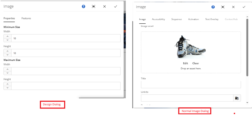
Fig: Design Dialog & Normal Dialog
Differences Between Dialog and Design Dialog
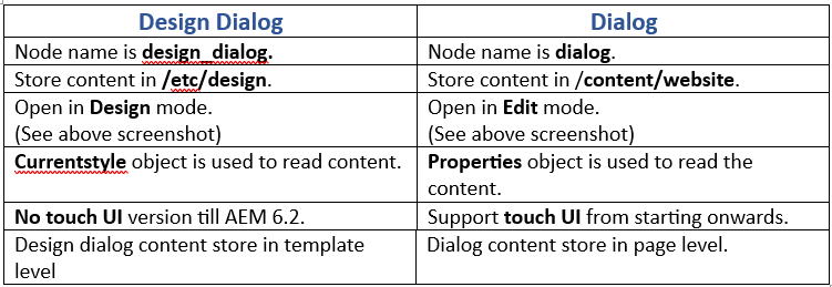
Fig: Difference between Dialog & Design Dialog
How to Create a Design Dialog
Tab component before creating design dialog.
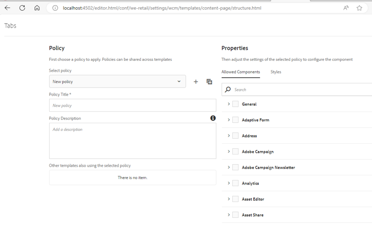
Fig: Tabs component Before Design Dialog
Step 1: Log in with crxde lite (http://localhost:4502/crx/de/index.jsp#/apps).
Step 2: Navigate to folder structure (/weretail/components/content/tabs).
Step 3: Select the component and create a node called cq:design_dialog.

Fig: Create Node
Step 4: Create different nodes with component names, add attributes, and save.
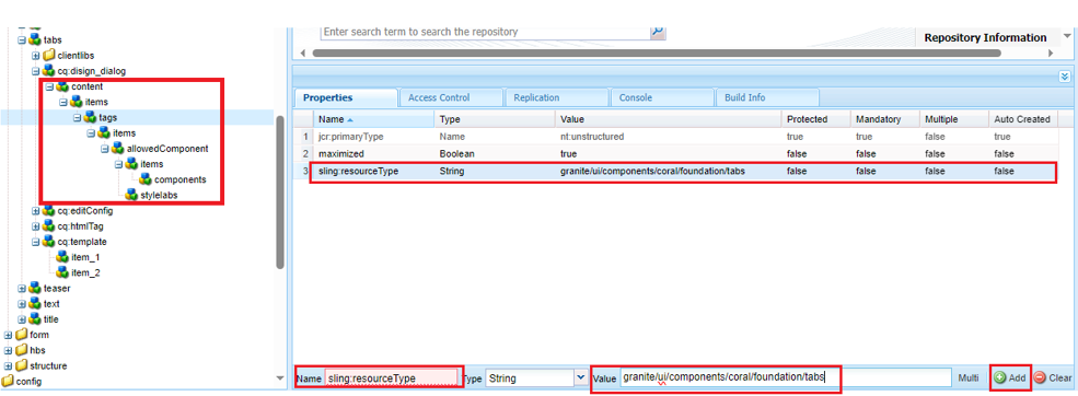
Step 5: Open the author URL, navigate the content page template, and verify the tab component.
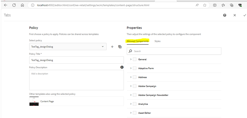
Fig: Tab component after Design dialog
Ex. Design dialog of the text component
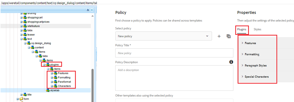
Fig: Design dialog of Text component
Design dialog isolates problems. It is used to change its layout, design, and style. Components are easier to maintain and update over time.

