Welcome back to getting to know Sitecore search. In this post, we’ll continue modifying our react ui to add a search bar, facets, sort options, and more style updates.
Update Search Results Component
In the previous post we used the basic search results component. But it was missing a search bar. Luckily, the sdk has a results component that includes a search bar . I followed the same instructions in my previous post to add the new component. I added the new SearchResultsWithInput widget to my main widget provider. Voila, I had a search bar above my search results. Some of the class names from the SearchResults widget changed, so I did have to make some updates to my previous css.
Adding Facets
There are two facets in your account by default: type and tags. You can add new facets from the Domain Settings page.
- Administration/Domain Settings/Feature Configuration
- Edit Facets
- Add an Attribute
- Choose the fields to add to the facet
- Set the label
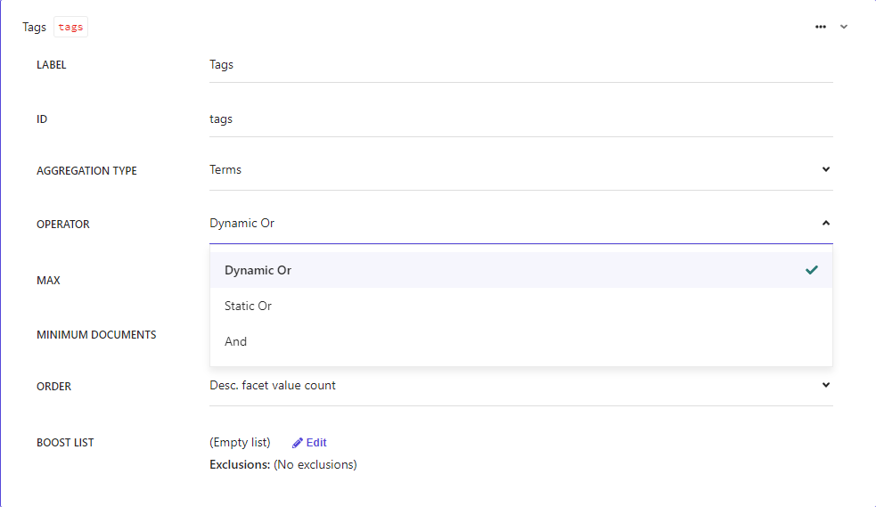
- Choose operator type
- Default is dynamic or
- An item will show in the results if it matches any of the selected facet options
- Default is dynamic or
- Save
- Publish domain settings
- Reindex your sources
Be aware that these facets are not immediately available. You must reindex your sources for the facets to be available.
Add Sorting Options
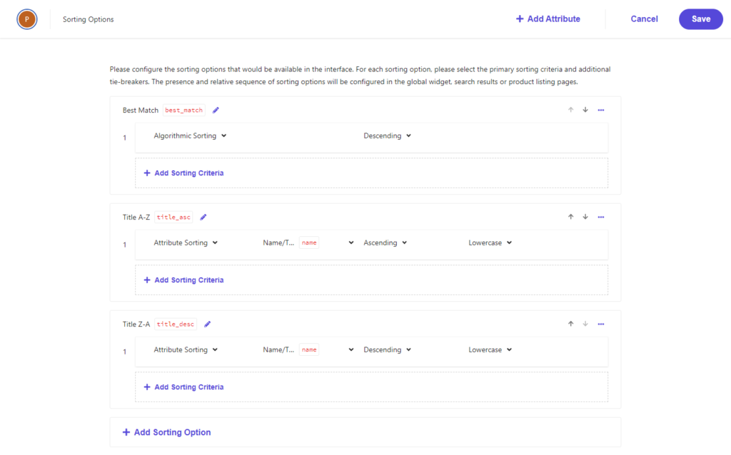
There are no sorting options created by default. Some common sort options to include are: best match, A – Z, and Z – A. You can add new sort options from the Domain Settings page.
- Administration/Domain Settings/Feature Configuration
- Edit Sorting Options
- Add a Sorting Option
- Set the display name and api name
- Choose attribute and sort direction
- Use the up/down arrows to change the order of the items
- Save
- Publish domain settings
- Reindex your sources
- Update SearchResultsComponent.defaultSortType in your react application
- Use api name
Be aware that these sorting options are not immediately available. You must reindex your sources for the sorting options to be available.
Update Widget Settings
We can update our widget settings to control our newly created facets and sort options.
- Enable/disable
- Control the display order
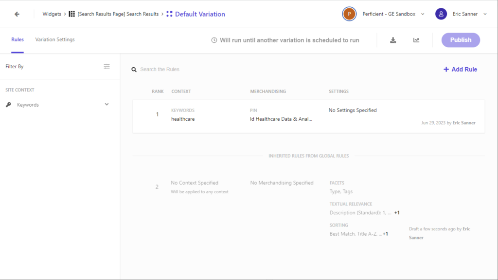
The settings are rule based per widget variation.
- Add a new rule
- Specify any site or visitor contexts
- Configure any boost, bury, or blacklist rules
- Apply settings
- Available facets
- Sorting
- Save
- Publish widget
You can create multiple rule sets per widget.
Hierarchy of Settings
There are several places to edit settings within the CEC. Each level can override the settings from previous levels.
- Domain Settings – Define configurations
- Global Resources/Global Widget/Global Widget Settings – Sets the default behavior for all widgets
- Global Resources/Global Widget/Global Widget Variations – Override the default behavior within a specific site or visitor context
- Widgets/Widget Variation/Rules – Override any global widget settings or global widget variations for this specific widget variation
You can see on the widget variation page which rules will be inherited.
Styling
The html structure of the default sdk components is well organized. Everything is granular and can be easily styled.
- Search bar
- Left column
- Clear facets
- Clear filter button
- Clear individual facet
- Facets
- Facet trigger
- Facet options container
- Facet options
- Clear facets
- Right column
- Results header
- Sort by
- Current sort
- Sort trigger
- Sort dropdown
- Sort options
- Search results
- Row
- Title
- Description
- Image
- Link
- Results per page
- Current results per page
- Results per page trigger
- Results per page dropdown
- Pagination
- Active page
- Available page
- Previous arrow
- Next arrow
I put a border around the search input box, added plus and minus icons to the facet triggers, gave a background to the dropdown for the sort options and number of results per page, added some general spacing around various elements. I’m no UX designer for sure, but I was pleased with my results.
Here is the css I used to create this page.
/* Search Bar */
div.sc-AOXSc {
  margin: 10px auto;
}

div.sc-AOXSc input,
div.sc-AOXSc input:focus {
  border: 1px solid black;
  height: 30px;
  padding-left: 20px;
}

/* Left Side Bar */
section.sc-ciJnBw {
  margin-left: 10px;
  margin-right: 10px;
}

/* Clear Facet */
section.sc-ciJnBw button.sc-iAfmwU:focus,
section.sc-ciJnBw button.sc-iAfmwU:hover {
  border: 1px solid black;
  text-decoration: none;
}

/* Selected Facets */
ul.sc-eflkNB li {
  margin-left: 10px;
}

/* Facet Trigger*/
div.sc-lltjXc button.sc-cwKisF {
  text-indent: 10px;
}

div.sc-lltjXc h3[data-state="closed"] button:after {
  content: '+';
  margin: 0px 10px;
  text-indent: 0px;
}

div.sc-lltjXc h3[data-state="open"] button:after {
  content: '-';
  margin: 0px 10px;
  text-indent: 0px;
}

/* Facet Option */
ul.sc-kgvdhe li {
  margin-bottom: 5px;
}

ul.sc-kgvdhe button {
  margin-right: 10px;
}

ul.sc-kgvdhe button:focus {
  border: 1px solid black;
}

ul.sc-kgvdhe label {
  text-transform: capitalize;
}

/* Right Side Bar */
section.sc-jdkVqZ {
  margin-left: 10px;
  margin-right: 10px;
}

/* Results Header */
div.sc-khksUn {
  font-weight: normal;
}

/* Sort Button */
section.sc-bZCZoC button {
  padding: 5px;
}

section.sc-bZCZoC button:focus {
  border: 1px solid black;
}

section.sc-bZCZoC button span{
  margin-right: 10px;
}

/* Sort Options */
div.sc-eDnVMP {
  background-color: lightgrey;
}

div.sc-gKHVLF {
  padding: 5px 10px;
}

/* Search Result Item */
div.sc-ksJisA,
div.sc-ksJisA:focus,
div.sc-ksJisA:focus-within,
div.sc-ksJisA:hover{
  border-bottom: 1px solid black;
  width: 100%;
  height: unset;
  margin-bottom: 10px;
  overflow: unset;
  cursor: default;
}

div.sc-ksJisA h2 {
  font-weight: bold;
  margin-bottom: 5px;
}

div.sc-ksJisA:focus,
div.sc-ksJisA:focus-visible {
  border: 1px solid black;
}

div.sc-fEyylQ {
  display: -webkit-box;
  -webkit-line-clamp: 3;
  -webkit-box-orient: vertical;
  overflow: hidden;
  margin-bottom: 10px;
}

/* Results Per Page */
div.sc-bCnriq label {
  color: black
}

div.sc-bCnriq button {
  padding: 5px;
}

div.sc-bCnriq button:focus {
  border: 1px solid black;
}

div.sc-bCnriq button span{
  margin-right: 10px;
}

/* Results Per Page Options */
div.sc-hLclGa {
  background-color: lightgrey;
}

div.sc-iBAaJG {
  padding: 5px 10px;
}

/* Pagination */
div.sc-bCnriq a {
  padding: 3px 10px 3px 10px;
  border: 1px solid grey;
  background-color: white;
  color: black;
  text-decoration: none;
}

div.sc-bCnriq a[data-current="true"] {
  background-color: black;
  color: white;
}
Be sure to test your styles for focus and hover states. By default, some of the elements do not indicate when they are focused, so it can be easy to lose track of where you are if you using a keyboard to navigate.
Interesting
I did note a few interesting things while writing this article.
- The labels for facet triggers and sort options are not translatable at this time. If you have a multilingual site and are indexing content in multiple languages, you will need to do something to translate the labels in the UI.
- It’s difficult to get the class names for the dropdowns for the sorting and number of results per page. You have to enable “break on subtree modification” on the parent of the button trigger.
- The default components in the sdk are quite usable and accessible. The tab order between items is good. The escape key closes accordions, sort and per page menus correctly. The labels are assigned to buttons correctly.
- The search results are not linked to the target page by default. Update the articlecardstyled.link href attribute so users see the destination url when they hover. Add a window.location.href = a.url to the onclick event. Do not remove the preventdefault or you will not get analytics in the CEC.
- The search data is not carried through the query string. It is not possible to share a url and get someone to exactly the same set of results you are seeing. Which makes sense once you consider personalized results that are targeted for your journey through the site.
Follow me on linkedin to get notifications as new articles are posted.


