This is an overview on Sitecore’s SXA Styles and Variants. This is Sitecore’s way of styling components. SXA comes preloaded with out-of-the-box components that include Variants and Styles. You’ll probably need to customize some of these existing SXA assets, and add some of your own.
*NOTE: Going forward, when I mention “styles” I’ll be referring to Sitecore’s “Style Ticks”, not CSS Styles.
Styles vs Variants
In a nutshell, if you want to change the look without changing the markup, use a Style. If you need to change the markup, use a Variant. One extra benefit of Variants, is that you can load a screenshot of the Variant into the Variant drop-down in the Experience Editor. This allows Content Authors to get a visual representation of the component before they put it on the page. In some instances, I’ve seen a site build completely with Variants, and very little Styles. After all, as a Sitecore developer, the Content Author is your primary customer.
Styles
Styles apply a unique class to the parent element of a component. This allows you to adjust the component and any elements within, using CSS specificity.
You can supply a custom class name in the Value field on the Style node in the Content Editor.
*TIP: Apply which renderings you want the styles to appear under. Otherwise, a Content Author could apply styles that don’t belong on specific components.
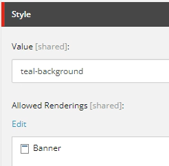
Styles settings
Styles are created in Sitecore at this location.
sitecore/Content/{tenent}/{site}/Presentation/Styles/{component}/{style}
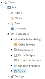
Styles location
Apply the style to the component using the paint bucket icon in the Experience Editor.

Styles application
Variants
Variants allow you to load different markup for a specific component. You can use Sitecore node structure, or Scriban Templates. Scriban is highly recommended.
Variants are created in Sitecore at this location.
sitecore/Content/{tenent}/{site}/Presentation/Styles/{component}/{variant}
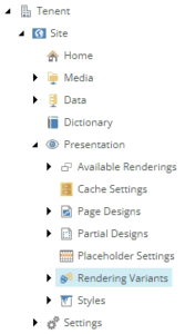
Variant location
When adding a new Variant, make sure you add a custom class name to the parent node in the Content Editor. This will allow you to style the variant using CSS specificity.

Variant class name
For Scriban templates, you can input the exact markup you want in the Template Field.
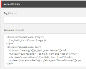
Variant Scriban
Learn all about Scriban on Sitecore’s documentation site.
https://doc.sitecore.com/xp/en/developers/sxa/100/sitecore-experience-accelerator/scriban-templates.html
Apply the Variant to the component using the Variant drop-down on the component in the Experience Editor.

Variant application
File Structure and Code Patterns
SXA comes with a pattern already in place. It is recommended to follow the existing patterns to maintain readability across your entire dev team, and for developers who haven’t yet joined your dev team.
CSS files are organized with ‘component files’ loading ‘sub-files’. The Component files are in the ‘{theme}/sass’ folder and are named component-{component}.scss coinciding with the name of the component.
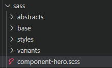
File Structure component location
Sub-files are located in ‘styles’ and ‘variants’ folders in the same ‘sass’ folder, and are named by the class name used in Sitecore.
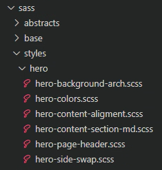
File Structure sub-file location
Within these component files are @includes that load the Sub-files.
*TIP: It is recommended to call these imports within the root class name, to strengthen CSS specificity.
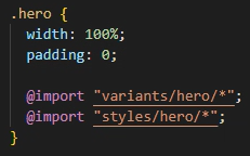
File Structure input
So that’s it! Knowing how these systems work will help with estimations, and future enhancements.
Go forth and add Styles and Variants to your Sitecore instance, with the Content Author in mind.

