Recently our Twilio delivery team has been looking at Paste, the new design system created by Twilio for in-house use. The Signal conference offered a great overview of Paste – How we built a unified, inclusive design system to nurture Twilio’s UX. If you have a Signal pass, I encourage you to watch it on demand.
Led by Twilions Aayush Iyer (Sr. Manager, Design Systems) and Jade Pennig (Engineering Manager, Design Systems), the discussion gave an intriguing background on how Paste came about and the problems it solves.
The Need Described
As Twilio has grown, the need for consistent UI/UX across the product space has grown along with it. Key drivers for the evolution of Paste include:
- The Twilio Console is used to administer, configure and support all of Twilio’s services. UI design for the Console has historically been a joint effort among various product groups. Increasingly, it has been suffering from inconsistency, lack of repeatable and re-usable patterns and components and difficulty in maintenance. Twilio took a giant step to address these concerns earlier this year with an overall redesign, in part using Paste.
- Acquisitions (SendGrid, Segment, etc.) bring their own design language, patterns and approaches.
- The Flex UI is a huge jump forward in customization for contact center agents and supervisors. But it still has limitations and inconsistencies in how, and to what degree, components can be re-used and styled.
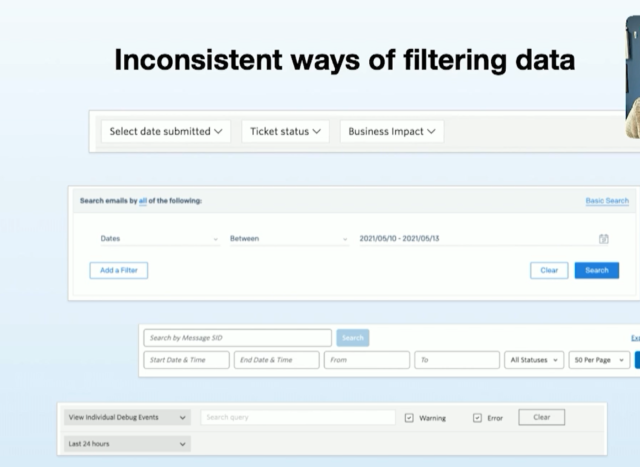
The Signal session provided examples of these inconsistencies – many of which I’ve personally experienced. These include inconsistent actions and patterns for “copy to clipboard”, variations in the way alerts and messages are surfaced to the UI, and different user interfaces and approaches for filtering data. These inconsistencies increase cognitive load. They also fail to provide an intuitive and clear way to learn to use the UI based on established patterns.

With the high velocity of product development, it is difficult to address accessibility concerns. As mentioned in the session, “Prioritizing accessibility is hard when you are moving fast.”
Examples:
- contrast ratio issues
- actions not accessible to keyboard-only users
- an interesting one I didn’t realize: ALL CAPS titles are typically interpreted by screen readers as acronyms
Use Cases In Our Delivery Practice
As a Twilio partner, Perficient’s engineers often spend time building plug-ins for Flex. We may also customize customer-facing UIs like web chat. Lately we’ve also seen an increase in solutions using a broader suite of Twilio services outside Flex. Applications using Twilio Video, Programmable Voice and Programmable Messaging may require UI elements to be built, whether customer-facing or simply to allow for administration.
We do have some experienced front-end engineers on our team. But more typically, it’s the old problem of developers, not front-end designers, trying to compose UI. As I’ve said to a few people, “I’m not a front-end UI designer, but I did stay at a Holiday Inn Express last night.” Kudos to the 5 of you who will get that joke.
The point is, I’m happy for anything that helps our engineers build UIs that come together quickly and consistently.
How the Paste Design System Helps
Paste helps by providing reasonable defaults, a great box model, consistent styling approaches and an opinionated way of styling React components. Often when customizing Twilio interfaces, we want a button or other element to fit the design language used by other Twilio products. It generally requires trial and error, and never seems to be exactly right.
Due to the original design of Flex UI version 1.x, we’ve been a bit locked into older versions of things. For instance, if you want to use MUI (Material UI) you have to use the version Flex 1.x is using, which is a version 3.x. MUI is now on version 5. Much of the interesting work, improvements, new patterns and modern components have moved on.
Twilio added support for newer versions of React over the past year. Prior to this, Flex UI was pinned to an older version of React. This created some limitations in using newer options and approaches around styling libraries. We’re hoping based on some of the demos we saw during Signal that aspects of the Paste design system will begin to make their way into future versions of Flex as well.
Next Steps
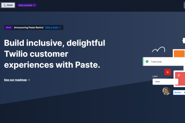
Paste is available to use now in your own front-end development. It uses a theme-first approach. Initial themes are based on the recent Twilio Console redesign and SendGrid design language. A key feature of Paste is transparency. All roadmaps are public and a collaborative approach to changes is prioritized.
Coming soon:
- Color Modes (the always popular Dark Mode for instance)
- the ability to do extensive customization on components to fit your unique needs
- a WYSIWYG theme designer
If this is all interesting to you and you’d like to learn more, read some additional articles from the Paste team. We think this library is going to get a lot more attention over the next year, so it’s a great time to start getting familiar with it.

