
The case for permission-based navigation
Many app stakeholders want to lock down parts of their canvas apps so that certain screens are only accessible to a subset of application users. Configuration of these permissions can be achieved a variety of ways, including security roles, CDS data, or other logic based on the current user. If a screen is not referenced in any Navigate functions throughout your application and its not the home screen, there is no way to access the page in the published version of the canvas app. In this post we will walk through dynamically hiding screens within a reusable navigation component.

Admin view of home screen with all navigation elements visible
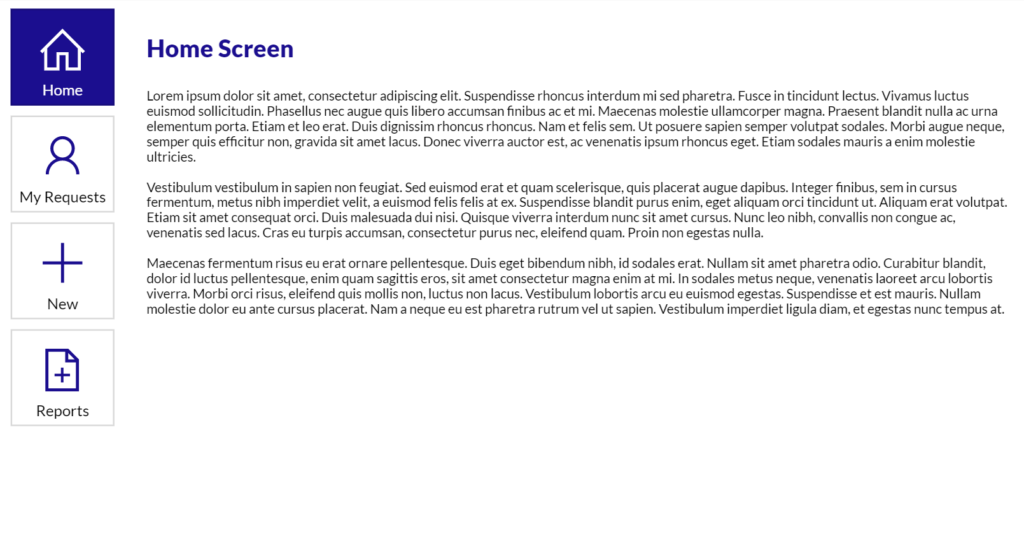
Admin view of home screen with some navigation elements visible
Setting up the navigation component
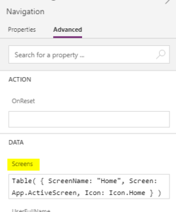
The driver of the navigation component is its custom properties. Create a new component and rename it Navigation. The most important property for this component will be a Table. Add a new table property to the Navigation component and title it Screens. One pain point to conditionally showing and hiding screens in the navigation is alignment. If the user is not an admin, we want to hide the Admin screen from the navigation, but we want to avoid a blank space. Therefore, the Screens table will be connected to the Items property of a gallery. It removes the need to to maintain conditional button coordinates, which can get messy.
Table property
As for the structure of the table, there are three fields: the screen itself, the name of the screen, and an icon. The screen name and icon are not technically required but can make it easier for users to understand the app’s structure. So that the table in the component correctly recognizes the types of each field, after creating the screens property as a table type, add the following sample table values:
Component’s Screens property configuration
Connecting the table to a gallery

Now that the component has an outline of which fields types are relevant to the table property, the next step is to add a gallery and change the Items property to Navigation.Screens. First add a button to the gallery. Change the Text property to ThisItem.ScreenName and the OnSelect property to Naviate(ThisItem.Screen). A transition type may also be added here, but is not required. Next, add the icon on top of the button and change the Icon property to ThisItem.Icon. Finally, adjust the style-related properties of the button and icon to match your company’s desired branding.
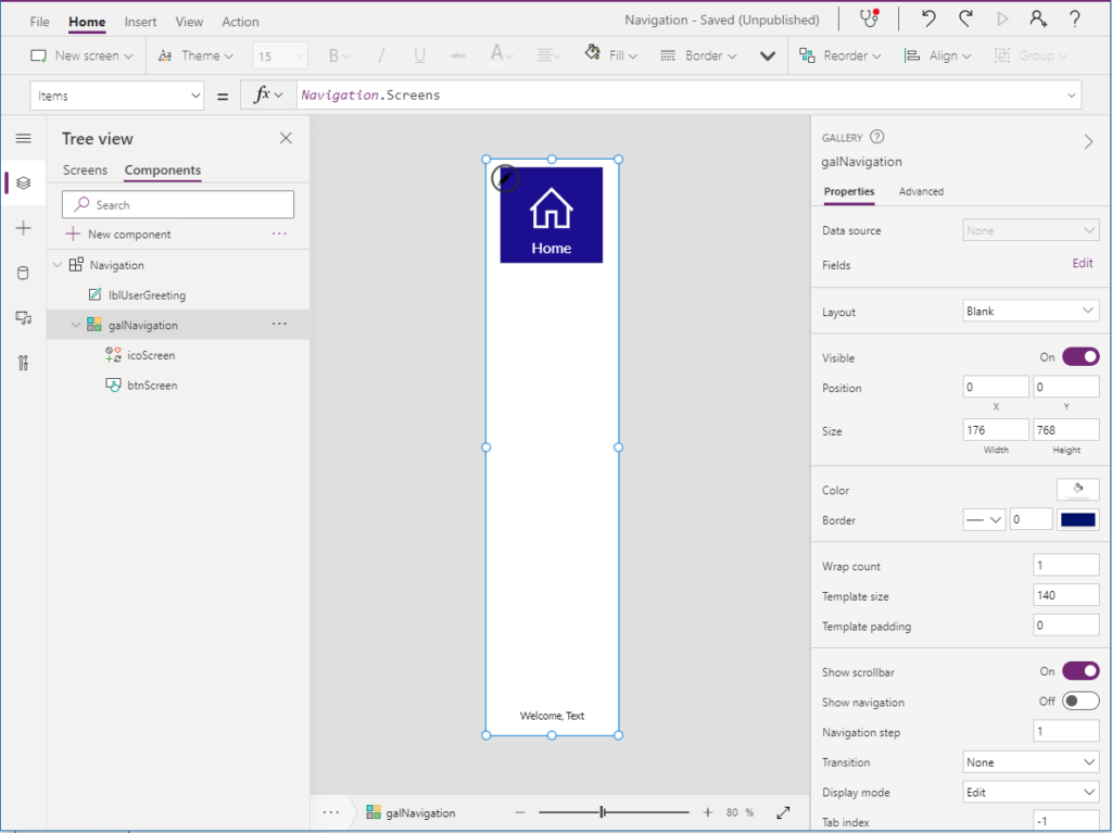
Items property of component’s gallery
Conditional styling
To further improve ease of use within your application, it may be helpful to add additional styling to the buttons so there is an indicator of which screen is active. This can be done referencing App.ActiveScreen. For example, the fill color of the button can be based conditionally on if the screen field in the selected item in the gallery is equal to the screen the user is currently viewing:
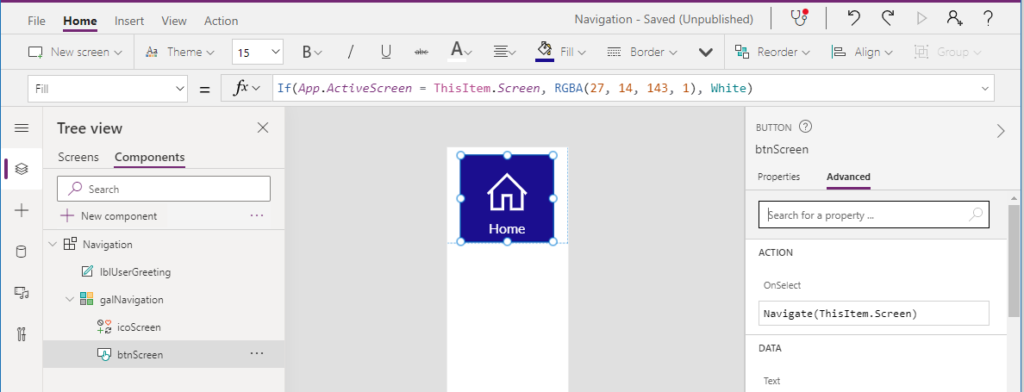
Conditional formatting on button Fill property
Adding the component to a screen
The component is now complete, so it can be added to the first screen in the application. After adding the new component, the next step is to build the table that will be passed to the table property in the new component. Like the property within the component, the table will have a ScreenName, Screen, and Icon. In addition, it should have a Boolean field called Visible, to decide if the screen should be surfaced in the app.
For ease of testing purposes, a global variable will be initialized to determine if the user is or isn’t an admin in the app OnStart:
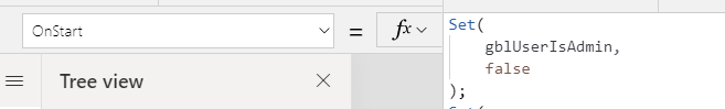
Changing OnStart for testing
Next, build the table with the four fields for each of the screens in the app that should be surfaced in the application by at least one user. In this example, there are 5 total screens. The Admin screen should only display if the user is an Admin, or gblUserIsAdmin is true.
Set(gblScreens,
   Table(
            {
                ScreenName: "Home",
                Screen: Home,
                Icon: Icon.Home,
                Visible: true
            },
            {
                ScreenName: "My Requests",
                Screen: 'My Requests',
                Icon: Icon.Person,
                Visible: true
            },
            {
                ScreenName: "New",
                Screen: 'Create New Request',
                Icon: Icon.Add,
                Visible: true
            },
            {
                ScreenName: "Admin",
                Screen: Admin,
                Icon: Icon.Lock,
                Visible: gblUserIsAdmin
            },
            {
                ScreenName: "Reports",
                Screen: Reports,
                Icon: Icon.AddDocument,
                Visible: true
            }
        )
     )
Removing certain screens from navigation based on current user
Run the OnStart and update the Screens property of the navigation component on the screen to gblScreens. This should show all the screens referenced in the table, but the Admin screen is still shown even though the gblUserIsAdmin variable is still set to false. Therefore, the final step will be to wrap the Table (gblScreens variable) in a Filter formula, so we remove the screens that shouldn’t be visible:
Set(
    gblScreens,
    Filter(
        Table(
            {
                ScreenName: "Home",
                Screen: Home,
                Icon: Icon.Home,
                Visible: true
            },
            {
                ScreenName: "My Requests",
                Screen: 'My Requests',
                Icon: Icon.Person,
                Visible: true
            },
            {
                ScreenName: "New",
                Screen: 'Create New Request',
                Icon: Icon.Add,
                Visible: true
            },
            {
                ScreenName: "Admin",
                Screen: Admin,
                Icon: Icon.Lock,
                Visible: gblUserIsAdmin
            },
            {
                ScreenName: "Reports",
                Screen: Reports,
                Icon: Icon.AddDocument,
                Visible: true
            }
        ),
        Visible
    )
)
Re-run the OnStart and note that the navigation component should now hide the Admin screen. Test this behavior by switching the value for gblUserIsAdmin. In the long term, the logic for setting if the user is or isn’t an admin may be connected to a relevant data source with this information.