In honor of Global Accessibility Awareness Day (GAAD), we’re examining common accessibility errors and providing recommendations for fixing them. The first topic in this series:
Fixing Low Contrast
WCAG Success Criteria 1.4.3 – Contrast (Minimum)
The visual presentation of text and images of text has a contrast ratio of at least 4.5:1, except for the following:
Large Text
- Large-scale text and images of large-scale text have a contrast ratio of at least 3:1;
Incidental
- Text or images of text that are part of an inactive user interface component, that are pure decoration, that are not visible to anyone, or that are part of a picture that contains significant other visual content, have no contrast requirement.
Logotypes
- Text that is part of a logo or brand name has no contrast requirement
This criteria is important for those with low vision and/or color blindness. Having sufficient contrast of text and images makes it easier for your content to be read by all your users. For example, white text on white background would have a ratio of 1:1 and is unreadable. On the other side, black text on white background has the highest contrast ratio of 21:1. The contrast ratio of 4.5:1 is the minimum threshold, so the higher the better!
Tools such as the WebAIM contrast checker, aXe browser extension, Microsoft Accessibility Insights, and Google Developer Tools can be used to detect color contrast errors. The results from these tools usually provide hexcode information, the current contrast ratio, and the minimum ratio to pass the criteria.
WebAIM Color Contrast Checker
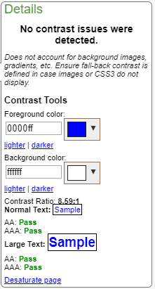
Color Contrast Checker Example #1
 In example #1, the blue text on white background has a color contrast ration of 8.59:1. This ratio passes both AA and AAA WCAG guidelines and would be an acceptable color combination in any digital style guide.
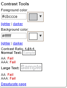
Color Contrast Checker Example #2

In example #2, the gray text on white background has a color contrast ratio of 1.61:1. This ratio fails both AA and AAA guidelines and would need to be modified for compliance. The next step would be to work with your design team to select the best color combination that fits within your style guide.
aXe Browser Extension (Firefox & Chrome)

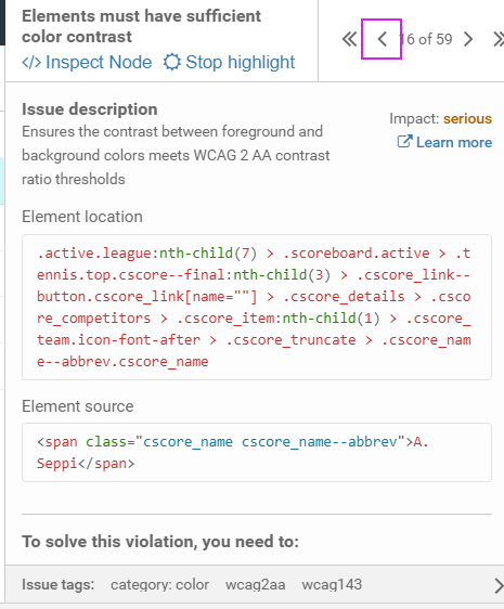
The use of an automated tool is an excellent method to identify color contrast issues on an existing web page. However, there will always be a need for manual investigation. The aXe tool identifies areas that “Need Review,” where the automated tool could not confirm a pass or fail. A common example of this is text over a background image.
For a manual investigation, use the automated tool in conjunction with the browser developer tools to review HTML/CSS. The aXe tool provides element source and element location with a link directing you to the error location in the HTML. From there, review the HTML and CSS to confirm if there is a contrast error.
Google Developer Tools
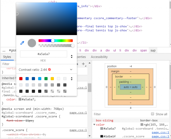
Google Developer Tools has built-in functionality to determine color contrast issues. Once the aXe tool (or any tool) has taken you to the error location, you can go to the style tab to check for the contrast ratio

Accessibility standards should be taken into account and incorporated into your digital style guide during the design process. This is the best way to ensure a compliant site. Text, icons, digital assets, and focus indication should all be taken into account and documented in your style guide. Resolving these issues increases the accessibility for those with low vision and color blindness and improves the user experience for everyone.
At Perficient Digital, our design team is aware of the accessibility guidelines and will always develop a WCAG-compliant style guide that is inclusive and provides a quality user experience for everyone.

