Have users who want to customize branding, colors and buttons in a Lightning Community? Design tokens are the key.
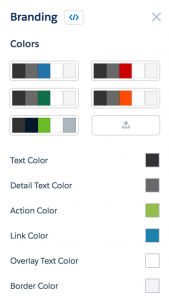
The brand panel in Salesforce Community Builder is equipped with five standard palettes and six color swatches to customize them. Using Lightning design tokens, we can tie these color swatches into a custom Bolt theme, giving users control over the colors in your theme.
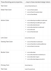
This table documents the swatches and the design tokens that control them. Some swatches can have more than one token applied to them, as is the case with the Action Color.
Using the table above, we can start by applying the action color to the buttons in our template with the colorBackgroundButtonBrand token as seen below.
.THIS button {
background: t(colorBackgroundButtonBrand);
}
.THIS button:hover {
background: t(colorBackgroundButtonBrandHover);
}
The t(tokenName) syntax designates a token reference. Note that Lightning is very particular that a token is used as it was designed. If you try to use colorBackgroundButtonBrand as a text color, your page will throw an error because it is meant only as a background property. To apply text color, you would need to use colorTextBrand or colorTextLink.
Next we could apply the Link Color design token to all our text links.
</span>
.THIS a {
color: t(colorTextLink);
}
 You can allow everything from just text and buttons color changes like the above example, or you can allow broad-stroke color control over your entire theme. Design tokens are a simple way to put the power into the hands of your users.
How to Learn More
For more details on design tokens, check out Salesforce’s full documentation on the design tokens portion of the Lightning Design System reference site or reach out to us with questions.


