As designers, there are a lot of things to keep in mind when creating a site that is accessible to everyone. Jesse Hausler, principal accessibility specialist at Salesforce, touched on these in his post, 7 Things Every Designer Needs to Know about Accessibility. Here are three of my favorite takeaways from his post, along with some tips and methods for testing your work.
1. Accessibility is an opportunity to innovate.
It’s not a barrier to innovation. Accessibility will not force you to make a product that is ugly, boring, or cluttered. It will introduce a set of constraints to incorporate as you consider your design. These design constraints will give you new ideas to explore that will lead to better products for all of your users. It’s an opportunity for new ideas. An attitude check.
2. Don’t use only color to convey information.
Color alone isn’t enough when trying to convey a message. Always pair color with an icon, or – even better – include a label as well. You’re really only using color to highlight or complement what is already visible.
This helps users who are unable to, or have difficulty with, distinguishing one color from another. This includes people who are color blind (1 in 12 men, 1 in 200 women), have low vision (1 in 30 people), or are blind (1 in 188 people).
For example, to display errors after someone tries to complete a form, don’t only use color to show that a field includes an error. Take the form below. Someone who is color blind would have a difficult time identifying which fields are giving errors. Can you guess how many fields have errors by looking at the black and white version on the left? When you see the colored version to the right, it’s surprising to see that all four fields are returning errors (notice the red stroke used around the input fields). Instead of just using color to indicate an field error, try other helpful things like adding an icon, tool tip, and/or label. Complement any use of color with additional visual cues that convey meaning.

3. Contrast helps readability.
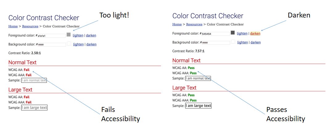
To help with readability, make sure there is enough contrast between any text and the background color. WCAG states level AA requires a contrast ratio of 4.5:1 for normal text and 3:1 for large text. Level AAA requires a contrast ratio of 7:1 for normal text and 4.5:1 for large text. Large text is defined as 14 point (typically 18.66px) and bold or larger, or 18 point (typically 24px) or larger.
There’s an easy way to check for this – use the WebAIM Contrast Checker. By entering in the hex value of the desired text as the “foreground color” and then entering the color of the background on which it will be placed, the contrast checker will immediately tell you whether or not it passes accessibility standards.
How to Easily Check Your Work Using Soft Proofs
Using soft proofs in Photoshop is an excellent way to quickly check your design and discover any areas that could hinder someone who is color blind.
To check this:
- Convert the document to RGB color mode, which provides the most accurate soft proofs for color blindness.
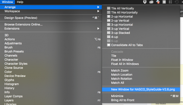
- To simultaneously view the original document and a soft proof, choose Window > New Window and arrange the windows for a side-by-side view (optional).
- Choose View > Proof Setup > Color Blindness, and then choose either Protanopia-type or Deuteranopia-type. (To comply with CUD, check your document in both views.)
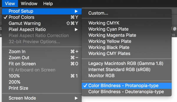
PRO TIP: Once set, keyboard shortcut Cmd Y (Mac) or Cntl Y (Windows) will turn this proof on/off for quick checks!
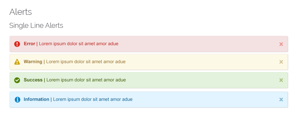
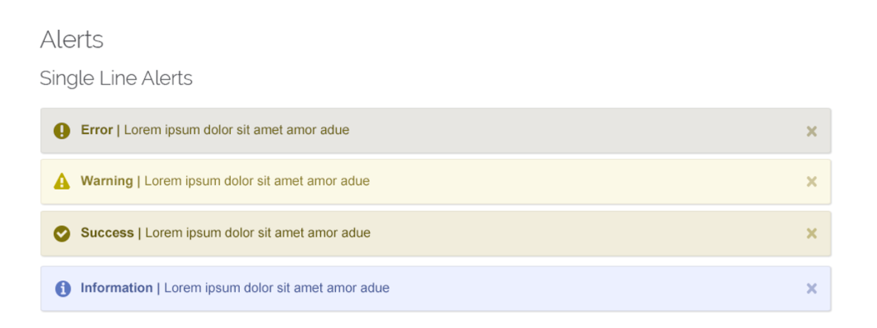
Notice the difference between the top and bottom alerts below. The bottom is showing the Protanopia-type view of color blindness. These alerts are another good example of why you need an icon or label along with using a color to indicate success or errors.
As a designer, it’s important that we remember good design doesn’t just look nice. It needs to provide the best user experience for the largest audience possible. Something might be beautifully designed, but if the user is frustrated or even worse, can’t access information that is important to them, then that design has failed.
As a user, have you run into any issues with accessibility in your life or on the web? Are you a designer that has learned from experience the value of designing for accessibility? If so, I’d love to hear about it in the comments.
