SPSS Data Audit Node
Once data is imported into SPSS Modeler, the next step is to explore the data and to become “thoroughly acquainted” with its characteristics. Most (if not all) data will contain problems or errors such as missing information and/or invalid values. Before any real work can be done using this data you must assess its quality (higher quality = more accurate the predictions).
Addressing issues of data quality
Fortunately, SPSS Modeler makes it (almost too) easy! Modeler provides us several nodes that can be used for our integrity investigation. Here are a couple of things even a TM1 guy can do.
Auditing the data
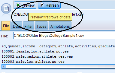
After importing the data, do a preview to make sure the import worked and things “look okay”.
In my previous blog I talked about a college using predictive analytics to predict which students might or might not graduate on time, based upon their involvement in athletics or other activities.
From the Variable File Source node, it was easy to have a quick look at the imported file and verify that the import worked.
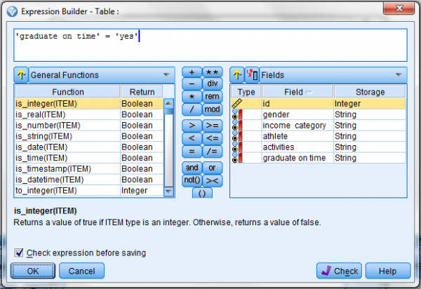
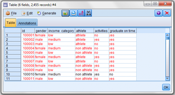
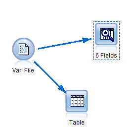
Another useful option is run a table. This will show if field values make sense (for example, if a field like age contains numeric values and no string values). The Table node is cool – after dropping it into my stream and connecting my source node to it, I can open it up and click run (to see all of my data nicely fit into a “database like” table) or I can do some filtering using the real-time “expression builder”.
The expression builder lets me see all of the fields in my file (along with their level of measurement (shown as Type) and their Storage (integer, real, string). It also gives me the ability to select from SPSS predefined functions and logical operators to create a query expression to run on my data. Here I wanted to highlight all students in the file that graduated “on time”:
You can see the possibilities that the Table node provides – but of course it is not practical to visually inspect thousands of records. A better alternative is the Data Audit node.
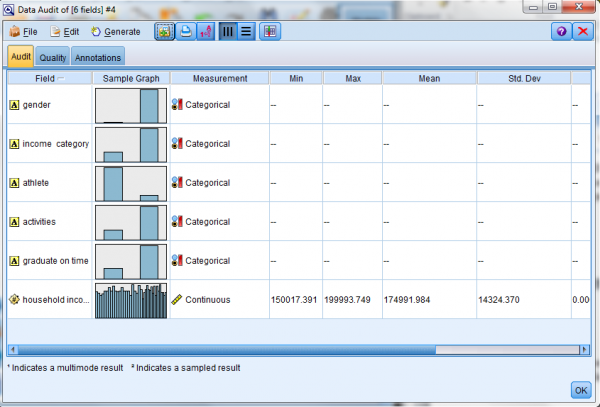
The Data Audit node is used to study the characteristics of each field. For continuous fields, minimum and maximum values are displayed. This makes it easy to detect out of range values.
Our old pal measurement level
Remember, measurement level (a fields “use” or “purpose”)? Well the data audit node reports different statistics and graphs, depending on the measurement level of the fields in your data.
For categorical fields, the data audit node reports the number of unique values (the number of categories).
For continuous fields, minimum, maximum mean, standard deviation (indicating the spread in the distribution), and skewness (a measure of the asymmetry of a distribution; if a distribution is symmetric it has a skewness value of 0) are reported.
For typeless fields, no statistics are produced.
“Distribution” or “Histogram”?
The data audit node also produces different graphs for each field (except for typeless fields, no graphs are produced for them) in your file (again based upon the field’s level of measurement).
For a categorical field (like “gender”) the Data Audit Node will display a distribution graph and for a continuous field (for example “household income”) it will display a histogram graph.
So back to my college’s example, I added an audit node to my stream and took a look at the results.
First, I excluded the “ID” field (it is just a unique student identification number and has no real meaning for the audit node). Most of the fields in my example (gender, income category, athlete, activities and graduate on time) are qualified as “Categorical” so the audit node generated distribution graphs, but the field “household income” is a “Continuous” field, so a histogram was created for it (along with the meaningful statistics like Min, Max, Mean, etc.).
Another awesome feature – if you click on the generated graphs, SPSS will give you a close up of the graph along with totals, values and labels.
Conclusion
I’ve talked before about the importance of understanding field measure levels. The fact that the audit data node generates statistics and chart types are derived from the measurement level is another illustration of how modeler uses the approach that measurement level determines the output.

