
An accordion is a UI element that displays content in a compact, space-saving way. It lets users expand or collapse sections, making it a great choice for FAQ sections, menus, or any content that can be organized into collapsible panels.
In this guide, we’ll show you how to implement a simple accordion using HTML, CSS, and JavaScript.
What is an Accordion?
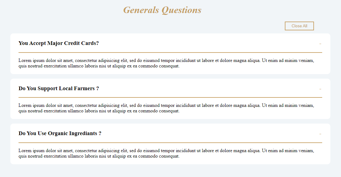
An accordion typically consists of multiple sections. Each section has a title and hidden content that is revealed when the title is clicked. Clicking one section title hides others while revealing the clicked one. This creates a clean and interactive user experience.
Preview

Step 1: Index.html (Our HTML Structure)
Let’s start with the basic HTML structure of the accordion.
Here’s the code:
<!DOCTYPE html>
<html lang="en">
<head>
  <meta charset="UTF-8">
  <meta http-equiv="X-UA-Compatible" content="IE=edge">
  <meta name="viewport" content="width=device-width, initial-scale=1.0">
  <link href="index.css" rel="stylesheet">
  <title>Welcome in my accordion</title>
</head>
<body>

  <div class="accordion">
    <h1><i>Generals Questions</i></h1>
    <div class="expand">
      <button type="button" class="btn_expand">
      </button>
    </div>
    <div class="accordion-item hide">
      <h3 class="title"> You Accept Major Credit Cards?</h3>
      <div class="content">
        <p>Lorem ipsum dolor sit amet, consectetur adipisicing elit, sed do eiusmod tempor incididunt ut labore et
          dolore magna aliqua. Ut enim ad minim veniam, quis nostrud exercitation ullamco laboris nisi ut aliquip ex ea
          commodo consequat.</p>
      </div>
    </div>
    <div class="accordion-item hide">
      <h3 class="title"> Do You Support Local Farmers ? </h3>
      <div class="content">
        <p>Lorem ipsum dolor sit amet, consectetur adipisicing elit, sed do eiusmod tempor incididunt ut labore et
          dolore magna aliqua. Ut enim ad minim veniam, quis nostrud exercitation ullamco laboris nisi ut aliquip ex ea
          commodo consequat.</p>
      </div>
    </div>
    <div class="accordion-item hide">
      <h3 class="title"> Do You Use Organic Ingrediants ? </h3>
      <div class="content">
        <p>Lorem ipsum dolor sit amet, consectetur adipisicing elit, sed do eiusmod tempor incididunt ut labore et
          dolore magna aliqua. Ut enim ad minim veniam, quis nostrud exercitation ullamco laboris nisi ut aliquip ex ea
          commodo consequat.</p>
      </div>
    </div>

  </div>
<script src="index.js"></script>
</body>
</html>
Key Elements of the HTML
-
- Accordion Container: The main wrapper for the accordion, which holds all the items.
-
- Accordion Items: Each item consists of a title (<h3>) and content (<div class=”content”>), which is initially hidden.
-
- Expand All Button: This button allows users to expand or collapse all sections simultaneously.
Step 2: index.css (Styling the Page with CSS)
While we won’t go into full detail about the CSS here, it’s crucial for making the accordion look presentable. The .hide class hides content by default, while the .show class displays content when the accordion section is expanded.
.accordion-item .content {
  display: none;
}
.accordion-item.show .content {
  display: block;
}
.accordion-item.hide .content {
  display: none;
}
Step 3: JavaScript: Making It Interactive

Let’s dive into the JavaScript code that makes this accordion interactive. We’ll handle two key things:
- Toggling Individual Sections: When a user clicks on a section’s title, it should toggle between showing and hiding the content.
- Expanding/Collapsing All Sections: The “Expand All” button will let users expand or collapse all sections at once.
Here’s the code for that:
let content = document.querySelectorAll('.accordion-item');
let title = document.querySelectorAll('.accordion-item .title');
let x = 'isopen';
const clickDefault = () => {
    for (let i = 0; i < title.length; i++) {
        title[i].onclick = function () {
            let contentClass = this.parentNode.className;
            for (let j = 0; j < content.length; j++) {
                content[j].className = 'accordion-item hide';
            }
            if (contentClass == 'accordion-item hide') {
                this.parentNode.className = 'accordion-item show';
            }
        }
    }
}
clickDefault();
const clickExpand = () => {
    for (let i = 0; i < title.length; i++) {
        title[i].onclick = function () {
            let contentClass = this.parentNode.className;
            if (contentClass == 'accordion-item show') {
                this.parentNode.className = 'accordion-item hide';
            } else if (contentClass == 'accordion-item hide') {
                this.parentNode.className = 'accordion-item show';
                clickDefault();
            }
        }
    }
}
let expandButton = document.querySelector('.btn_expand');
expandButton.innerHTML = "Expand All";
expandButton.onclick = function () {
    if (x === 'isopen') {
        content.forEach((element = 'accordion-item hide') => {
            element.className = 'accordion-item show';
            expandButton.innerHTML = "Close All";
            x = 'isclose';
            clickExpand();
        });
    } else if (x === 'isclose') {
        content.forEach((element = 'accordion-item show') => {
            element.className = 'accordion-item hide';
            expandButton.innerHTML = "Expand All";
            x = 'isopen';
        });
    }
}
How the JavaScript Works
- clickDefault Function:
- This function listens for clicks on each title and toggles the visibility of the corresponding content. When a section is expanded, all others are collapsed.
- clickExpand Function:
- This function allows each section to toggle between expanded and collapsed states when clicked.
- Handling the “Expand All” Button:
- The expandButton.onclick function toggles between expanding and collapsing all sections. When clicked, the button changes the text between “Expand All” and “Close All.”
Output
When the Closed All button is clicked, all the sections will be closed:
When the Expand All button is clicked, all the sections will be expanded:
When the “Expand All” button is clicked, all sections expand, displaying all their content at once. Afterward, each item can be closed individually by clicking on its respective title without automatically collapsing any other open sections.
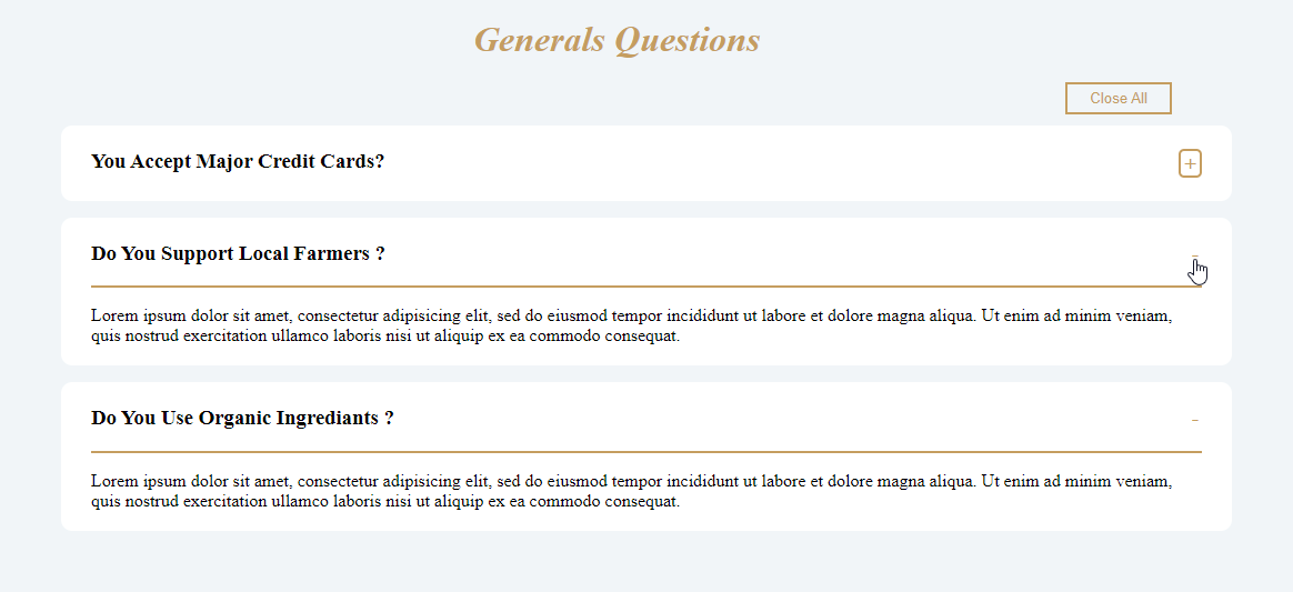
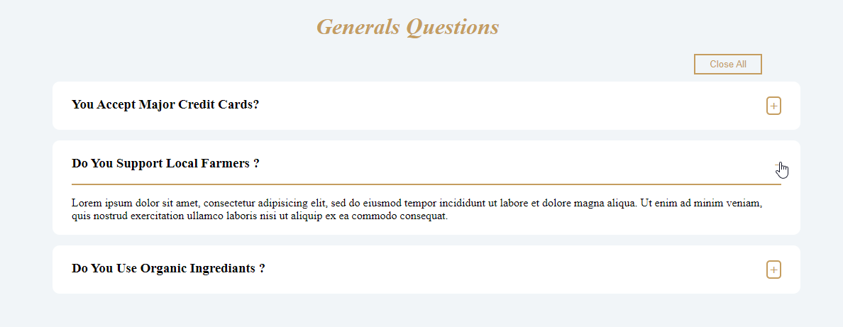
When the “Close All” button is clicked, all the sections are collapsed. Afterward, when you expand a new section, the previously opened section automatically closes, ensuring only one section is open at a time.
Conclusion
We’ve built an accordion using HTML, CSS, and JavaScript in this simple guide. The accordion provides an efficient way to present large amounts of information in a compact form, enhancing user experience by allowing sections to expand or collapse with a simple click.
This is a great guide for implementing an accordion with JavaScript! The step-by-step explanation and code snippets make it easy to follow, even for beginners. Interactive UI elements like these enhance user experience significantly. Thanks for sharing this useful tutorial!
Your article, Implementing an Accordion with JavaScript: A Simple Guide, is a fantastic resource for developers! You’ve explained the concept clearly with practical steps, making it easy to implement. The structured approach and real-world examples are incredibly helpful. Thank you for sharing such a well-explained and valuable coding guide!