When building websites in Optimizely Commerce (Spire), you may need to create sections that span the entire page width. Full-width sections are essential for design elements such as banners, hero images, and background sections. Optimizely Commerce (Spire) provides a flexible framework that makes it easy to configure and implement full-width layouts, allowing developers to create visually engaging designs with minimal effort. This guide will walk you through utilizing this feature to seamlessly create full-width sections.
How to Create Full-Width Sections
Step 1: Folder Structure
- First, ensure you have already created a blueprint under the directory src\FrontEnd\modules\blueprints. For example, you might have a blueprint named CustomBlueprint.
- Navigate to the CustomBlueprint/src. Ensure that a Start.tsx file exists in this directory. If it does not, create and add this file.
Step 2: Understand the Options in Start.tsx
The Start.tsx file is the entry point for setting up the main themes, custom widgets, and pages. It uses Mobius styling principles to ensure everything looks consistent, flexible, and accessible. These principles provide a unified design, allowing for easy customization of themes, colors, typography, and other UI elements while maintaining a seamless, responsive user experience across devices.
In the Start.tsx file, you will find two options for configuring the full-width layout through the style guide:
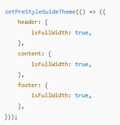
- setPreStyleGuideTheme: If you add your code under this method, you can update the full-width settings directly from the content admin interface
- setPostStyleGuideTheme: If you use this function, the full-width settings will be fixed, and you won’t be able to modify them from the content admin interface.
Step 3: Full-Width Configuration Code
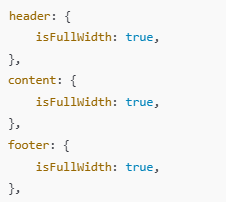
Optimizely Commerce (Spire) already provides a built-in solution to configure sections like the header, content, and footer to span the full page width. To enable full-width for these sections, use the following code snippet:
Explanation
- header: { isFullWidth: true }: Ensures the header section spans the full width of the page.
- content: { isFullWidth: true }: The main content area extends from edge to edge, perfect for displaying banners or immersive visuals.
- footer: { isFullWidth: true }: Sets the footer to full width, ideal for footers with background colors or design elements that must reach the screen’s edges.
Step 4: Integrate the Code
Add the above code to the Start.tsx file within one of the theme configuration functions (setPreStyleGuideTheme or setPostStyleGuideTheme), depending on whether you want to allow updates to the full-width settings from the content admin interface.
Step 5: How to Update the Full-Width Configuration from the Content Admin
After configuring the full-width settings in the Start.tsx file, Optimizely Commerce (Spire) provides an easy way to manage and update these configurations directly from the Content Admin interface.
- Go to the Content Admin and navigate to the Style Guide

- In the Site Configurations section, you will find the Full Width settings.
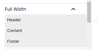
- Click on each option (Header, Content, and Footer) to see a toggle that allows you to make the section full-width.
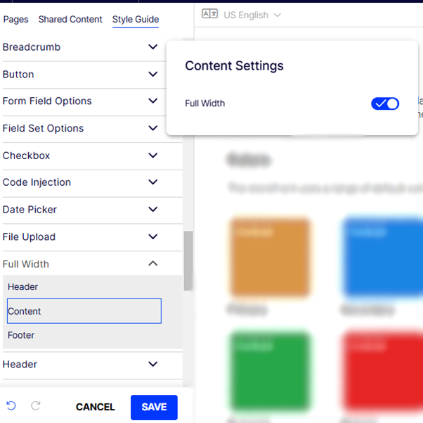
Note: You can only update the full-width setting using the setPreStyleGuideTheme option in the Start.tsx file.
- After updating the value in the Settings modal, ensure you save the changes.
Step 6: How to Use the Full-width Option on Actual Pages
- To use the full-width option on pages, add a Row widget. Edit the Row widget, and you will see a Full Width Checkbox option (by default, this option will be unchecked).
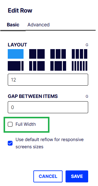
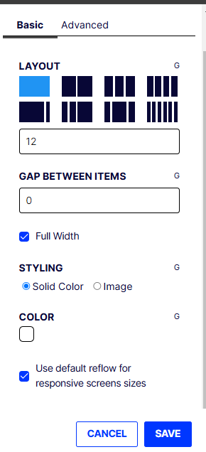
- To make the section full width, check the checkbox.
Note: Once the checkbox is checked, any content in that row will be displayed at full width.
Conclusion
Optimizely Commerce (Spire) provides a straightforward and flexible solution for creating full-width sections, making it easier to design visually engaging websites. Following the steps outlined in this guide, you can quickly enable full-width layouts for your header, content, and footer. Whether you prefer to manage these configurations through the Content Admin interface or directly in the code, Optimizely Commerce offers the flexibility to create seamless, immersive designs that enhance the overall user experience. With full control over these settings, you can customize your site’s layout to fit your specific design needs while maintaining a consistent and responsive interface across devices.

