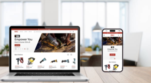
In the world of Ecommerce, competition is fierce, and your potential customers are just a hop, skip, and click away from visiting your competitors’ sites. The first impression and encounter between your online store and a visitor can be the make or break on whether the visitor turns into a buyer, much like how first impressions can make or break a blind date. In this blog, we will discover how you can ensure that your ecommerce site is making a great first impression on your visitors with the help of the Perficient Accelerator for SAP Commerce.
Setting the Scene for a Good Date and a Bad First Date
Picture this, you have been set up on a blind date by your friend. Your friend tells you that they set you up with a good friend of theirs and think that you two are a great match. You agree to meet the person you have been set up with at a nice restaurant. You walk in and instantly notice your date. They dressed for the occasion, are on time, and greet you with a smile.
Before even speaking a word to your date, they have made a good impression on you. They have done all the little things right and because of that, you are willing to listen to them and move the date along.
However, making a bad first impression has just as big of an impact, if not bigger, than a good first impression. Imagine the same scenario except when you showed up, your date was late, did not have their hair done, and did not dress for the occasion. And on top of that, they greeted you with a frown and rolled their eyes. You would probably quickly decide this wasn’t going to work and might even leave altogether.

Creating Good First impressions for your Ecommerce Site
Similar to a first date, a bad first impression on your ecommerce site will have a deal breaking impact. If your ecommerce site isn’t “dressed for the occasion,” your visitors will likely leave your site without a second thought of browsing your product catalog. The initial interaction a visitor has on your site significantly impacts whether they decide to explore your products or bounce off the page.
Much of the first impression, both in dating and ecommerce, is visual. Before getting the chance to even talk to your date, you must first visually see them. Similarly, before making a purchase on an ecommerce site, visitors must visually experience the site. If the site appears buggy, outdated, or hard to read visitors might decide not to buy from it even before exploring the products.
Remember, in ecommerce, your competition is literally just a click away. That’s why creating a strong first impression is paramount to your ecommerce success. Here are some ways you can create a captivating site design to make a positive first impression on your visitors:
Dress to Impress: What it Takes to Craft an Engaging Front-End Experience
1. Clear Call-to-Action (CTA): Your product pages should have a clear and easy to find CTA that stands out. For any ecommerce website, the desired CTA is for the visitor to buy your products. A strong CTA encourages visitors to take the desired action, such as “Add to Cart” or “Buy Now.” Here are some best practices to follow when it comes to your CTA:
- CTA button should stand out from the rest of the page. It should be a different color than the rest of the page, so it is easily recognizable.
- On mobile the CTA button should land above the fold, meaning the visitor does not have to scroll down to find it.
- Keep the CTA copy simple. A simple “buy” or “add to cart” works just fine. You don’t want to be too elaborate in the CTA copy to not risk confusing the user.

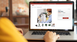
2. High-Quality Photos: Engaging, high-resolution product images are crucial in presenting your product in the best light. Visuals play a significant role in convincing potential customers of the product’s quality and value. Even if you do not sell tangible products, it’s important to have high-quality photos that show people smiling and having success using your product. On your product page it is important to:
- Use high quality images that are big enough for the user to clearly see.
- Show multiple angles of the product.
- Show a person using your product.
- Allow the user to zoom in on the product.
- Link images to product variants
3. Good Spacing: A clean and organized layout with proper spacing is important to any website’s design as it makes the website easier to navigate. This is especially important for mobile users. If your products and links are too  close together it makes it difficult for the user to accurately click on the product they want to see. This clutter leads to a bad user experience.
4. Fast Page Load Speed and Checkout: Nobody likes a late date, right? It’s important to be on time and being late can be a deal breaker. Well, the same goes for your ecommerce site. A slow page load time or checkout process can be the difference between a conversion and an abandoned shopping cart. Slow page load times can lead to frustration and an increase bounce rate and slow order checkout process will lead to higher shopping cart abandonment rates.
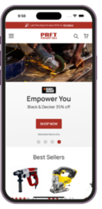
5. Dynamic Banners: Visually appealing and interactive banners create a more engaging and impressive experience for users. A good dynamic banner has a clear CTA, responsive design, and allows for content personalization that adds to the site’s overall aesthetic and also promotes product discoverability.
Meet Your Perfect Match: Perficient’s Accelerator for SAP Commerce
With more than 65 SAP Commerce engagements and 122 SAP Commerce developers, Perficient is a leading SAP Commerce partner. Leveraging our expertise in SAP Commerce Composable Storefront projects, Perficient has crafted an accelerator that streamlines development and enhances user experiences. The Perficient Accelerator for SAP Commerce not only seamlessly integrates with platform features but also showcases its potential through customizable components, delivering unmatched functionality.
Check out our SAP Accelerator demo to get a glimpse of how we can transform your site! Now that you know what it takes to make a great first impression to keep your visitors on your page, learn more about how we can accelerate your commerce transformation!

