
What is a Box and Whiskers Plot? Understanding a Powerful Tool for Data Visualization.
1. Introduction
Welcome to our exploration of the Box and Whiskers Plot, a fundamental tool in the world of data visualization. This type of plot, also known as a box plot, gives us a unique way to understand a dataset’s distribution and summary statistics in a graphical manner. In this blog, we’ll explore box and whiskers plots, their essential components, and how they are used in various fields for data analysis.
2. Understanding the Concept of Box and Whiskers Plot
A. What is a Box and Whiskers Plot?
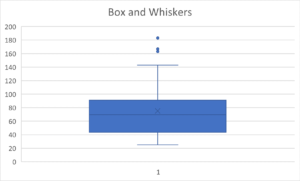
A Box and Whiskers Plot is a simple yet powerful way of visually displaying the five-number summary of a dataset: the minimum, first quartile (Q1), median (Q2), third quartile (Q3), and maximum. These plots allow you to understand the data’s spread and center. The ‘box’ represents the interquartile range (the middle 50% of scores), while the ‘whiskers’ represent the rest of the distribution, except for any potential outliers.
B. Key Elements of a Box and Whiskers Plot
Here are the main components of a box and whiskers plot:
- Minimum: The smallest data point, represented by the left end of the whisker.
- First Quartile (Q1): This is the median of the lower half of the data (excluding the median of the entire data set), represented by the left edge of the box.
- Median (Q2): The middle value of the data when arranged in ascending order, represented by a line inside the box.
- Third Quartile (Q3): The median of the upper half of the data (excluding the median of the entire data set), represented by the right edge or top half of the box.
- Maximum: The largest data point, represented by the right end or top of the whisker.

Now that we’ve familiarized ourselves with the concept and key elements of a box and whiskers plot, we’re ready to dive deeper. In the next section, we’ll explore how to create a box and whiskers plot step by step.
C. Making a Box and Whiskers Plot
Creating a box plot, or a box and whisker chart, requires a structured approach. First, you need to have your data ready, preferably sorted in ascending order. If you’re using Excel, select your data series, then click on “Insert” and choose “Insert Statistic Chart,” followed by “Box and Whisker”. This will automatically generate a box plot based on your data. Finally, you need to interpret the plot, understanding that the boxes and lines indicate the distribution of the data, with box limits marking the range of the central 50% of the data and the central line indicating the median value. If you’re working with multiple data sets, remember that each box plot represents one set of data, so comparisons can be drawn.
D. Interpreting a Box and Whiskers Plot
- Minimum and Maximum: These are the lowest and highest data points in your data set, excluding any outliers. In the plot, these are usually represented by the ends of the whiskers.
- First Quartile (Q1): This is the median of the lower half of your data (not including the median of the full data set). In other words, 25% of your data falls below this value. It’s represented by the lower boundary of the box.
- Median: The median is the middle value of your data set when it is ordered from least to greatest. In other words, 50% of your data falls below this value. This is typically represented by a line in the middle of the box.
- Third Quartile (Q3): This is the median of the upper half of your data (not including the median of the full data set). In other words, 75% of your data falls below this value. It’s represented by the upper boundary of the box.
- Interquartile Range (IQR): The IQR is the range of the middle 50% of the data values. It is calculated as Q3 minus Q1. The length of the box in the plot represents the IQR and shows where the bulk of the values in the data set lie.
- Outliers: These are individual data points that fall outside the “whiskers.” Whiskers typically represent the range for the bulk of the data; anything outside of the whiskers is considered an outlier. If outliers are present, the whisker on the appropriate side is drawn to 1.5 * IQR rather than the data minimum or the data maximum. Small circles or unfilled dots are drawn on the chart to indicate where the outliers fall.
Valuable Insight
When comparing multiple box plots, the respective medians can give insight into the differences between the data sets. If the median line of one box plot lies outside of the box of another, then there is likely to be a difference between the two groups.
Also, the shape and spread of the box and whiskers can provide valuable insights. For example, if the box is skewed with one whisker significantly longer than the other, this indicates that the data is skewed in the direction of the longer whisker. Additionally, the range of the box and the length of the whiskers can help indicate the variability of the data, with longer boxes and whiskers indicating more variability.
3. Conclusion – the power of a Box and Whiskers Plot
The box and whiskers plot is unique in that it condenses five key numbers of a dataset population into one visualization. When using a box and whiskers plot, the shape and distribution of a dataset can be understood immediately.
It also highlights outliers at the high and low end of the data’s range, giving a sense of typical values versus rare outliers.
Box and whiskers visualizations are available in most statistical and business intelligence applications. For example, visualization is available in Power BI, Tableau, and Qlik.
Now that you understand Box and Whisker plots and how you can visualize the distribution of a data set, it may just be the first chart you make with any new set of data.