Box-sizing property in CSS
Box-sizing is a CSS property that helps us set the height and width of an element. Sometimes, when we set the height and width of an element, it doesn’t work as expected. In such situations, we can use the box-sizing property to adjust the element’s size.
Box-model:
The Box-model is a term used in CSS to describe the layout of an element.
The CSS box model is the box that is wrapped around every element in CSS. It consists of the content, padding, and border.
By default, total rendered height and width is calculated as:
- padding + border + width = actual rendered width
- padding + border + height = actual rendered height
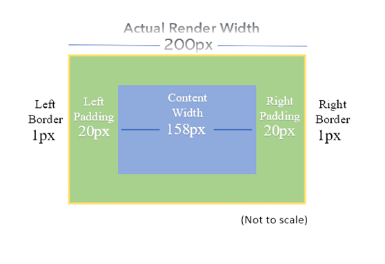
Let’s understand the below example that illustrates the box model.

Without the box-sizing property, the width of the element is the content area.
In the above example, we are setting the width to 158px. It will be set to it but if we add padding of 20px and a border of 1px to both sides, then after rendering, the actual width is 200px.
Box-sizing: Border-box:
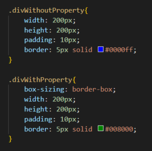
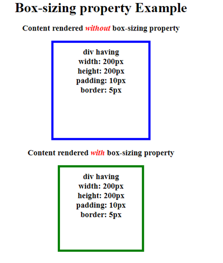
By using this property, we can prevent the border and padding from increasing the element’s width and height. For example, if we set the element’s width to 200px and add some border and padding to it, the actual total rendered width of the component will still be 200px.
Let’s see how it works:

OUTPUT:

Tip:
You do not have to set this property for each element. Instead, use the universal selector (*) to set this property for all components or elements.
How to do it:

Conclusion:
The CSS box-sizing property determines how the size of an HTML element is calculated, allowing padding and borders to be included or excluded from element sizing. By using box-sizing properties, you can create more predictable and consistent website layouts.


Nice blog! I really liked it. The content was informative and well-written. Keep it up!
Great blog! I thoroughly enjoyed reading it. The content was not only informative but also beautifully crafted. Keep up the fantastic work!
Nice! Good blog! Good work!