The AEM Forms product comes with many out-of-the-box (OOTB) UI components that allow you to build meaningful forms for your business; the forms can be used to collect data, like applications, surveys, and consent authorization. But, these OOTB UI form components come with default UI styling. When we integrate AEM Forms into a website, the OOTB form components adapt to the websites styling using the themes. In some business use cases, the themes will not meet the requirements. So, in those use cases, we need to use the custom styling for individual components.
In this blog, I am going to highlight how easy it is to customize the OOTB components’ UI styling. To demonstrate this, I am going to use the AEM Forms Table and Textfield component. The default UI style of a textfield component is to display the border around the textfield as shown below image:
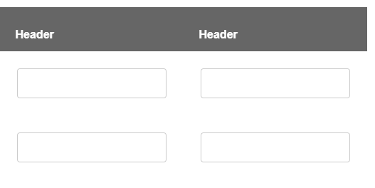
Fig: Border around the textbox
But, when we use this textfield’s inside table, borders hide by default. Please see below image where the border around the textfield is hidden:
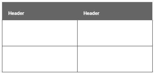
Fig: Border around the table cells
AEM Forms provide flexibility to change the components styling through the UI styling properties panel. When the OOTB properties do not give options to meet your UI requirements, we can add custom CSS and refer it in the UI Styling properties panel.
How to Add Custom CSS
In my AEM application code base, add a custom CSS file and add it to the clientlibraries through css.txt file. Below is the image of my custom css file called tableBorderTextbox.css:

Note: The important thing to notice here is CSS selector path. The custom class name customTableCellTextBox followed by a table body element tbody and last the guideFieldWidget.textField class. This specific css style will impact only on the textfield inside a table cell where it has a class name customTableCellTextBox.
How to Find the OOTB AEM Forms Components CSS Class
A quick and easy way to find an OOTB AEM Form component’s CSS class is using the browsers developer tools. Using the DOM Element inspector, we can select the textfield inside the table cell as shown in the below image:
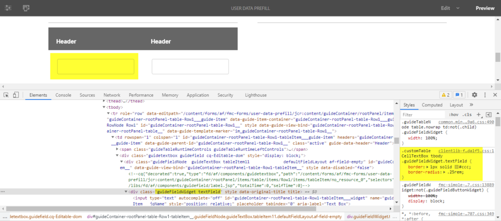
Fig : Inspecting DOM Element.
For more OOTB AEM Forms widgets styling classes refer: Styling constructs for adaptive forms | Adobe Experience Manager
Integrating Custom CSS Class to the AEM Forms Components
The next step is to tie the custom class name customTableCellTextBox to the table. As I explained above, the selector path is important. In this case, my path traverse from the custom class name followed by table body and then to textfield. So, I need to apply the custom CSS to the table style.
By using the edit mode in the page toolbar, you can go to edit mode as shown in the below image. Select the table component and click on the edit button. It will bring the style properties panel as shown in the below image:
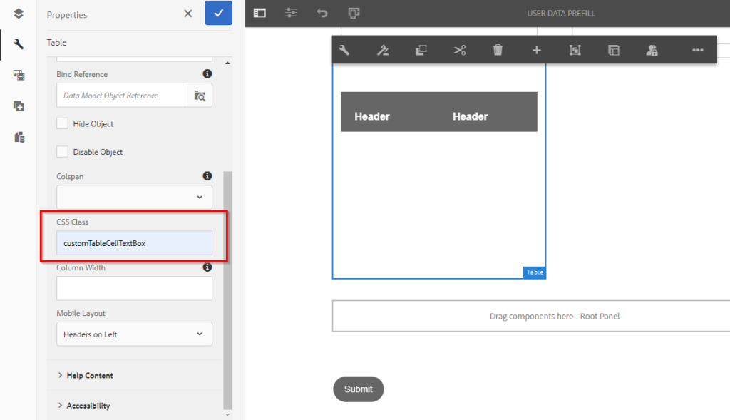
Fig: CSS class field for table component.
In the CSS Class field, add the custom class and save changes. Now your table will look as below image:

Then, the next question is: what if I need to customize more UI elements to the same table? We have already used the CSS Class tied to one selector path. Using the same selector path logic, you can add additional custom styles for example
customTableCellTextBox tbody guideFieldWidget.<component>
I hope you have found these tips and tricks to custom styling with AEM Forms helpful. If you have any additional questions, please post your questions and comments. Feel free to check out more helpful hints about Adobe by viewing our blogs.

