Google’s Material Design is a design system that helps teams build high quality digital experiences across different platforms. One of the best parts of Material Design is that it provides guidelines, implementation, standards, and code for different components used across different technologies – web, React, Angular, iOS, Android, etc. This presents a great advocacy to use Material as a standard for an enterprise where different technologies are used across various applications. But should you rely on Material?
Variations Across Different Technologies
It turns out that the design and implementation of the components provided by Material for different technologies are different altogether. Let’s say an organization has decided to use Material as their design system and there are two projects using two different technologies, one Angular and another a static website driven by a CMS. Material has a separate set of components for Angular and another separate set for web (expand the components section on the left).
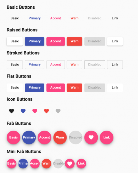
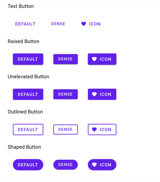
A button component’s style in Material Angular is completely different from its web implementation. The Angular version has a Stroked Button variant, while the web version has an Outlined Button variant. If we need to use the outlined button in Angular app, it would need to be styled separately. The case with a stroked button would be similar. It needs separate styling in the web app. Likewise, a text field input also has different styles and interaction in both the web and Angular versions. Either of them will need additional styles added to match each other. Which one should be used as a standard now?

Material Angular Buttons

Material Web Buttons
Apart from variations in the design of components, there are some components that are present only in the Angular version and not implemented in the web version at all. Let’s say both the Angular and web projects require an autocomplete feature. Material provides a built-in, easy to use implementation for this component in its Angular version. This is not present in the web version. One would need to write custom JavaScript and custom styles to make sure the web’s implementation matches that of Angular’s. The same goes for a date picker component as well. Material Angular has a built-in date picker component while there is none for web. Again this has to be a custom implementation. The same holds good for accordion/expansion panel, stepper forms, tooltip, etc. They all need a custom implementation to make sure it matches the Material’s design guidelines.
This discrepancy in the implementation of components across different technologies is sure to add perplexity for the developers and designers working on different projects. Moreover, if Material’s Angular components get an upgrade, the custom components need to be upgraded manually as well. This adds unnecessary developer overhead in maintaining and testing components not supported by a particular variant of Material (be it Angular or web or React).
One begins to wonder why the brains behind Google’s Material did not put much thought into creating design and implementation guidelines for components across different technologies in a homogenous manner. The absence or changes in implementation of components across different technologies creates much confusion and development overhead among the teams using them. A comprehensive and meticulous review of Material’s design system and its components is absolutely necessary if it is going to be used as a standard across different technologies in an organization.

