In this post, I will review some formatting tricks with Obiee reporting.
I recently got this opportunity to work on a project where reporting needs were quite different than usual. More than the reporting data, there were more challenges while it came to formatting the report in the required format.
For Obiee reporting, Mozilla Firefox has always proved to be the best browser. However, I use Google Chrome and Internet Explorer too.
Headers in Obiee
I came across this reporting requirement where Column headers were not in one single straight line but in a multi-level angular text format.In column properties, I used a combination of HTML tags like <br> and <center> for alignments on Column headers supported by CSS Style transform: rotate(90.0deg) wherever required. Unfortunately, this workS only if the Folder heading is empty.
For image display as shown below, under column properties, Obiee gives some inbuilt images or you can also upload a custom-built image through URL or Fmap option.
For Footer, you can simply use a static text view in the same report view with different font options.
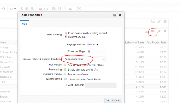
Two levels of headers are provided in Obiee by default. As shown below, just make sure if you want to see both headers then set the option in the Results section: View Properties as Separate rows.
There is an option to Import formatting from other analyses on the results tab. Also, it’s a good practice to maintain the same formatting across multiple reports for a single Dashboard, Dashboard page or a Project.
There are several other options to make the report look more lively while creating Dashboards in Section properties, Column properties, etc. Also when it comes to having too many columns in the same report, formatting becomes a challenge. Especially when it comes to a Mobile, Tablet or Laptop look where the report is required to look good in all these different visual mediums having different browser settings.
Thank you for taking the time to read my blog. Hope this was helpful.


